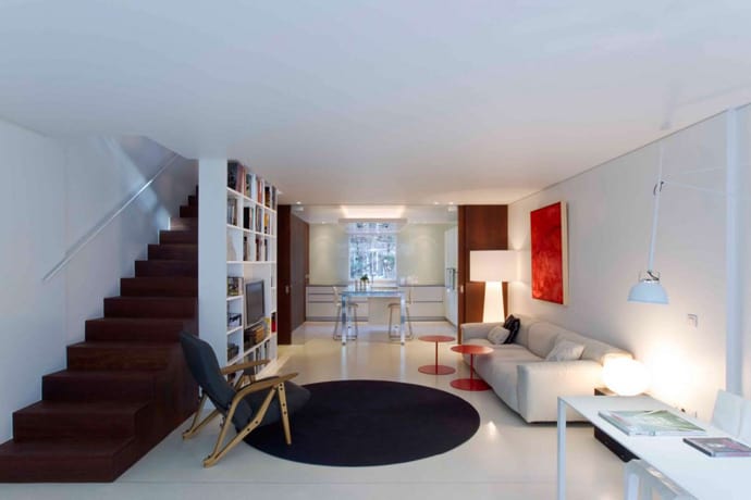
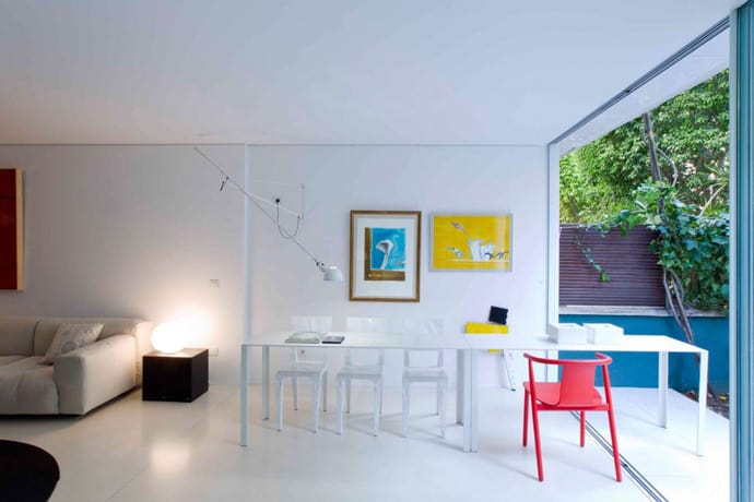
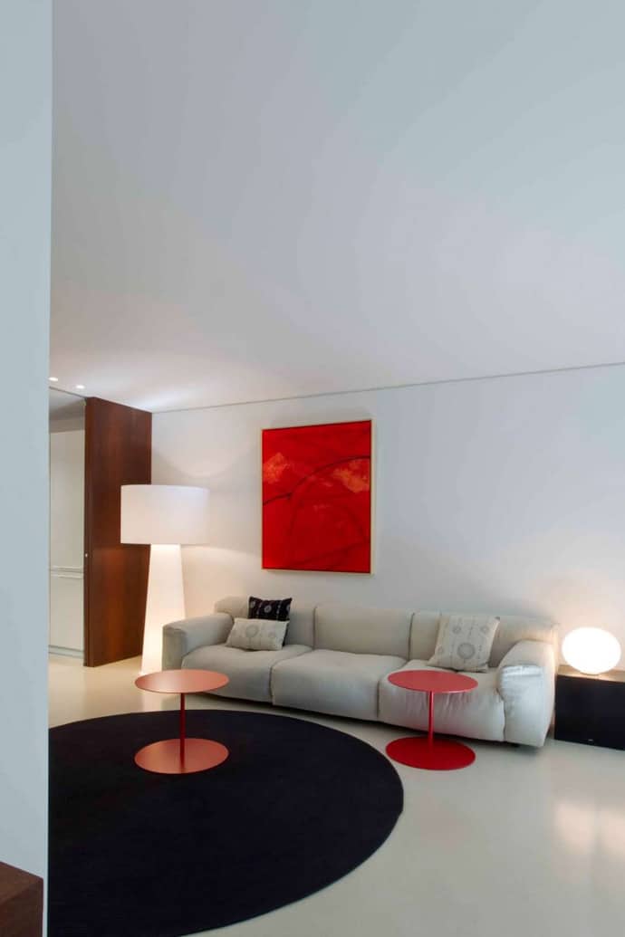
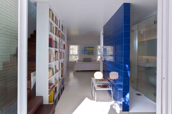
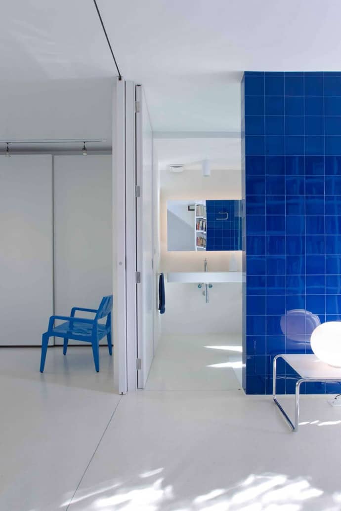
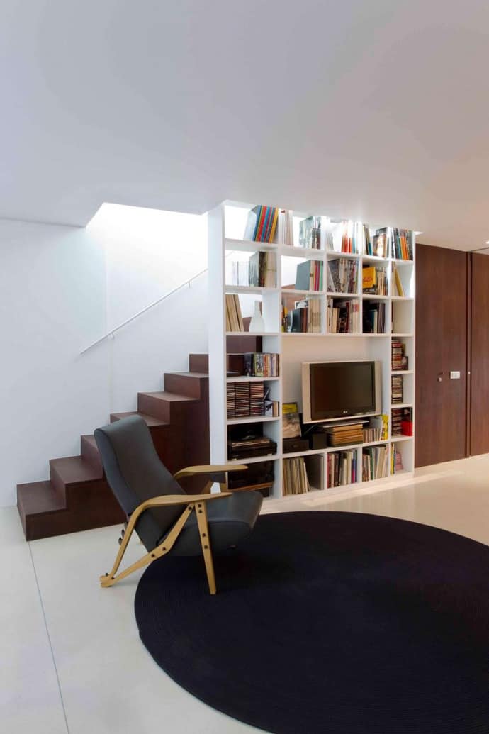
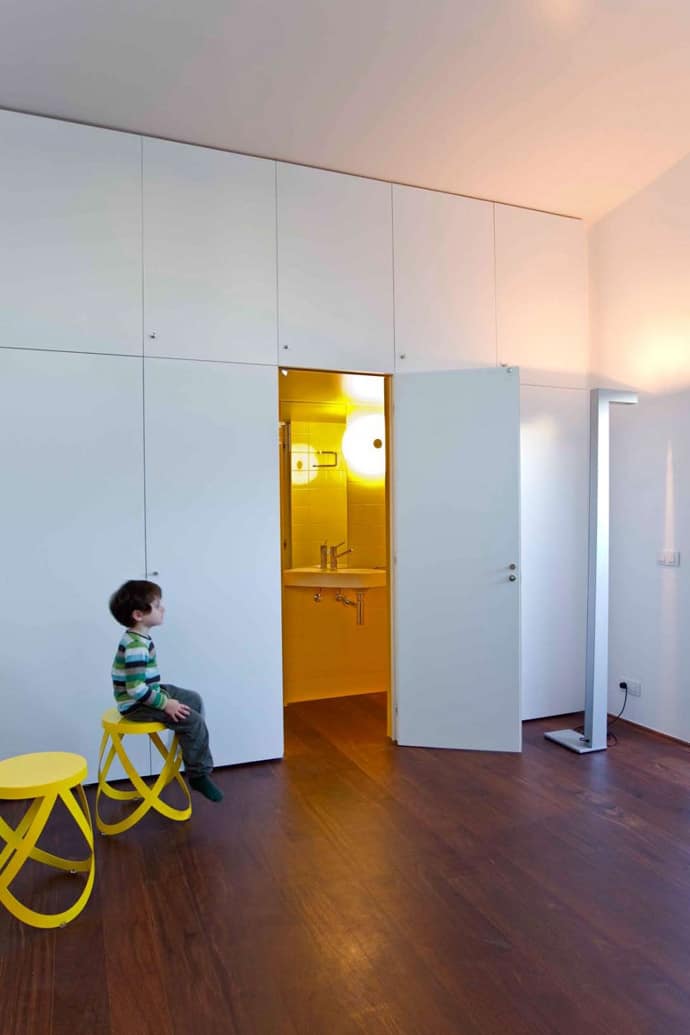
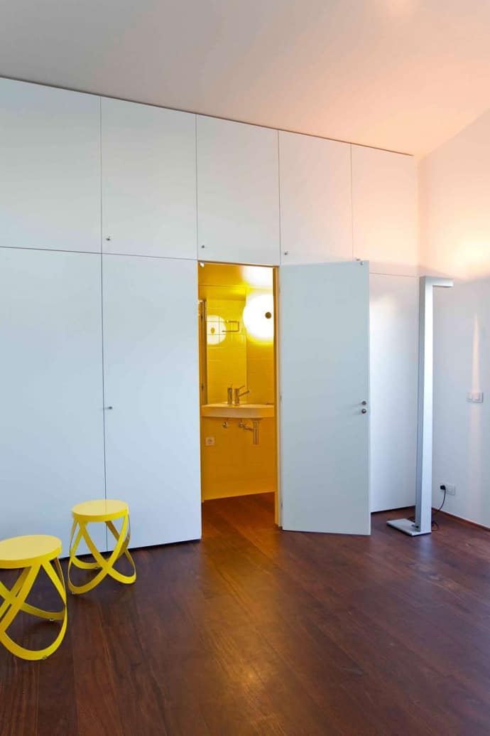
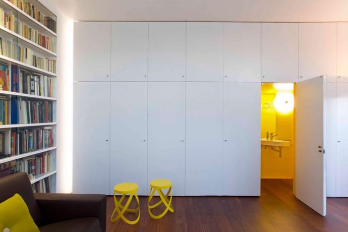
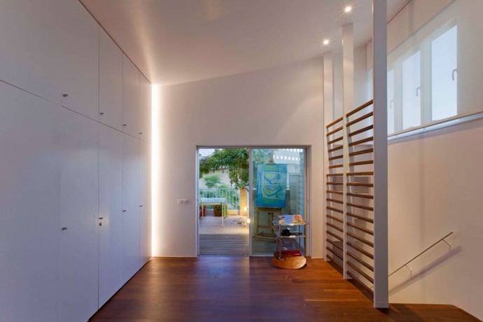
The theory of less is more isn’t about spending less. It is about achieving better design through simplicity. It is about getting the greatest impact through careful editing and restraint. This project we present you today is the refurbishment of a 155,51 square meters house located in the Olympic Village from Barcelona. The project was carried out by Javier San Jose Marques and Interior Design studio MINIM. We liked the house because the spaces are serene and uncluttered, but not cold and sterile. The designer let the objects have some breathing room, the better to be appreciated. There is a real art to creating spaces that have no excess, but that exude warmth and beauty. A precious piece of advice in minimalist design … choose a single stand-out piece and then let it … stand out. One red accent table has all the more impact in a room with a monochromatic gray color scheme. Adding any other red in the room would dilute the effect.
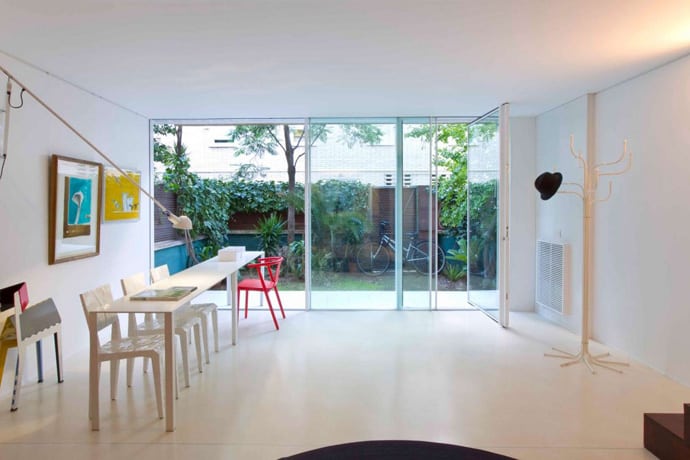
The living room is a wide open area that provides a lot of space for the guests.
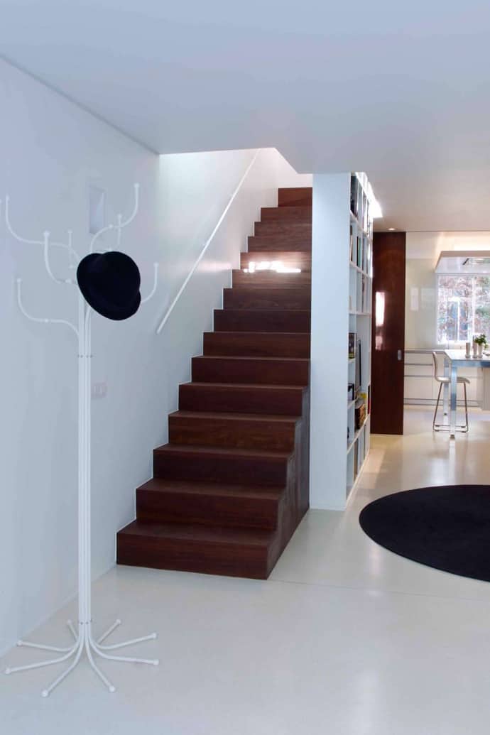
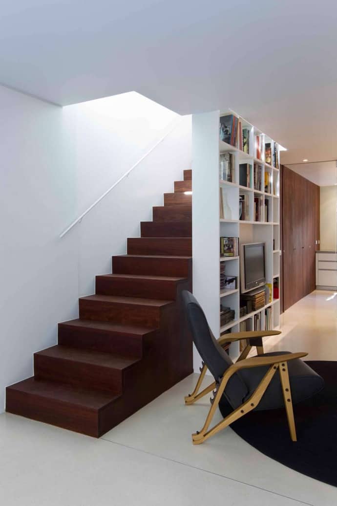
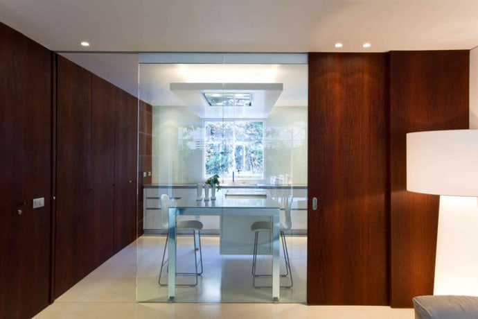
Choose high-quality and beautiful material, then let it stand on its own.
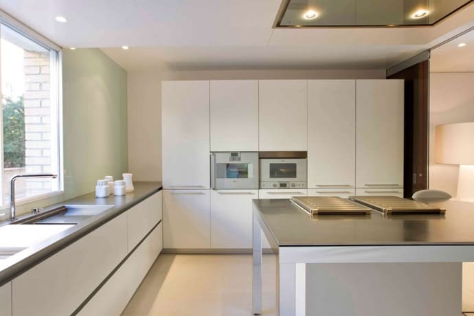
Kitchen furniture by Italian firm Dada and stools by Tate of Jasper Morrison
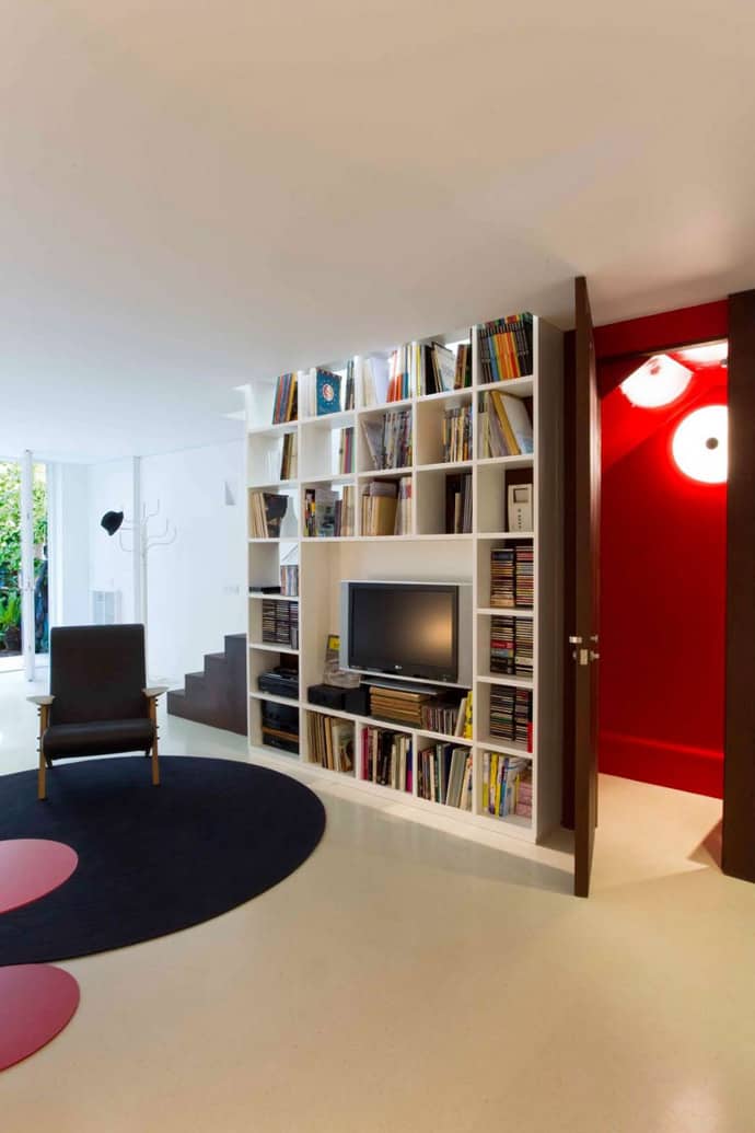
Whatever its associations, red is a powerful and beautiful color. True red is a primary color, but the spectrum of reds is vast, from pale pink (white with a little red in it) to scarlet and crimson. In decorating, bright, vibrant reds are usually reserved for accents, while darker, browner reds end up on walls, floors and doors.
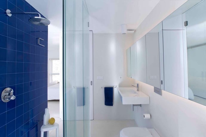
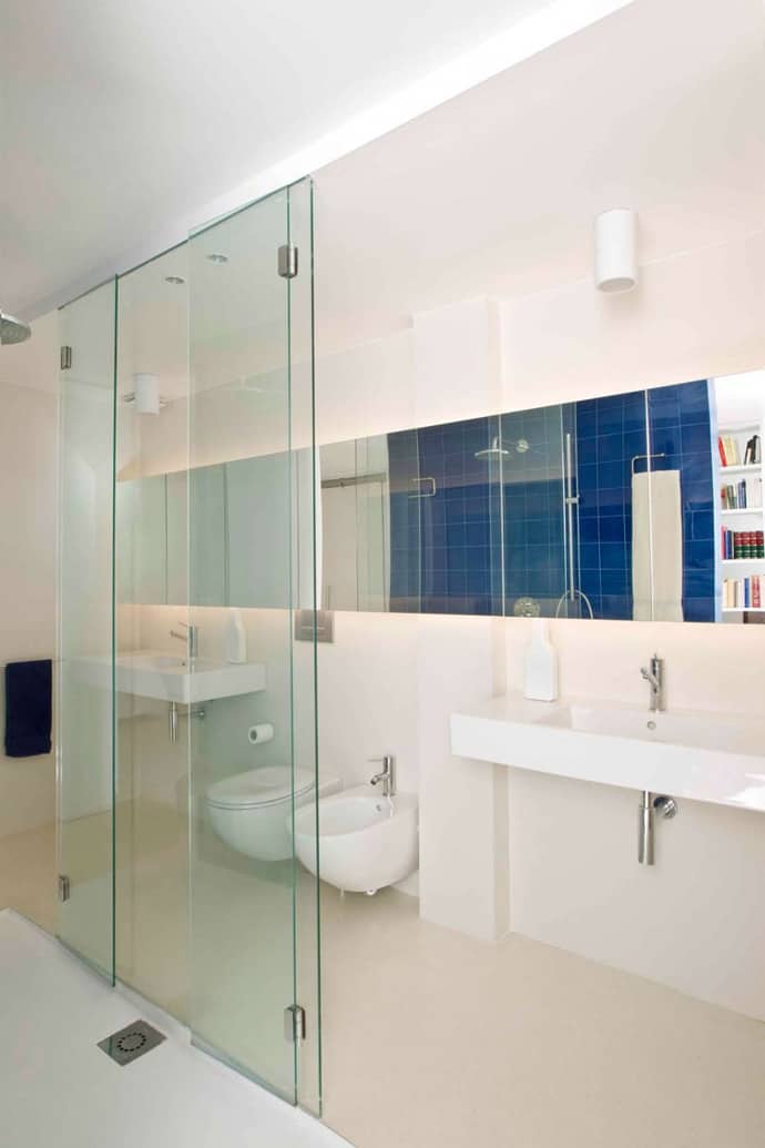
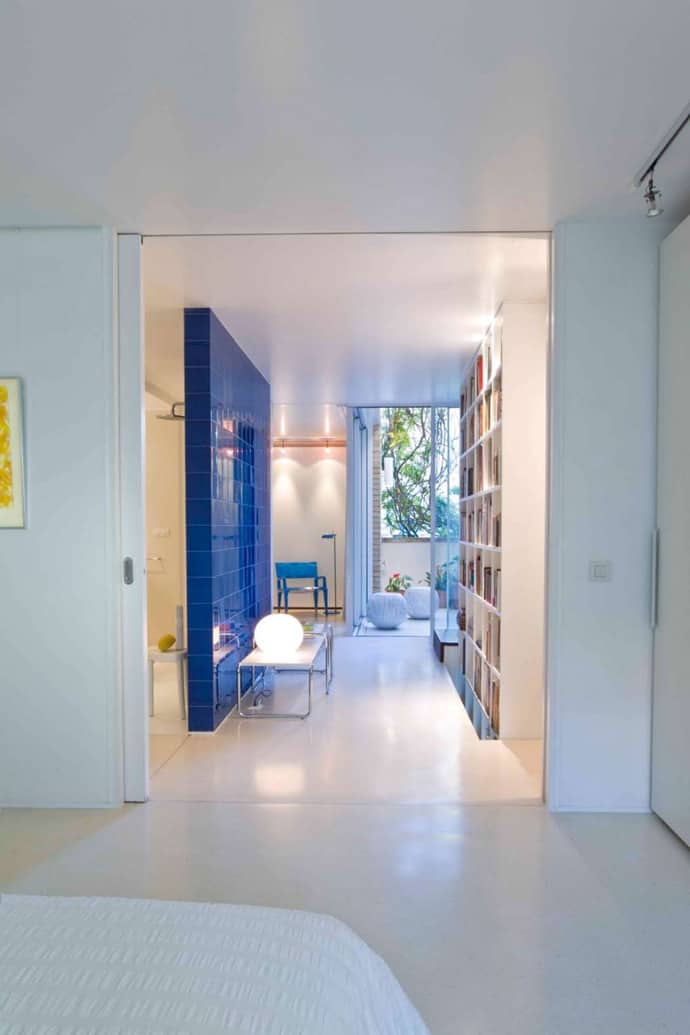
Blue is a wonderfully calming color – perfect for the place where you most want peace and quiet: the bathroom.

