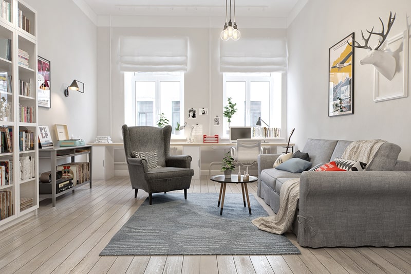
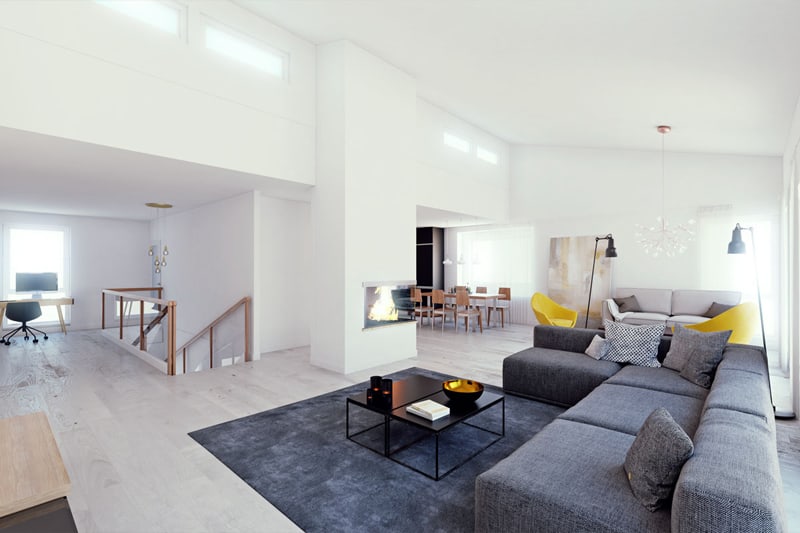
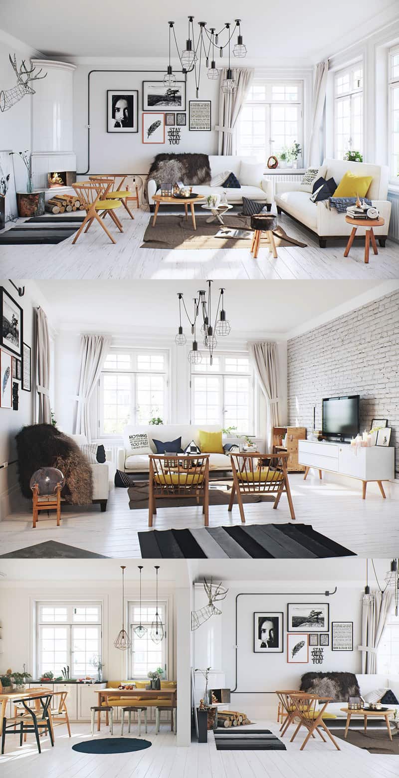
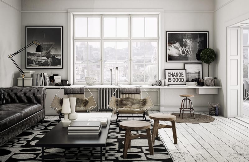
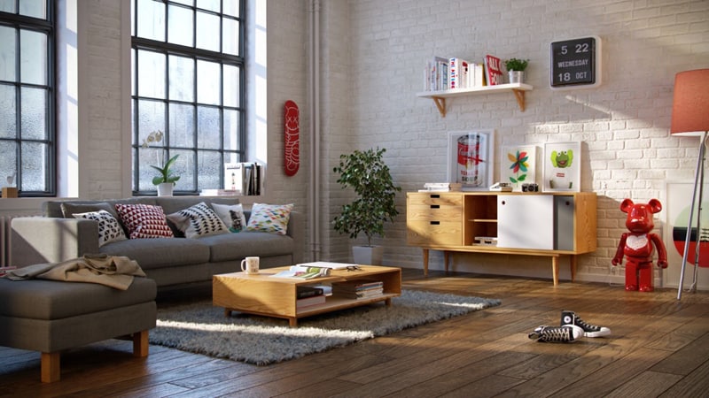
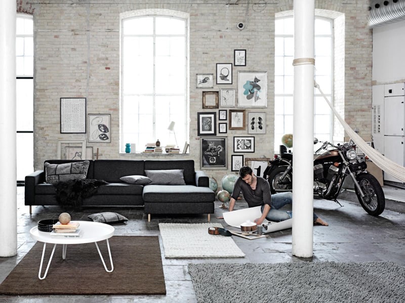
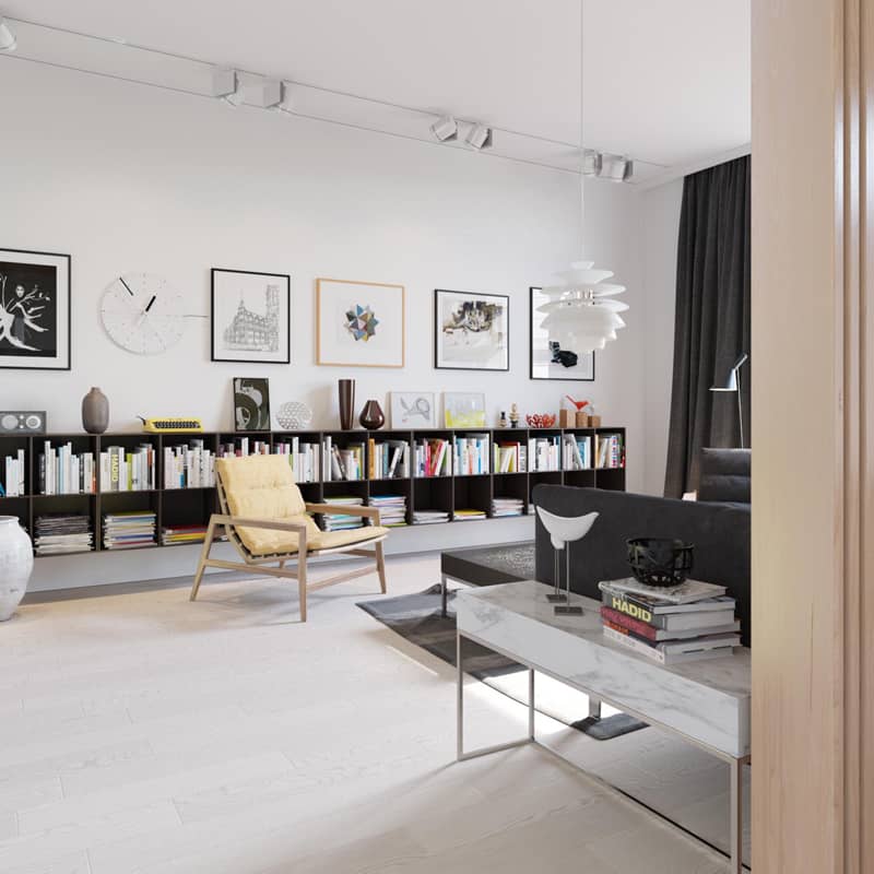
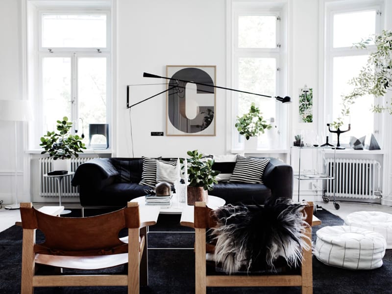
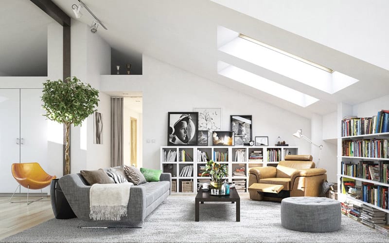
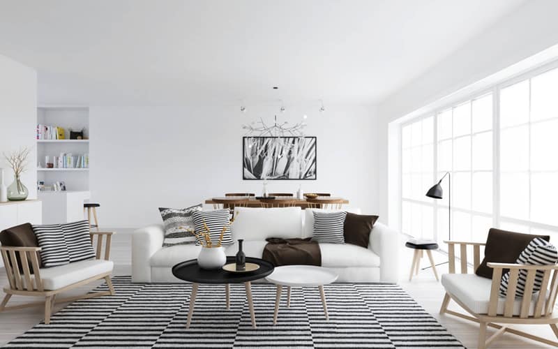
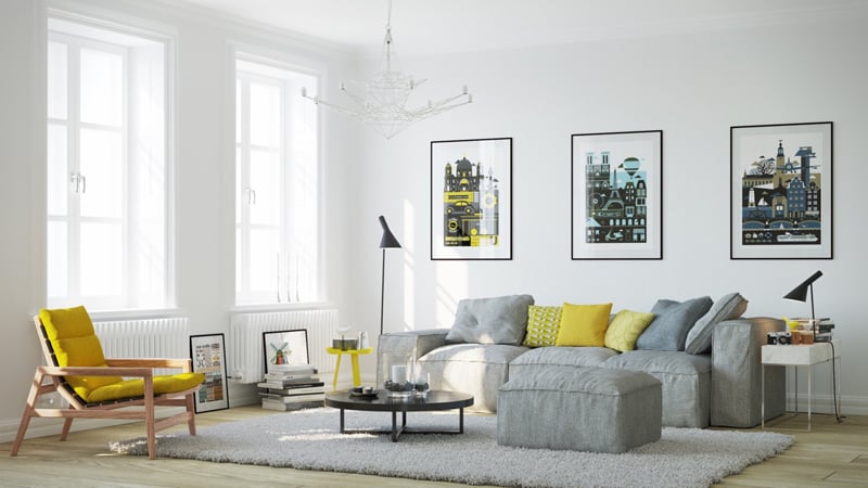
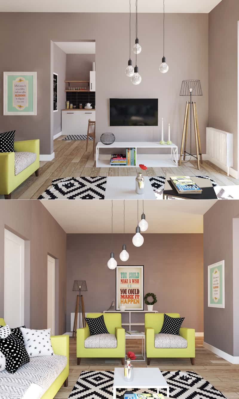
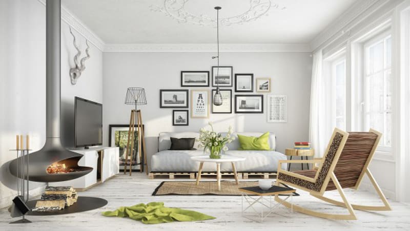
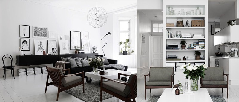
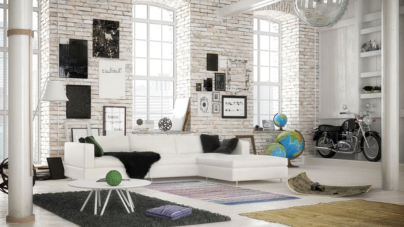
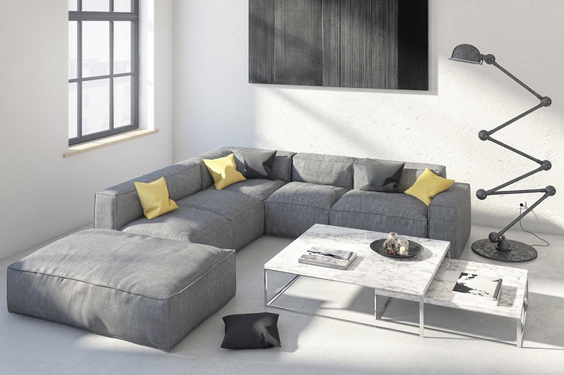
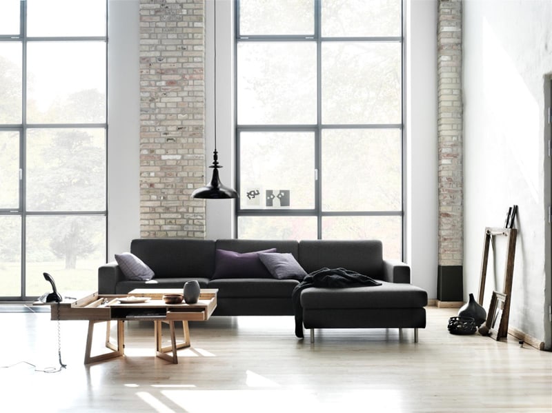
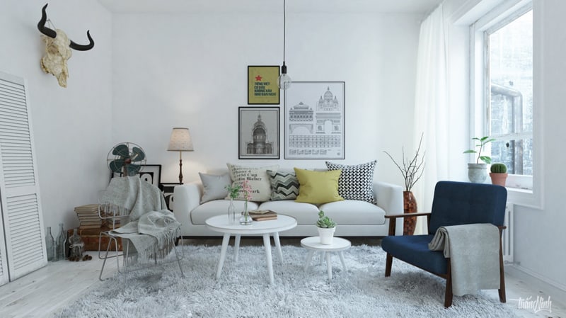
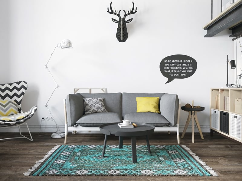
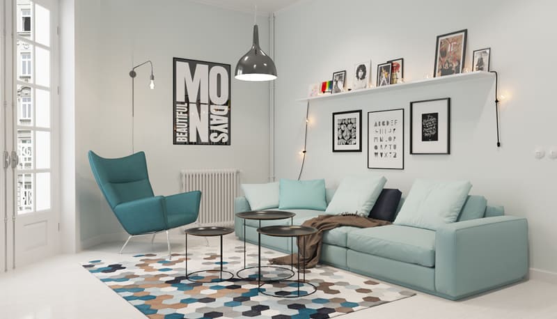
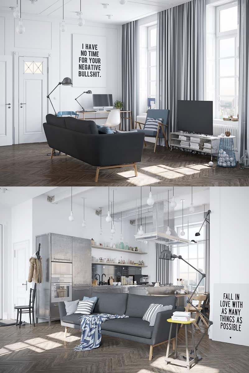
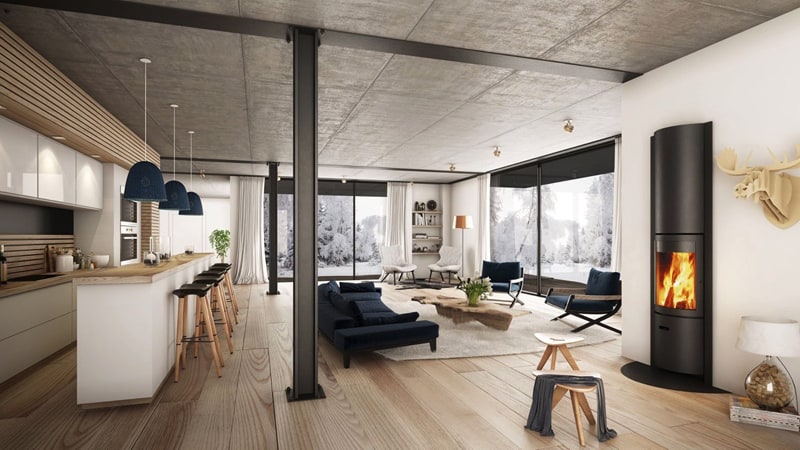
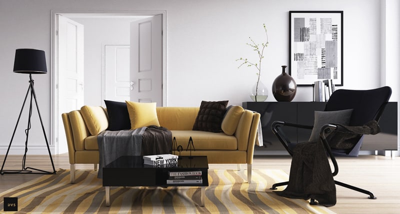
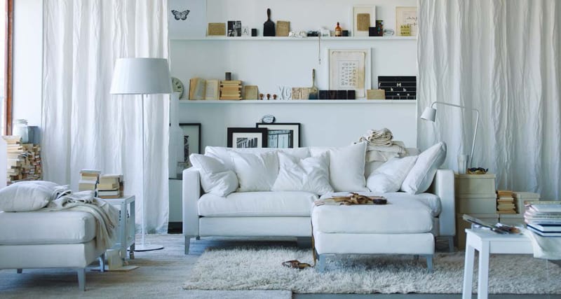
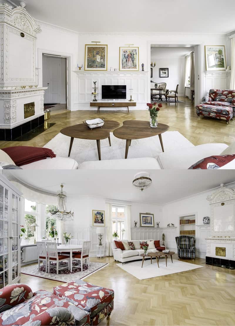
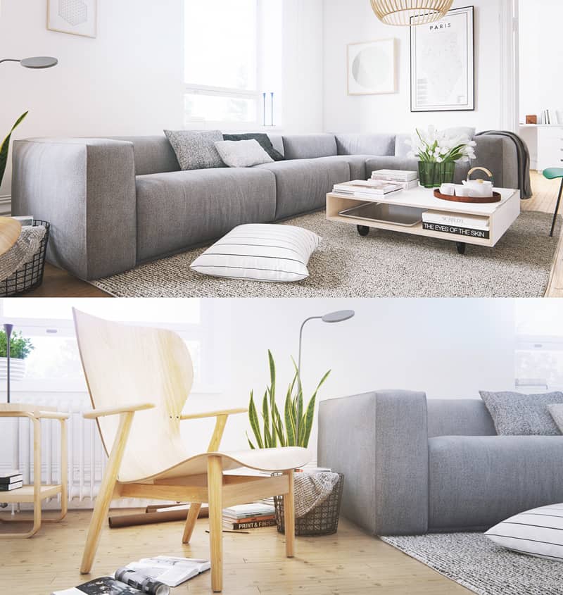
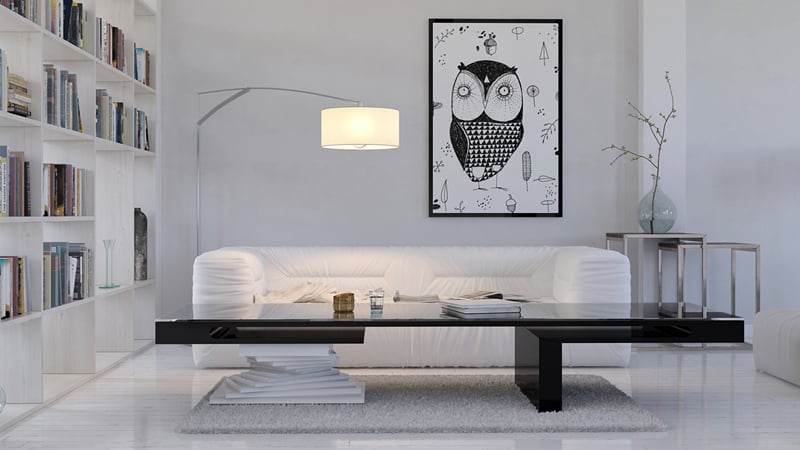
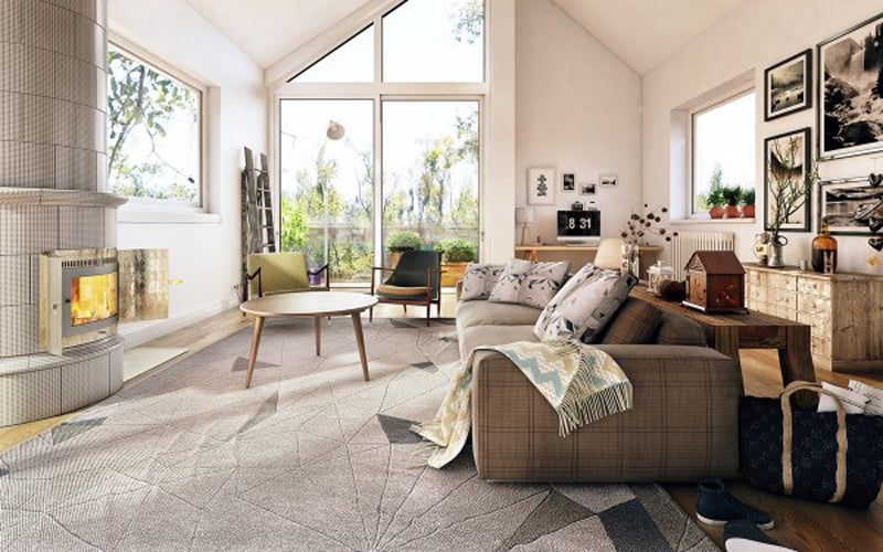
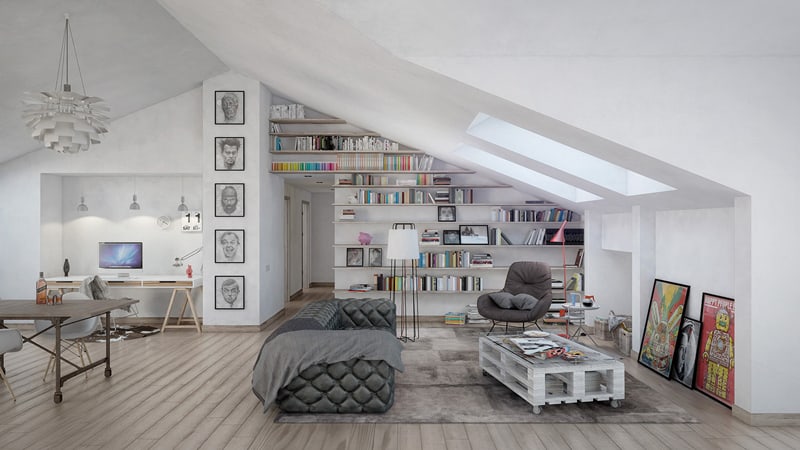
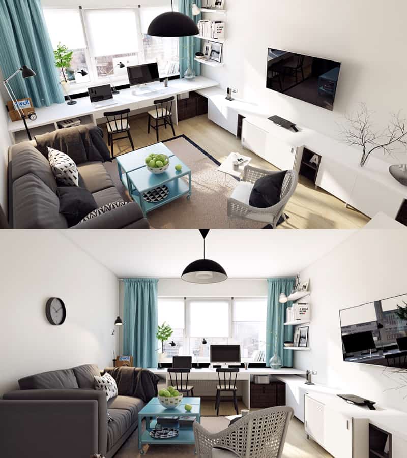
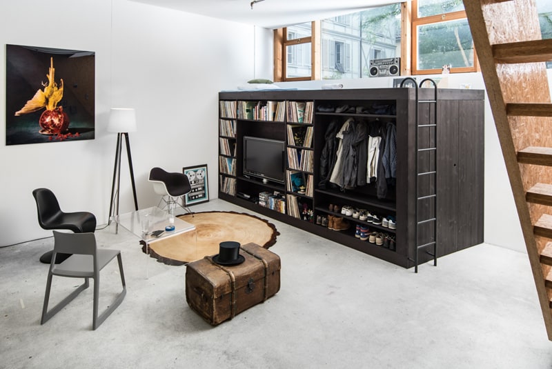
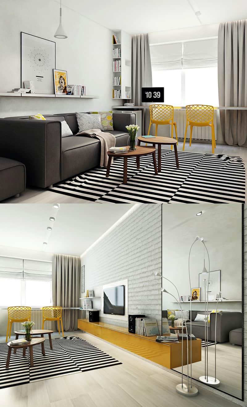
A little bit of Scandinavian Graphic Design Should Be Everywhere. Why ? Because everyone deserves a little Nordic style…. In my opinion all interiors should have a bit of the air, the elegance of Scandinavian design. It’s obvious that this style, a little busy, airy, full of light and white, is much more relaxing than the shabby chic-boho interiors when everything is stacked, crammed, loaded to the smallest corner, without letting any wall square breathe.
Scandinavian Graphic Design inspired many artists
Scandinavian designer graphics have inspired many artists, architects, decorators. Why? Because it is contemporary, because it adds to the quality of living, because it is normal and natural to forget the light, the white and the quietness you feel in any interior based on Scandinavian design.
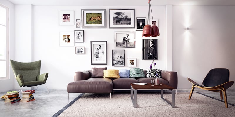
A friend of mine was telling me the other day that she doesn’t see the point of not having pictures, hanging on the walls. To her, that house is unfinished. But my goodness, how nice it is to be able to breathe, to be able to look blankly and collect your thoughts and not constantly bump into objects, graphics, colors. Scandinavian graphic design is one of my favourite.
I like the simplicity, freedom, fresh air and airy interiors full of light and opening to the outside, to the green, to the forest.

