Many restaurateurs (and other commercial business owners) view spring as a time to reassess their décor and update the way their restaurant looks. Restaurant design trends are like a revolving door – they come as quickly as they go. But more often than not, what people envision for their restaurant dining space is not actually realized. Without the right design and thoughtful planning, good intentions won’t necessarily lead to the desired outcome. If you are one of those people who find their designing ambitions constantly leading them down a frustrating path, not all hope is lost. Whether you are planning a complete overhaul for your space or just simply want to spruce up your existing décor, this article will point out common mistakes and how to avoid them.
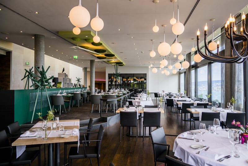
Mistake No. 1 –Lack of Cohesion between Operations and Design
If you don’t know what the restaurant design mistakes are or not aware that you are making them, you won’t be able to correct them. The most common errors are no match or identification with the restaurant concept. For example, inefficient production areas behind a nice looking dining room or seating layout interfering with service are some contributing factors to design mistakes. Operational functionality of the restaurant needs to be integrated with the design flow. Design elements should first concentrate on creating a restaurant layout based on efficient work flow, menu and anticipated restaurant table turnover. Only then you can design the ambiance around these elements.
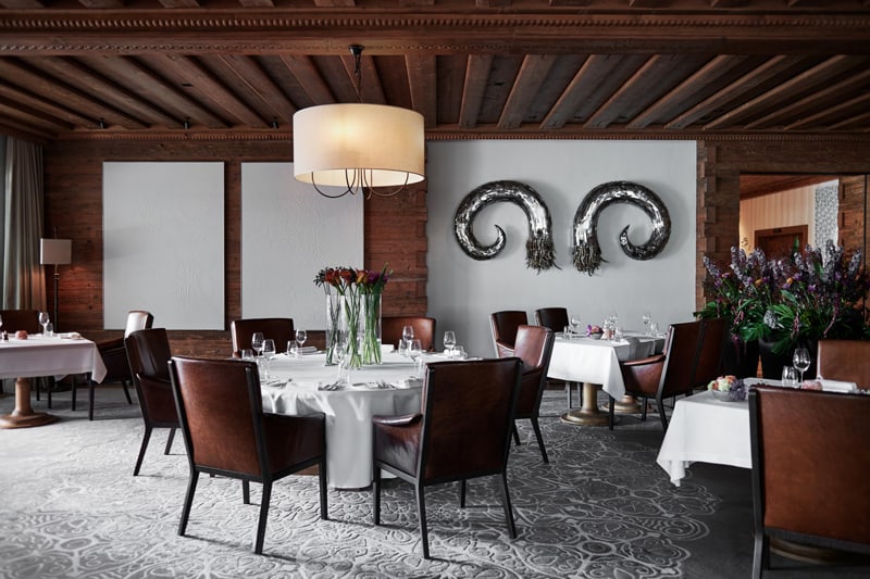
Mistake No. 2 – Over/Undersized Restaurant Furniture
Another common mistake that many restaurant owners make when designing their space is buying restaurant furniture before measuring the room. Consequently, you may end up with furniture that is either too big or too small for your space. Before you purchase any new items, be sure to measure your entire room and get the exact dimensions so you will know what furniture piece need and how many will reasonably work with your layout. While restaurant booths are comfortable, they can overcrowd your dining room and look out of place in a small venue. Circulation and flow are important for both functionality and comfortable dining experience for customers.
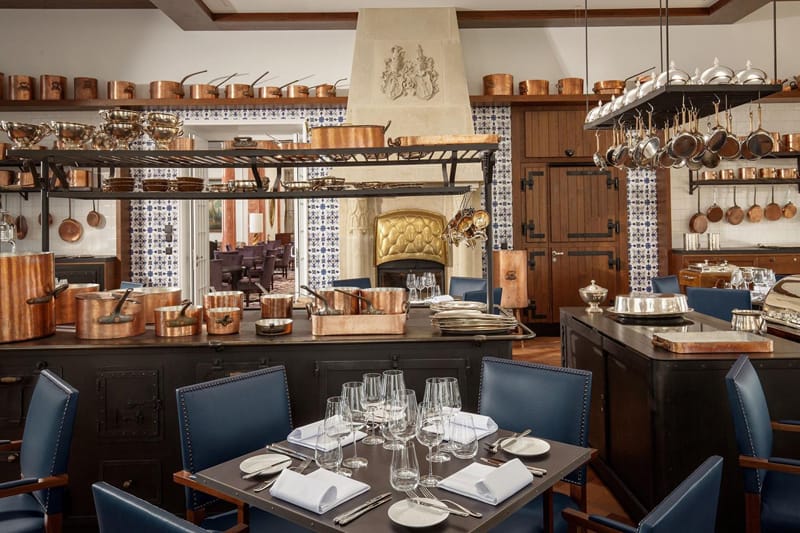
Mistake No. 3 – Irrelevant or Too Many Decorations
Outdated, faded or other decoration elements that don’t represent your brand can detract from profits. The restaurant design needs to circumvent the brand story and personality. Good planning helps with execution of your brand so you should start by writing down the vision you want for your restaurant. Once you have brainstormed ideas, you can think about decoration, lighting, other fixtures and even restaurant tables and chairs. Everything placed inside (and outside) of your restaurant should support the concept. That means every item should communicate your brand’s personality. Only use decorations that are relevant to your concept and be sure to clean/dust them regularly as dust or any sort of grime seen on and around these ornaments can detract from the dining atmosphere.
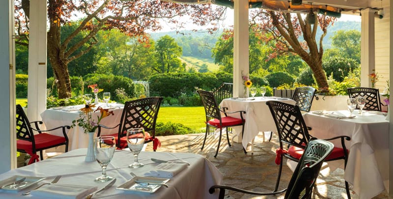
Mistake No. 4 – Worn Out Looking Exterior
A run-down, tired looking restaurant exterior design can reflect poorly on your entire dining establishment. Since most people are visual, it won’t matter how good the food you serve is if your restaurant’s exterior looks unsafe or uncared for. Most guests will pass by and go elsewhere. While parking lots are expensive to repave, adding a blacktop is a simple and affordable way to give your lot a clean and updated aesthetic. Outdoor lighting should be brighter than indoor lighting in the evening so to entice hungry by-passers. Paint the building, mend any chippings, replace flickering or dead light bulbs, inspect/repair commercial patio furniture (if you have any) clean the windows and care for grass and other plants around the premise regularly. Unfortunately, many restaurants don’t factor these measures into their budgets and therefore are unable to afford to maintain their exterior design when needed. To avoid this predicament, we suggest you invest at least 1% of your total revenue in up-keeping and ongoing maintenance projects for your restaurant’s exterior design. You also need to think about updating partitions for restaurant bathrooms, if the old ones are in a bad condition.
Mistake No.5 – Harsh or Dim Lighting
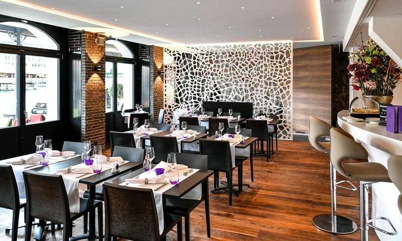
Have you ever spent any time in a dressing room department store and felt blinded by the harsh overhead lighting? It’s an unpleasant feeling which can dim one’s dining experience. Too much lighting is one of the worst ways to illuminate a space. Great food and efficient service cannot salvage the ambiance that was ruined by poor lighting. Inappropriate lighting can change the color of your food, giving it an unpalatable appearance. The right amount of lighting can make guests feel more welcomed and relaxed. Layering lighting around a room is always a good solution. Investing in overhead lighting makes a lot of sense. Table and floor lamps are ways to add secondary lighting to your dining room to make it more functional and visually appealing. You can turn on and off these lights as necessary. That way, you and your customers won’t end up in a room that is too harsh or dim.
Mistake No. 6 – No Interior Directional Signage
Restaurants that don’t use interior directional signage or incorporate zone merchandising miss out on sales opportunities. Zone merchandising identifies various zones or marketing channels which are used to communicate with guests throughout a restaurant and use each area to formulate an in-house marketing plan. Some of these key sections or zones can be windows, table tops, bathrooms, greeter stations, TVs and more. Restaurants that use this marketing technique create an inviting, welcoming, engaging and fresh atmosphere for customers. The tone, however, must be consistent with the restaurant’s backstory and business perspective. Interior directional signage helps visitors navigate around the restaurant, enabling them to find the exit, bathroom, dining room, party room and other important areas.
Mistake No.7 – Cluttered Floor Plan
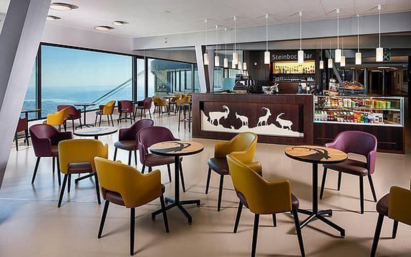
A restaurant floor plan is one of the most crucial elements in which a modern restaurant design demands owners to use for their establishments. A poorly drawn out floor plan that is cluttered with tables and chairs too close together, for instance, can be difficult for hosts, servers and customers to navigate. Placing tables and chairs too far apart from each other, however, can make customers feel displaced and disconnected with the entire restaurant. To avoid this mistake, use a combination of tables and booths that are placed along walls, spaced reasonably in open areas or close to the bar. This layout arrangement will leave enough room for everyone to walk around the restaurant without bumping into each other and the furniture.
Mistake No.8 – Noise Pollution
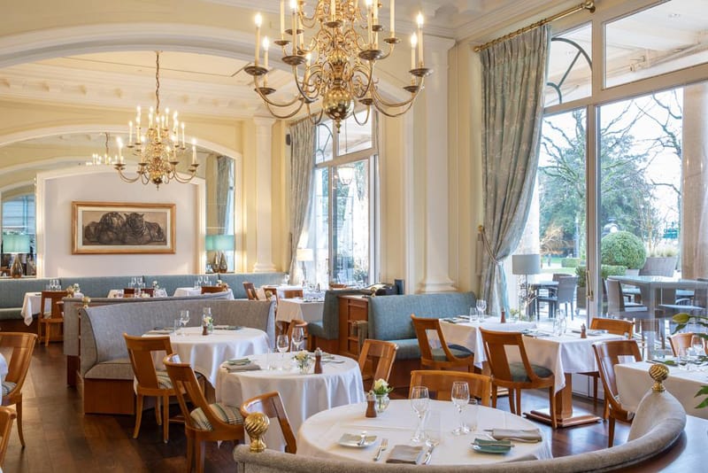
Acoustical issues like ambient noise or music that is either too loud or low, can be a distraction. Just like it’s important to find the right color theme, concept and number of staff, there is a fine line drawn between too much noise and uncomfortable silence in a dining room. Guests don’t like to feel they are at a library but by same token, they don’t want to experience a rock concert while dining and socializing. There should be a reasonable amount of noise to facilitate conversations between diners where they don’t feel the need to whisper or shout. Create ambient noise by playing soft music in the dining room. Also, use furniture to dampen noise and reduce echoes with drapes and couches.
