Doctors may like to think that what happens in the exam room is the most important part of a patient’s visit. In fact, your waiting room may have more to do with patients’ overall satisfaction than with their medical care.
3 Ways to Improve Your Waiting Room for Patients
Make wait time enjoyable.
Studies have shown that the actual wait time is not as important to people as the perception of their wait. If their time was spent doing something pleasant, patients are less likely to notice — let alone complain about — the wait. Brewing a cup of coffee or tea takes several minutes and can increase patients’ overall perception of value.
Consider the design.
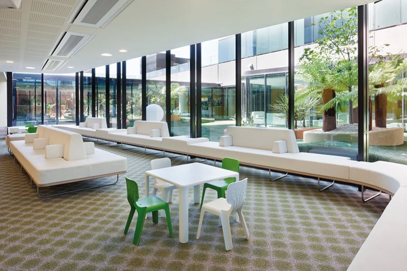
Yes, you’re a doctor, not an interior designer. But there are certain elements you can easily and affordably incorporate into your waiting room, including comfortable seating. One progressive design company has suggested that modular seating — with movable components and cushions that can be customized to different offices or individuals — would improve doctors’ waiting rooms.
Let patients be productive.
You can help them by providing free Wi-Fi and directing them towards high-quality patient education materials of your own, either on your website or social media pages, or on a TV or tablet in your waiting room. Patients can watch your patient education videos in the waiting room, then go home and share them with their family members on their phone or computer after the appointment.
also view: Amazing Ideas of How to Design a Modern Dental Clinic for Children
Here are 3 Modern Private Clinics that show you how important is the way you take care of your patients. Enjoy!
1. The Royal Children’s Hospital
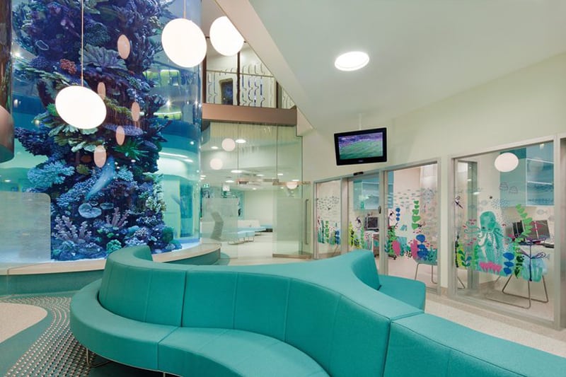
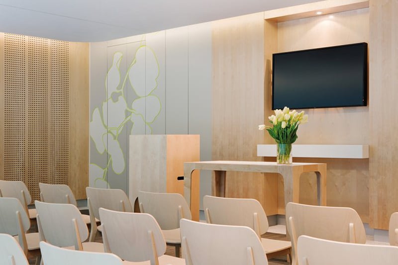
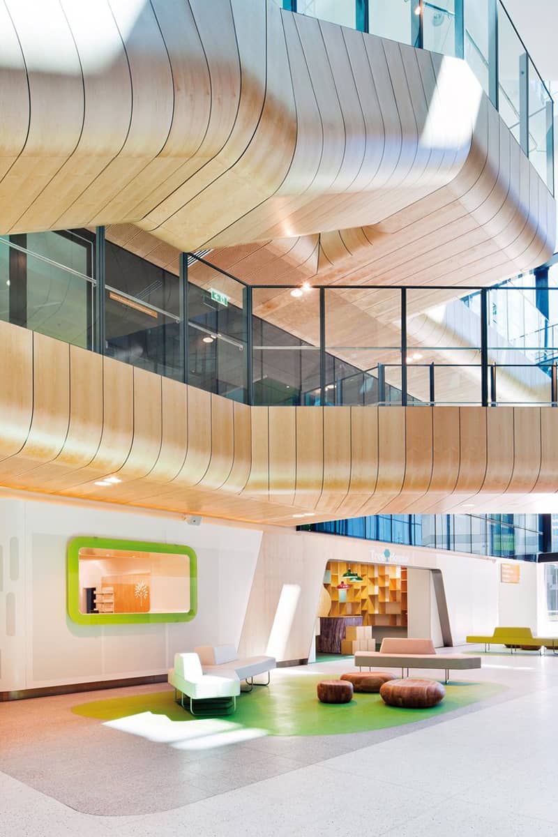
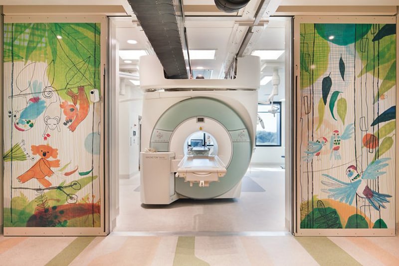
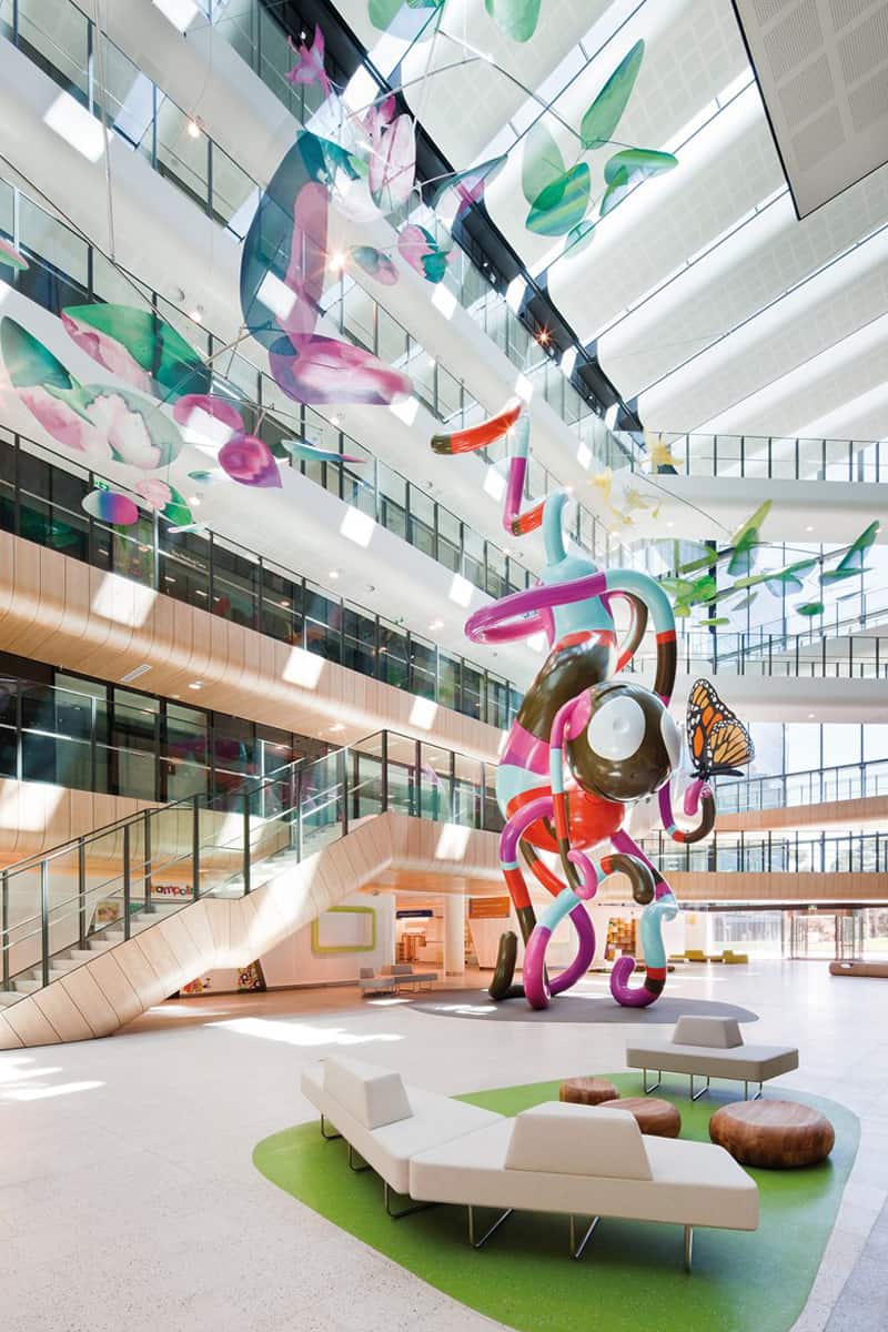
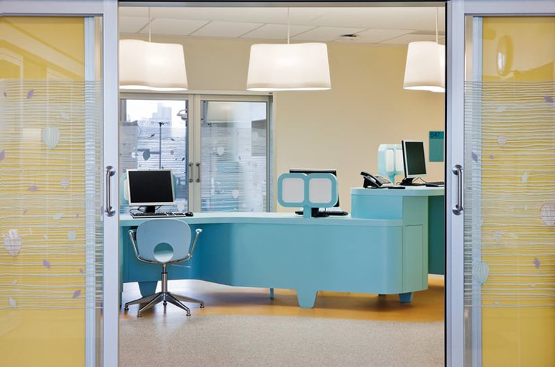
Bates Smart Architects and Billard Leece Partnership designed a beautiful $AUD 1 billion Royal Children’s Hospital located in Melbourne, Australia. The design is based on ‘state of the art’ ideas developed by the hospital around a family-centred care model that puts children and their parents at the center of the tertiary level pediatric care facility. Using innovative and evidence-based design principles, the RCH reflects changing healthcare practices, workplace patterns, user expectations, community aspirations and environmental responsibility.
The building’s formal arrangement, as well the internal and external spatial experiences, has been assembled to promote a restorative and healing environment for children and their families.
The resulting architectonic language has been directly informed by the Royal Park setting, a park with a character much like a typical slice of Victorian bushland. Special attention was paid to the natural textures, forms and colours of the park and how this could directly inform the material expression of the building. A detailed study resulted which indicates how the built environment infused with the experience of nature can speak to children and help provide a therapeutic hopeful backdrop for those visiting the hospital. Considered detailing invites the human touch, acknowledges the child in a respectful way, provides a robust and safe environment yet de-institutionalises the hospital genre.
The building has been split into campus masterplan with a central street joining major new public gardens to the north and southwest. The north orientation breaks away from the city grid and turns instead to the park enabling the collection of buildings light-filled landscaped gardens around their full perimeter, avoiding a ‘front and back’ portrayal and enhancing the connection between child and park. The use of narrow footprints for the clinical buildings provides for abundant natural light to enter all corners of the Hospital. The natural slope of the site meant the new facilities could link to the park at three different levels intertwining the Hospital with its park setting.
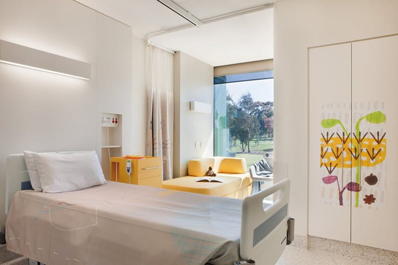
The Inpatient Building is designed in a star shape, connecting the rooms to the park. More than 80 per cent of the rooms have park views, others look into courtyards. Specially designed glass sunshades on the Hospital’s exterior allow activity in the grounds below to be viewed from the patient’s bed.
Bedroom spaces, 85% that are single occupancy, have been designed to be calm and comforting, befitting a place of recovery and respite. Medical procedures are conducted away from the bedroom whenever possible, leaving the bedroom to be a haven for rest and family time. Desk surface for schoolwork, sofa beds for family stays and opportunities for personalisation are provided to encourage a normalisation of the hospital stay.
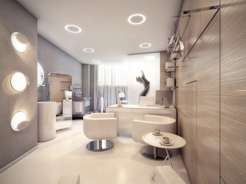
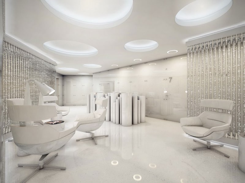
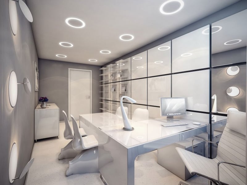
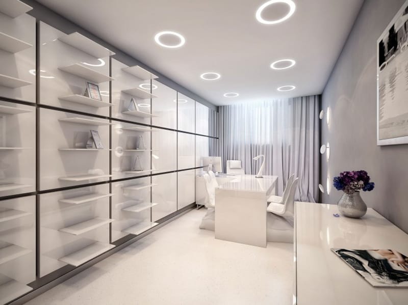
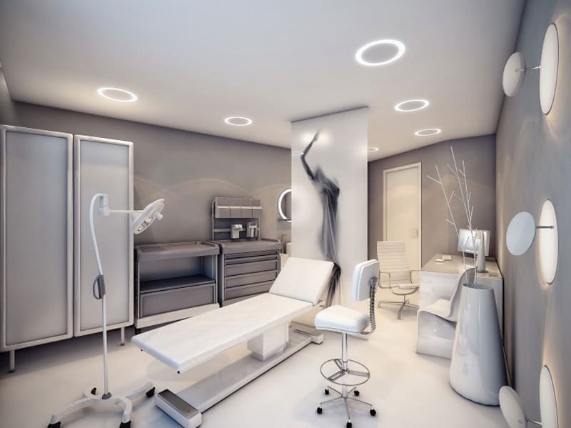
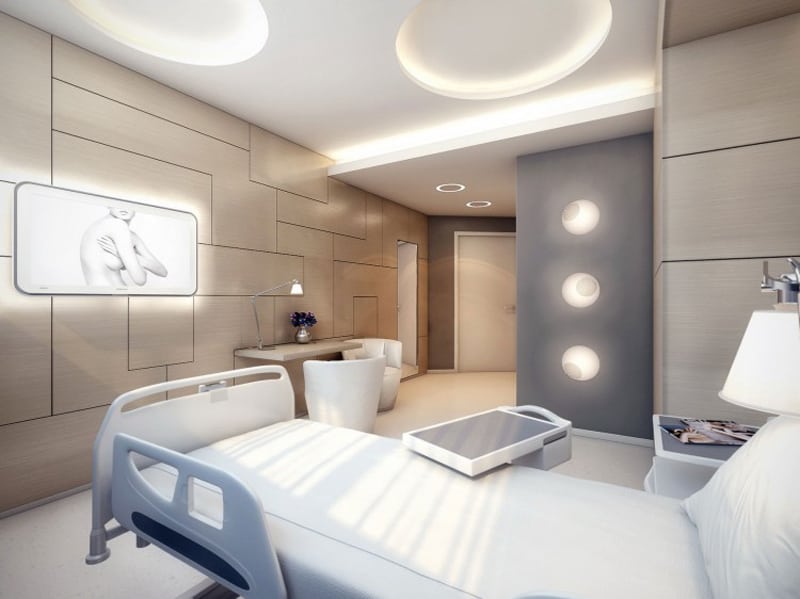
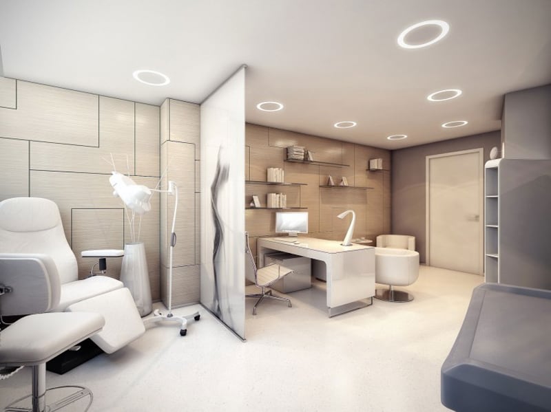
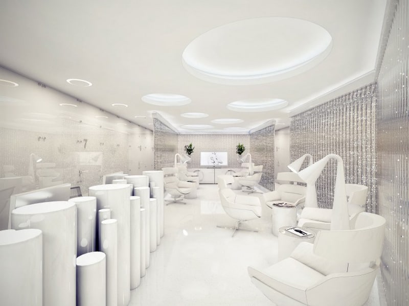
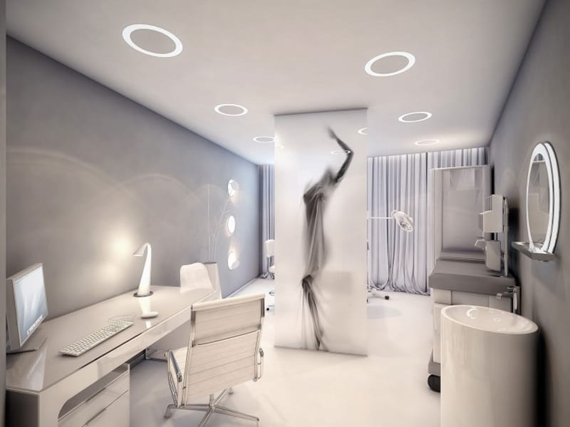
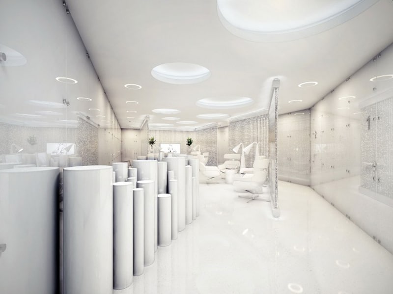
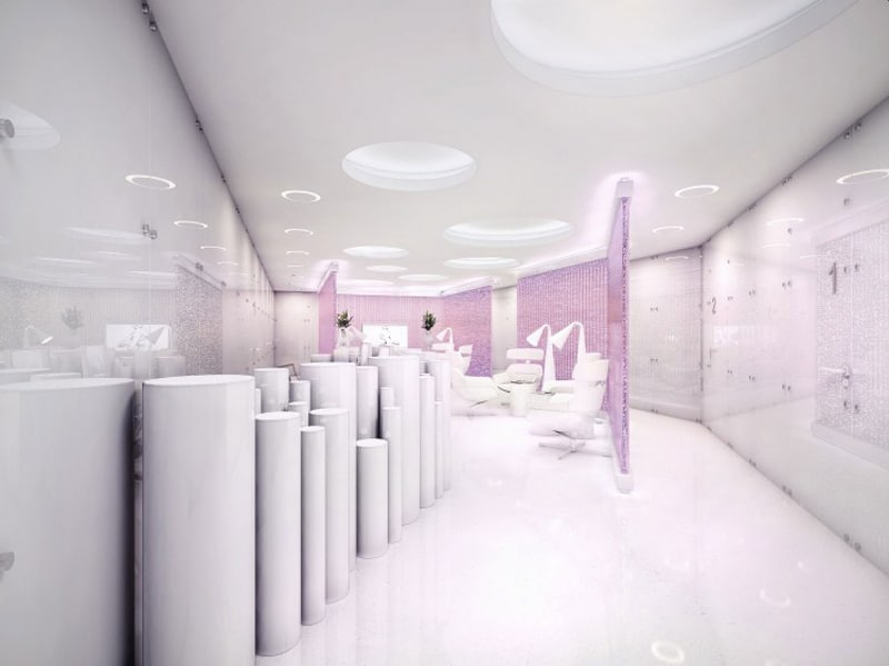
2. Amazing Surgery Clinic Interiors by Geometrix Design
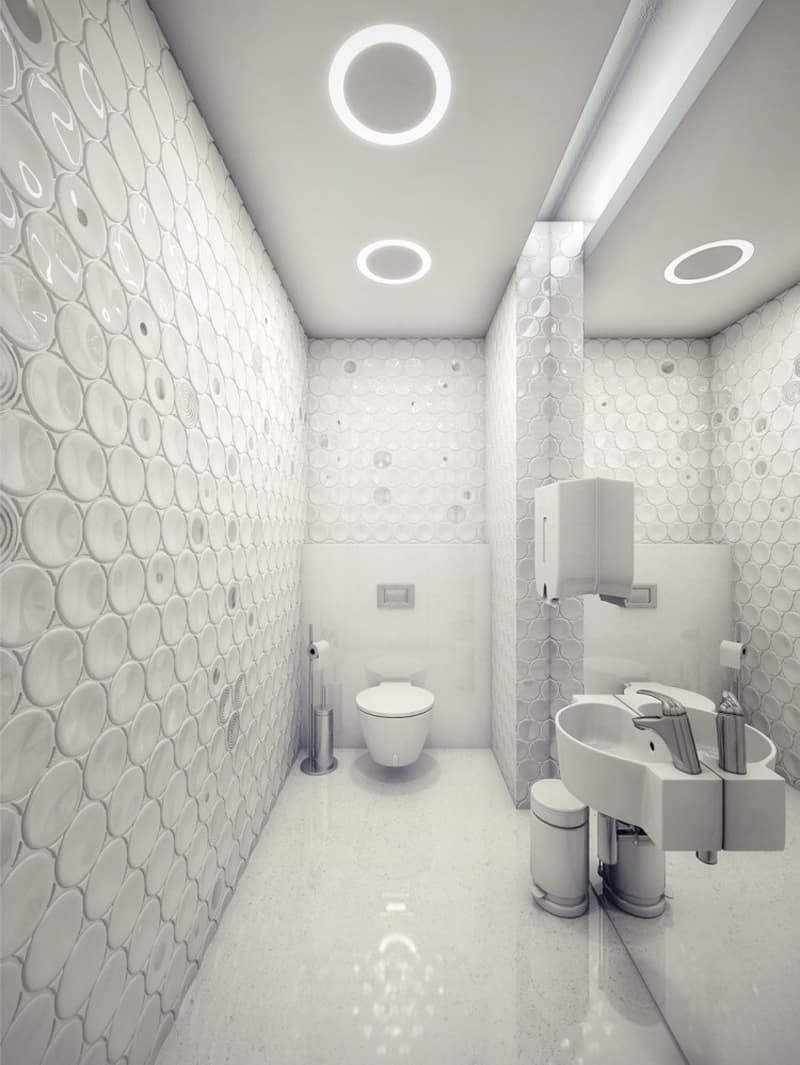
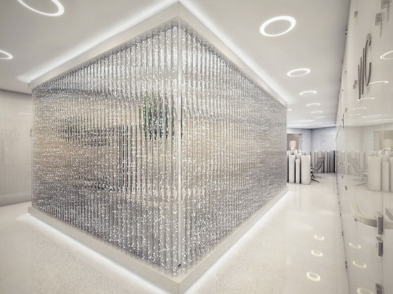
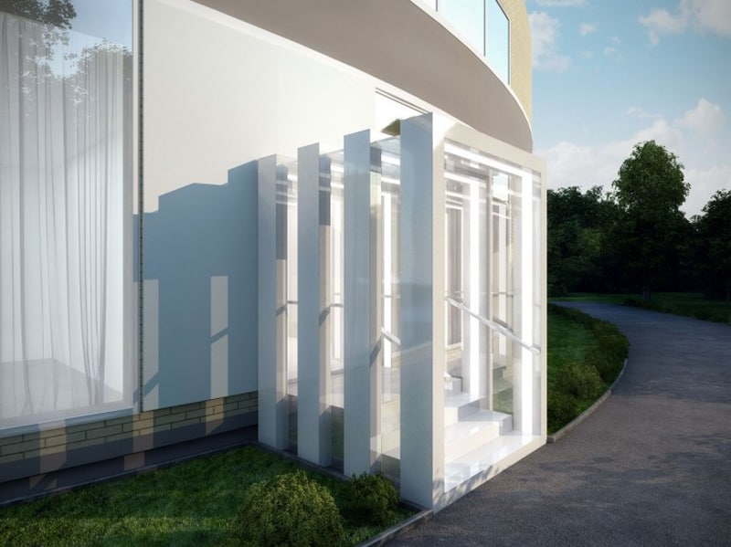
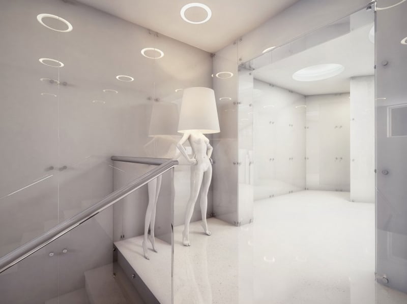
Russian interior designers Michael Miroshkin and Elen Miroshkina have designed the interiors of a futuristic surgery clinic. This project will probably never see the light of day but their 3D renderings are pretty amazing.
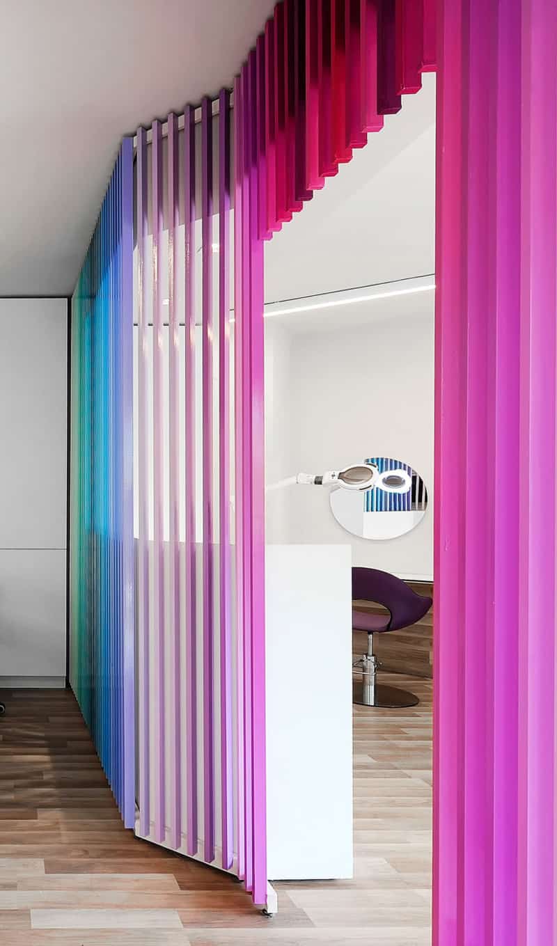
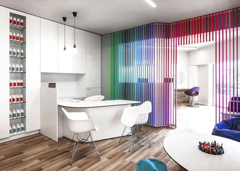
3. A Colorful Private Clinic That Will Brighten Children’s Visits
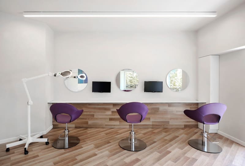
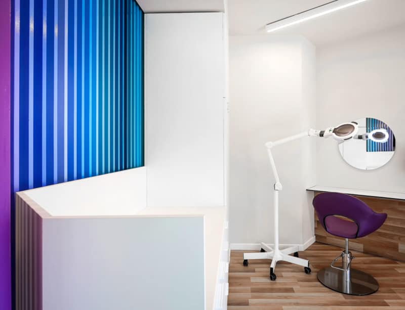
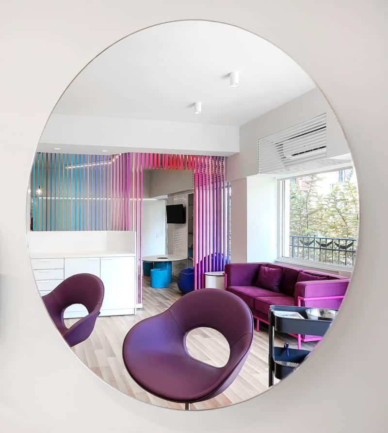
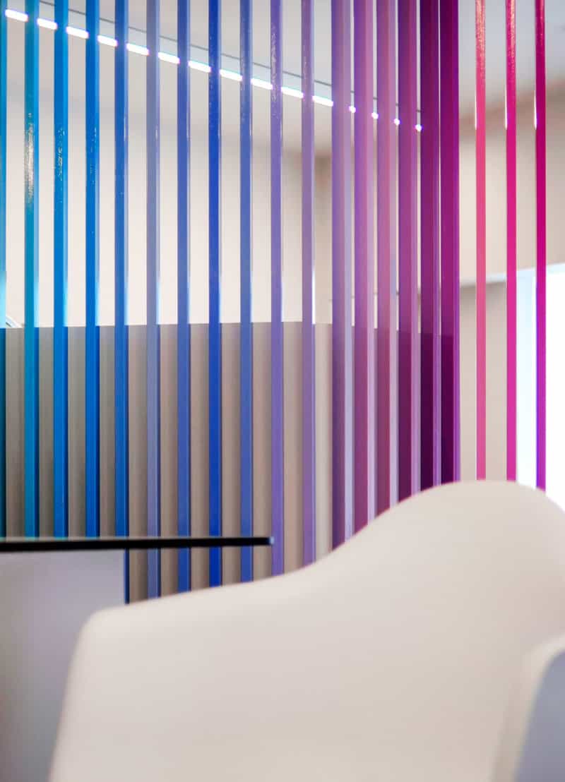
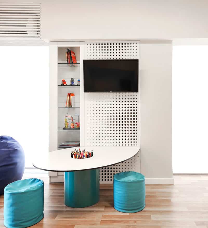
This colorful project is part of a small private clinic that has been designed by architecture firm PATSIOS Architecture + Construction in 2016. It is located in Tsimiski, Thessaloniki, Greece and has an area of 55 square meters. Its spaces have been decorated in a very specific way. It has been filled with colors to bring joy and to attract the attention of the younger people who go there.
Once inside, we’re greeted by a space with white walls and wooden floors, as well as purple furniture that is sure to attract our attention. There, small TVs were placed strategically to ensure visiting children are never bored

