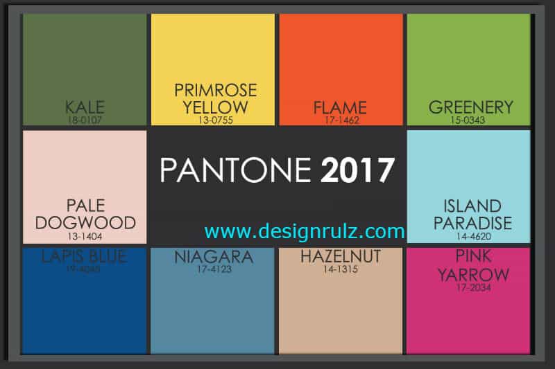
The 2017 Color Trends in interior design have been released. Pantone, the leader in the color market, released their top color trends with new shades inspired by nature. The Pantone fashion color report from the hues seen on the runway is not only for fashionistas so here’s how these colors could look in your interiors. Most of them are brave enough to be used as overall paintings, but you can also put them into tiny decorative items. From romantic sunsets on the beach to energetic escapes at the mountain, they all connect you with essential elements. Moreover, the gallery below will show you a bunch of ideas of how to remodel your home with style. Explore it and write us if you decide to change the look of your crib!
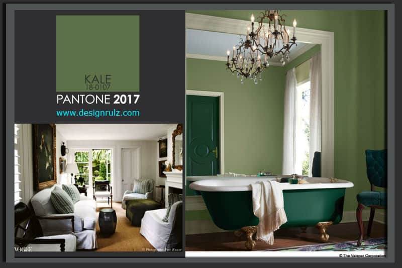
KALE, the vegetal infusion
Does a wall like a cabbage sound attractive to you? Then take Kale as a dominant tone and refresh your interiors. It works amazingly with white and it gives a royal touch to your interior. Mix it with a darker tone of green and you will get a hot contrast.
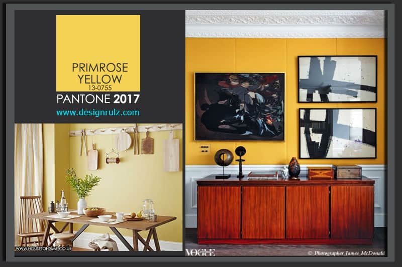
PRIMROSE YELLOW warms your heart
Missing the sunny days? Primrose Yellow knows how to bring the warmth inside. I would choose this tone for my kitchen if I plan to furnish it with items made of wood. Also, it is a perfect background to exhibit paintings or drawings in your living room.
Light the passion with FLAME
Whenever you feel the need to activate your senses, paint a wall in FLAME! The color has the power to enliven the space, while also adding some passion to your habitat. It works amazingly in both living and bedroom. But, due to its strong visual effect, flame is the kind of color you should introduce with grace. One wall is enough; do not exaggerate with it because you will feel uncomfortable, and sometimes even stressed.
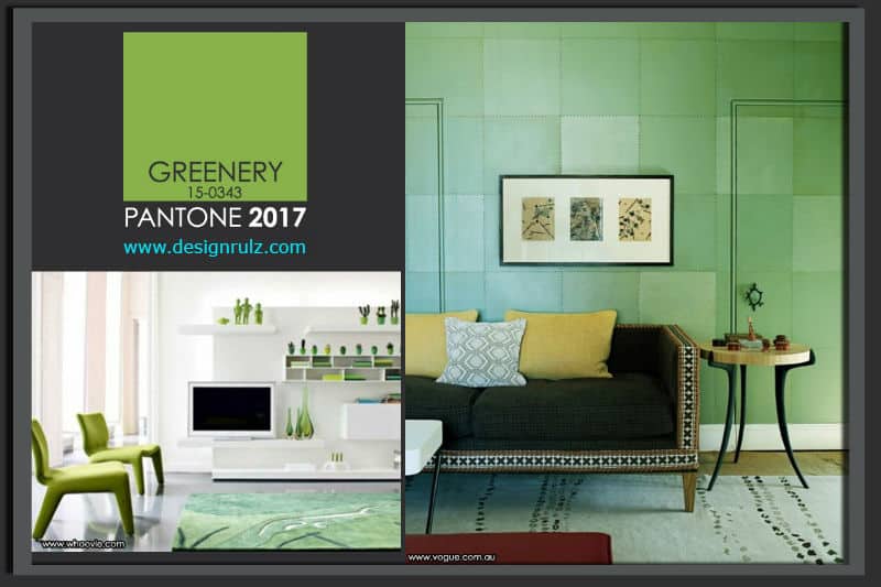
Push the fresh button: GREENERY
Garden green connects you with mother nature. It gives you the feeling of a raw escape in the jungle. There are two possibilities to work with it: paint an entire wall and let it become a focal point of the room or decorate with green items here and there. On a white background, it adds energy to the space.
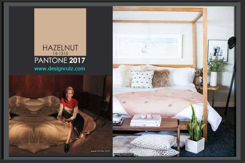
The natural look: HAZELNUT
I do believe this is the tone of harmony – light, gentle and very warm, it creates the equilibrium we all want when coming back home from work. You can choose items of furniture in hazelnut or bed clothes to dive in brown! For a calm effect, combine it with white or pale pink; red or dark brown will boost its passionate character.
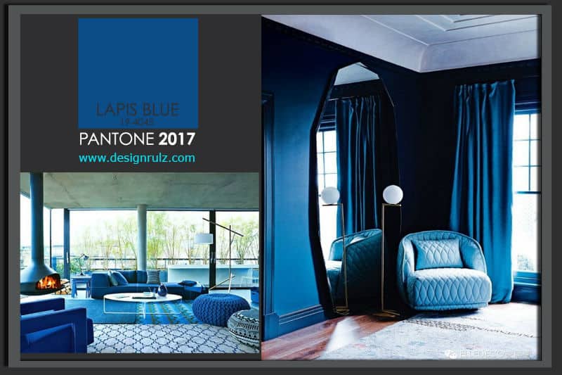
The dreamy LAPIS BLUE
Although many people qualify it as cold, lapis blue is a fairy like tone that shades mystery on a room. Persons who have the courage to use it inside are powerful and love poetry. It also communicates easily with the exterior environment. Those who love the glam effect, I suggest a sophisticated mix with silver. Also, tall floor lamps with oversized bulbs or sculptural pendants will add a dramatic effect to the room.
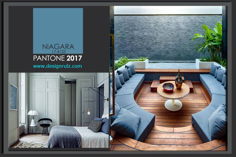
NIAGARA is more than a waterfall
It’s also a color that can recreate the vigor of the waterfall at home. I love the light tone of the bedroom on the left. Mixed with grey, it produces a soft, elegant composition. Also, look how beautifully it combines with wood. The circular benches on the deck are perfect for a late night gathering with family and friends. Place some pots with greenery nearby and you will have a fresh atmosphere all the time.
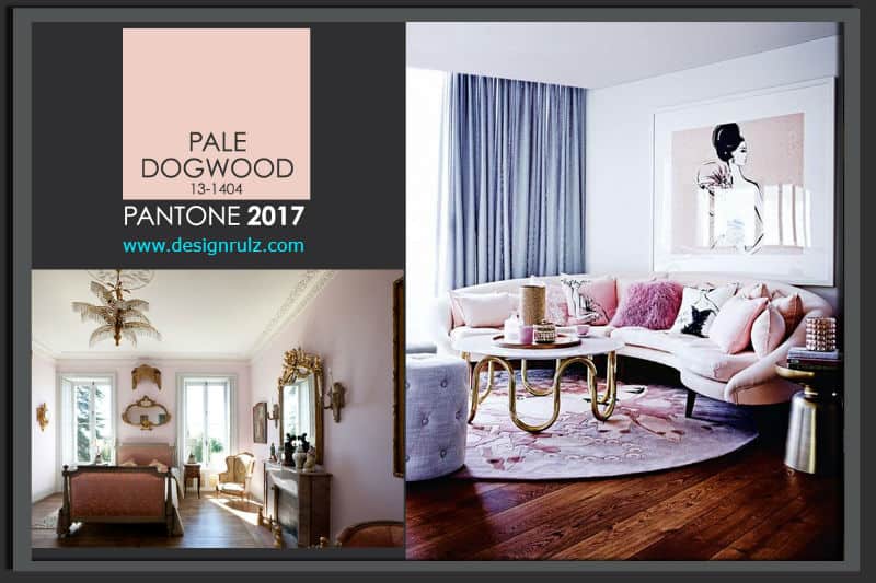
The PALE DOGWOOD feel
The light to medium brown or a medium yellowish-brown color gives me the impression that I am embraced with tenderness. Perfect for elegant salons, eccentric living rooms or showrooms, the color is going to be very trendy this year. Mix it with violet or pink to obtain a Hollywood evening effect or add golden insertions and crystal decorations for a glamorous look. If you use it to pain the walls, try a light tone.
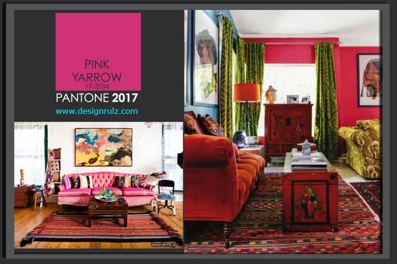
Party with PINK YARROW
My image about pink interiors is always of a vivid party with crazy guests. Red velvet sofas and green heavy curtains integrate very well in this décor. What kind of personalities love this hue? Artists, writers, musicians, designers – people who want to transform their house into a statement for brave ornamentations.
Escape with ISLAND PARADISE
Island paradise is the tone that screams: Vacation! Perfect for Mediterranean interiors and comfy sunny rooms, it blends fabulously with pink, red and violet. It transmits a sort of extravagance you cannot deal with easily. If you mix it with white, then an airy, clear look will shape the interior. But, if you like the wild side, try a hot pink nearby.

