Nordic interior design contains the ingredients of a comfortable and functional living. Besides being so stylish, it also adapts to various minds, budgets and possibilities. Spotted on Adela Parvu’s blog – a Romanian talented interior designer, the apartment below features bright interiors, colorful spots and original decorations. In a nutshell, all the pieces make the habitat puzzle comfortable and refreshing. I love the way light touches the furniture, the bursts of color that animate the corners, the clear layouts that form the design. Gliding between simplicity and functionality, the Scandinavian spirit evokes the tranquility of a serene landscape. That’s exactly how I felt after exploring the gallery below, a project realized by Eg Projekt studio from Poland. You can borrow a lot of ideas for your home too!
Reading by the window
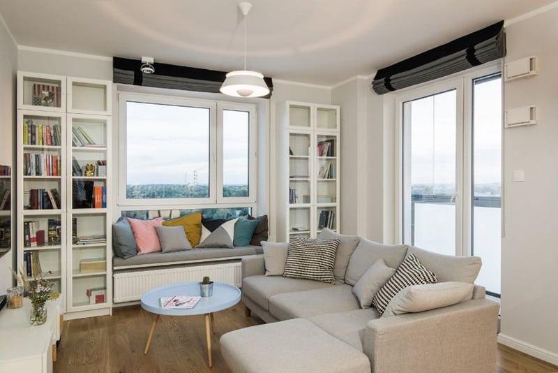
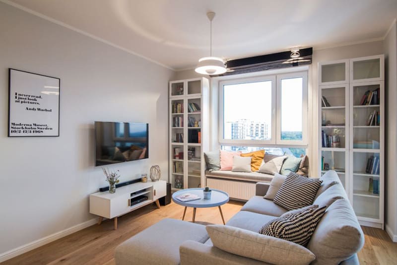
If there is something I would fight for with my room mates, this is a reading corner by the window. With a mattress and a bunch of pillows on the sill, you will dive into a splendid universe. In this room, the area above the heater proved to be perfect for a literary escape. Flanked by two bookcases, it looks like a davenport and it offers a generous space for both reading and relaxing. Having a book in your hands and an amazing landscape by your side, you will experience a mini paradise at home. Let natural light come inside through floor-to-ceiling transparent glass walls.
Nordic interior design with original posters
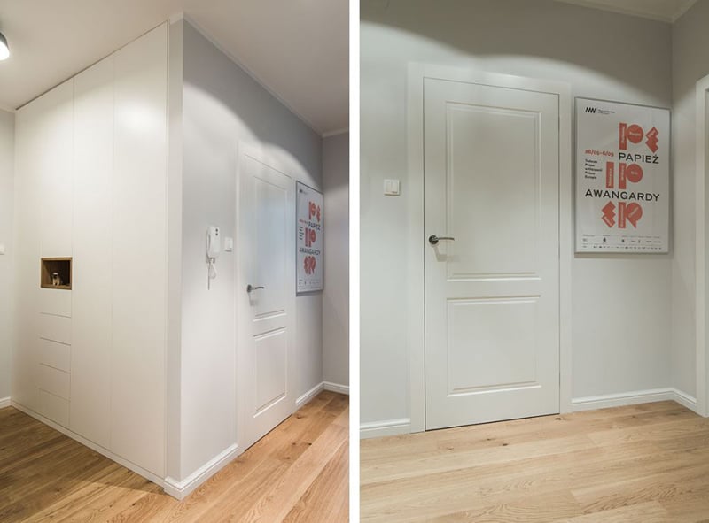
Insert spots of colors and you will animate any clean white background. Here, a large poster featuring a lively geometry creates a focal point near the door. It’s not something fairy, dreamy or catchy. It’s simply a way of saying ‘we love accents’ and that’s how we add personality to the space. You can play with squares, circles, triangles, letters and fonts on various prints. Choose colors from a light range; Nordic interior design does not scream for attention! Also, the owners used the space in the hallway for a built-in closet. It is almost invisible and very accessible.
Original mix and an ingenious cut
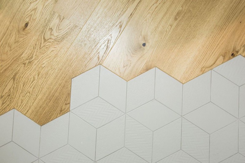
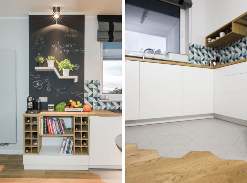
Aren’t you tired of right lines that meet in certain angles? My point exactly. The need of combing flooring materials appears in open plans because you look for solutions to delimit the areas. Here, grey tiles cover the floor in the kitchen, while wood warms the dining area. Before actually ‘planting’ the mix, we advise you to make a simulation on the computer to check whether the materials create an harmonious match. As a result, a quite common mix transformed into something memorable.
Geometric wallpapers
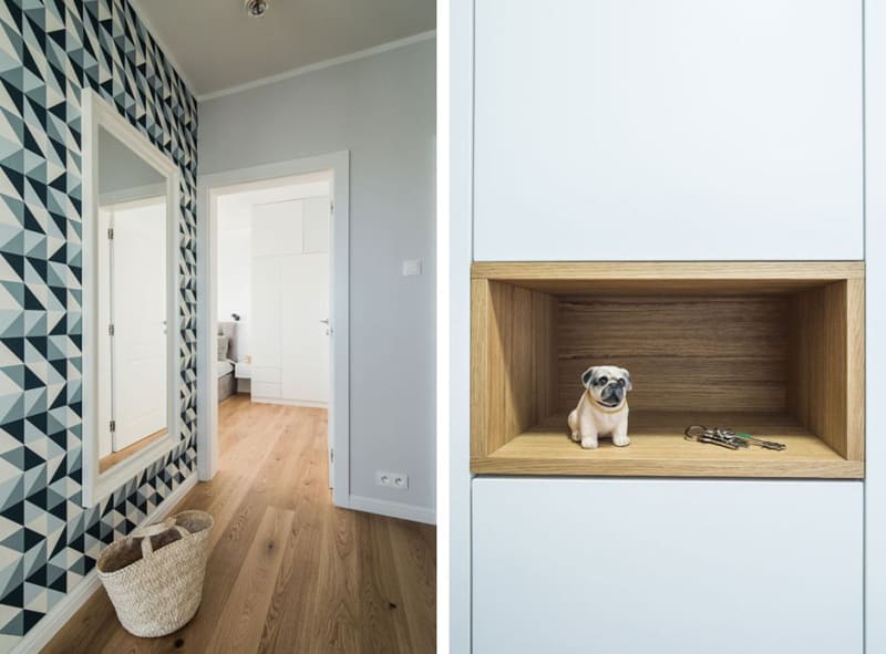
Known for their amazing visual effects, the wallpapers with ultra-modern geometries enliven the space. They are bold, sharp and sometimes have the power to make a contemporary statement. You can find a wide range of models on f&p interiors. Order geometric wallpapers in blue, green, black and many more. The white basket for magazines feels just perfect nearby, while the large mirror on the wall makes the space look wider.
My kitchen is for dancing
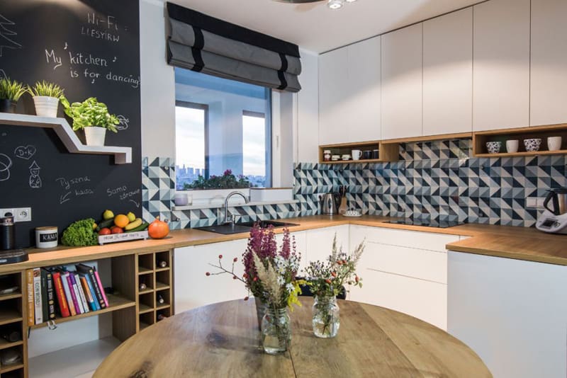
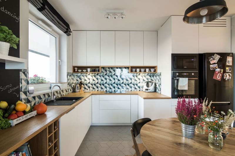
Isn’t this message wonderful for a kitchen? You feel relaxed and your guests as well. I love the playful spirit of the Nordic interior design — this makes it forever young. Due to a rather limited space, the working area concentrates in a corner furnished with large cabinets. A ‘strip’ with geometric tiles accompanies the countertop, adding dynamism to the space. In the middle, a round wooden table becomes the focal point. Don’t forget about flowers and greenery — they enliven any room in a second!
Patchwork tiles
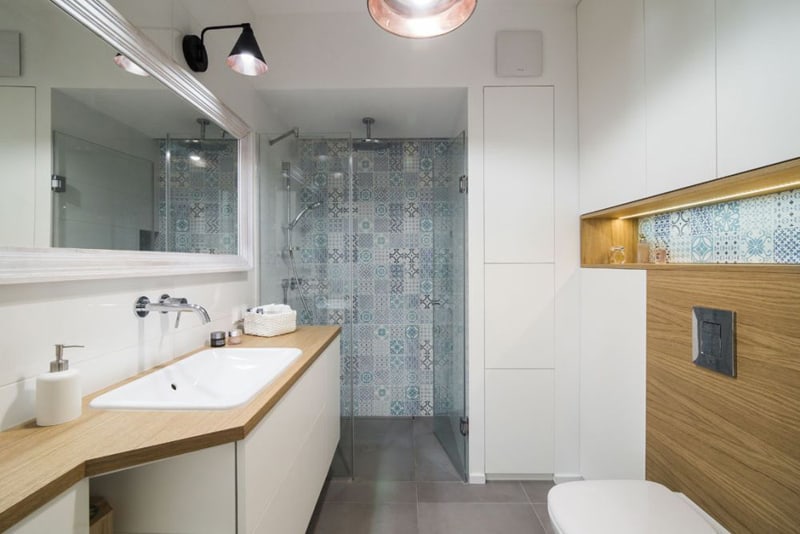
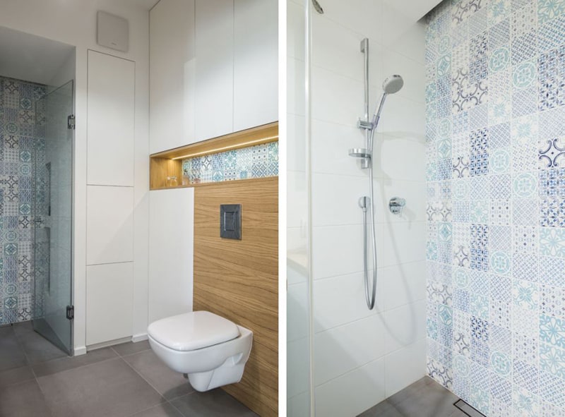
They give you freedom and transform any space into a creative universe. Using patchwork tiles in a room requires attention and good taste. Too much of too many can become tiring, kitschy or crowded. A trick to avoid such feelings is to rely on a single specter of color. In this bathroom, the designer opted for an elegant mix of blue and green — from light hues to hot accents. The result? You feel like diving into the Mediterranean and enjoy a fresh atmosphere all the time. Also, when designing with patchwork tiles tale a pure ‘alley’ by your side. This consists of large areas of white, beige or any natural tone that would pair beautifully with the chosen design.
Messages animate the interior
Looking for ideas to surprise your guests? Write messages on blackboards, posters, papers or slim wooden tablets and hung them wherever you feel they enliven the spirit. From inspirational themes to meditative lines and from funny stories to crazy jokes, the list is limitless. In this living room, Andy Warhol’s ‘I never read. I just look at pictures’ statement on a clean background decorates the wall.
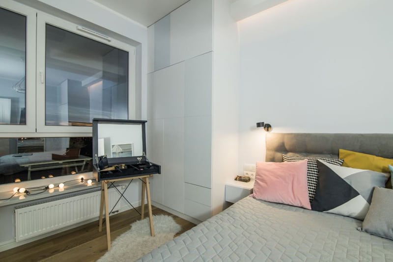
Bare windows featuring a garland of lighting bulbs…would you replace a curtain with it?
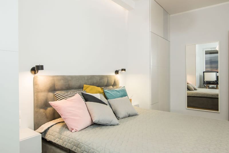
Nordic design: a simple layout with colorful pillows in the bedroom

