I love contemporary urban cribs. They are relaxed and welcoming, always featuring original decorations that make the interiors feel out of the ordinary. Spotted on designist.ro, the modern flat below proves that happiness resides in harmony and simplicity. Is there a receipt to follow? Not really, but as a general rule keep only what’s necessary, appealing and looks towards the future. Briefly, do not make the space feel crammed and smothering. Refreshing in their modesty, the rooms of this flat reflect good taste, originality, tranquility and a sparkling creativity. If I were to imagine these interiors on a canvas, a pure white landscape with irradiant hues would come to my mind. This means that every corner has the power to brighten the vicinity. How do you get this in a modern flat? You make sure the overall layout is airy and functional and start playing with textiles, materials, vintage furniture and appealing decorations until you create your own well-being. This requires courage, imagination and some brainy tips. You will feel loaded with good pieces of advice after browsing the gallery below.
Shabby chic influences
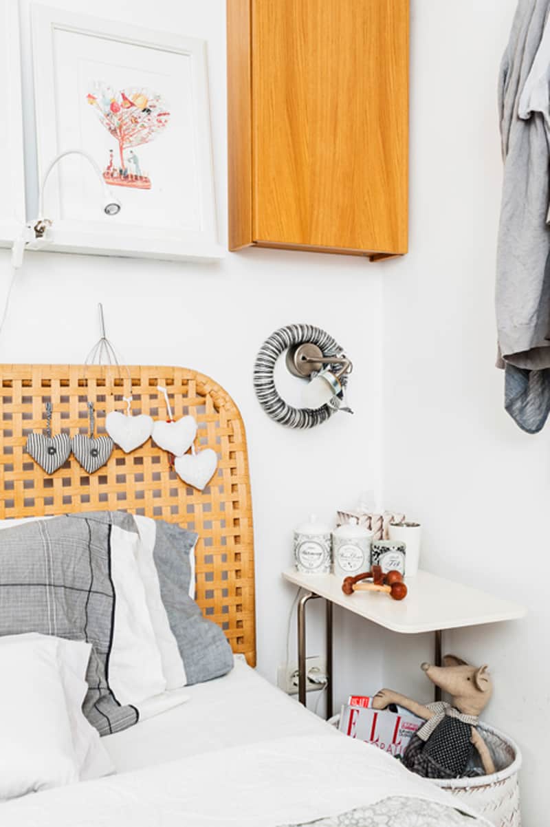
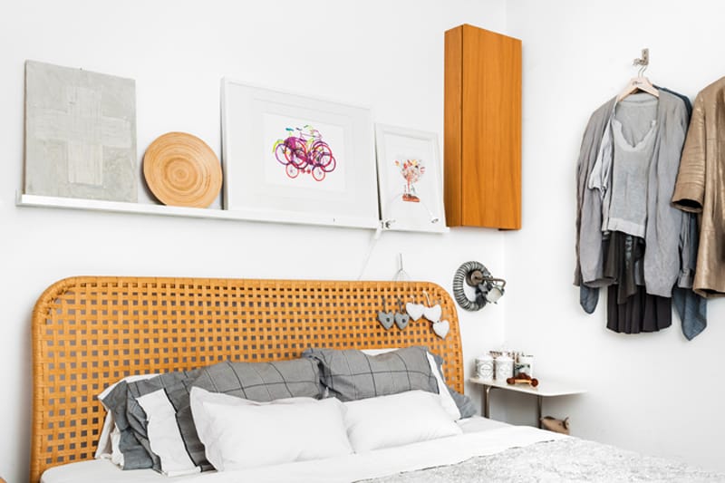
Shabby chic is not a frequent presence in a modern flat. But even the brand new aesthetics borrow elements from this romantic, elegant style. Near the matrimonial bed above, five heart shaped decorations and several ceramic boxes add a bit of grace. A white cane basket holds books, magazines and toys. Artificial light comes from two sources – a clipper lamp above the bed and another bulb fixed in the wall -, but I would have also added another refined item. For example, a large abat-jour with roses on a ceramic holder or a music box on the bedside table.
Industrial wall exposed
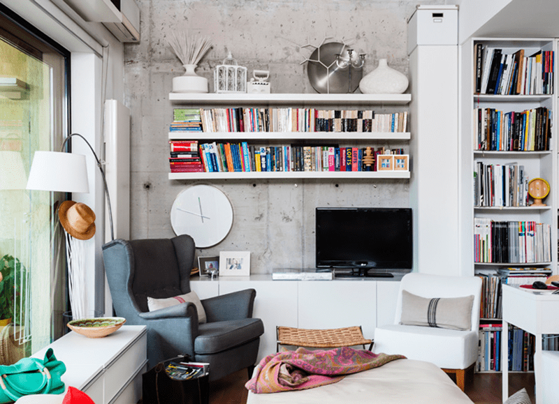
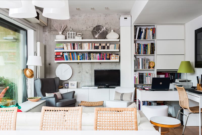
Concrete exposed walls with books nearby are one of my favourite combinations. This blank, naked aesthetic makes the inhabitants feel very relaxed — it’s like a sort of upheaval inside your own house. Not all the details have to be extremely arranged and finished! And when you attach piles of books on the wall, it becomes amazing. The cold layout warmed with colourful books and magazines is seducing and always a picture to look at. The owner of the flat discovered the wall while the workers were cleaning it for painting and she decided not to cover it. It looks fresh and natural, while adding dynamism to the space.
Modern layout with rustic influences
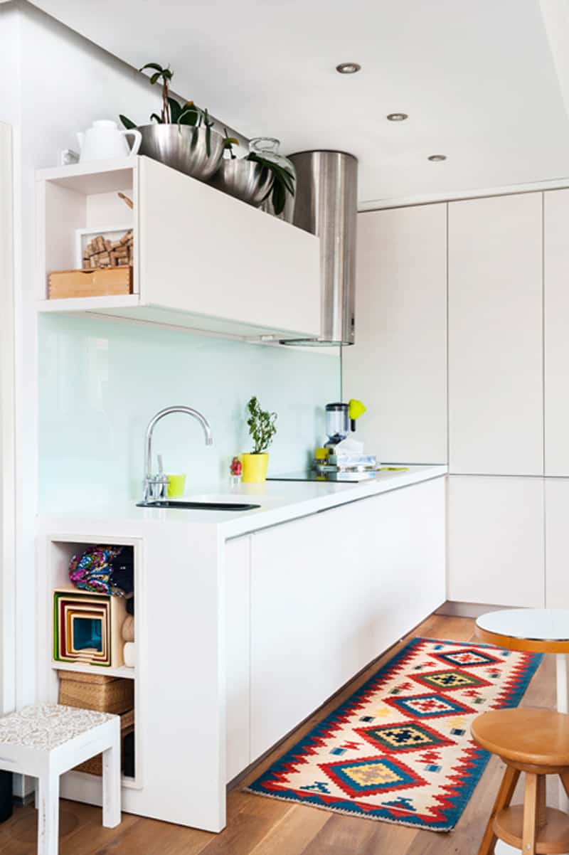
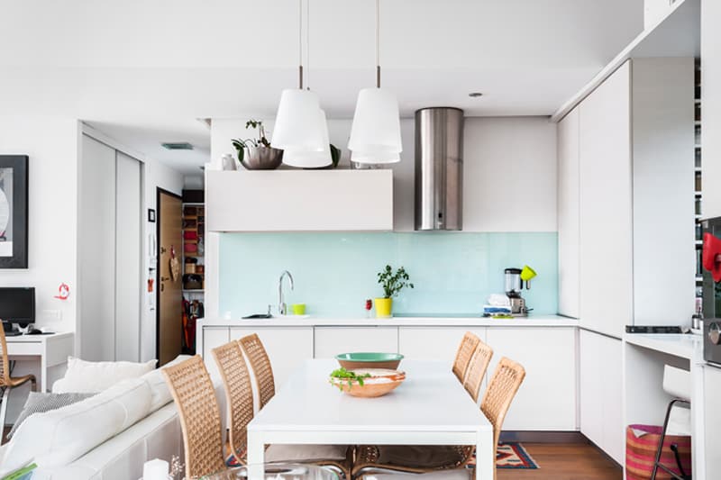
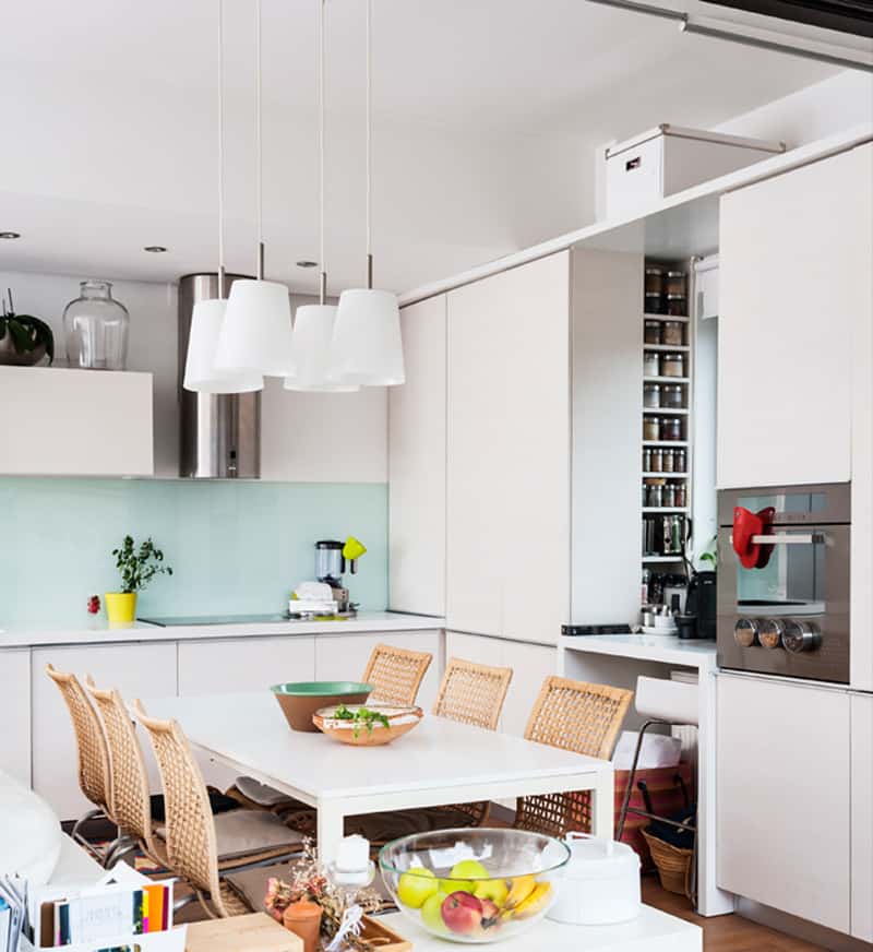
The kitchen does not enjoy a very generous space and the designer opted for an all-white background. Thus, floor to ceiling cabinets hide the ‘working’ utensils behind the doors. Moreover, the storing area becomes very functional and accessible as many information is visible when you open one single door. To enliven the spotless landscape, colourful elements broke in. A traditional carpet pairs wonderfully with two wooden stools, while pots with greenery animate the superior level — the countertop. Why does rustic work? It creates a sense of connection with the past that becomes irresistible. It reminds us about simpler times and makes the atmosphere very comfortable. Do not forget about white! It’s always a solution in tiny spaces.
Shared spaces: living and dining room
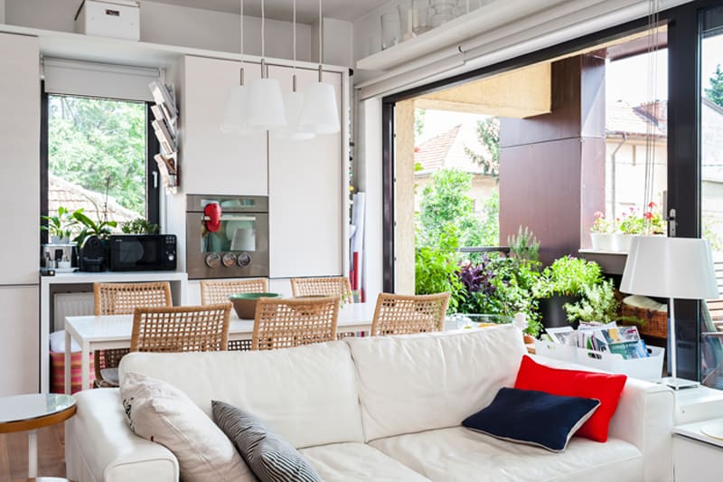
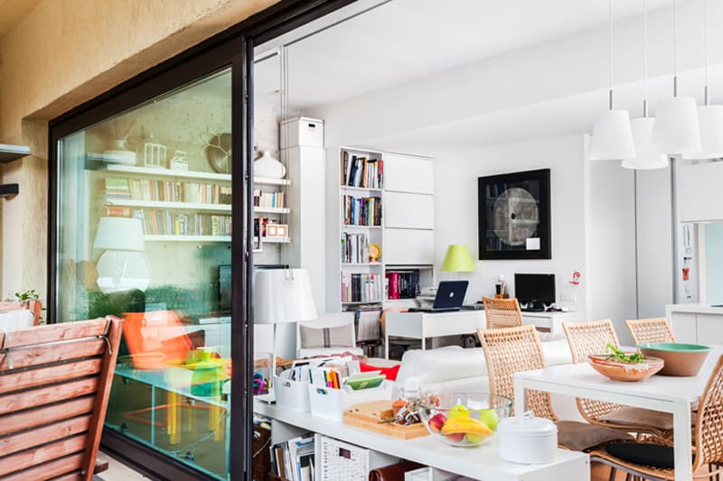
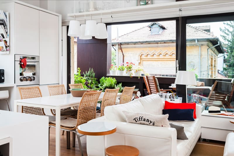
Featuring one open plan, the living and the dining room share it very wisely. Designed in layers, the plan reveals step by step every area, inviting the guests to pick the perfect seat. The dining table functions like a transgression element because it links the kitchen with the living room. White dominates the space and makes the interior feel very bright. Always opt for large transparent windows when the exterior is generous and let the garden connect with the interior too. The table features 6 light chairs that remind me of sunny picnics.
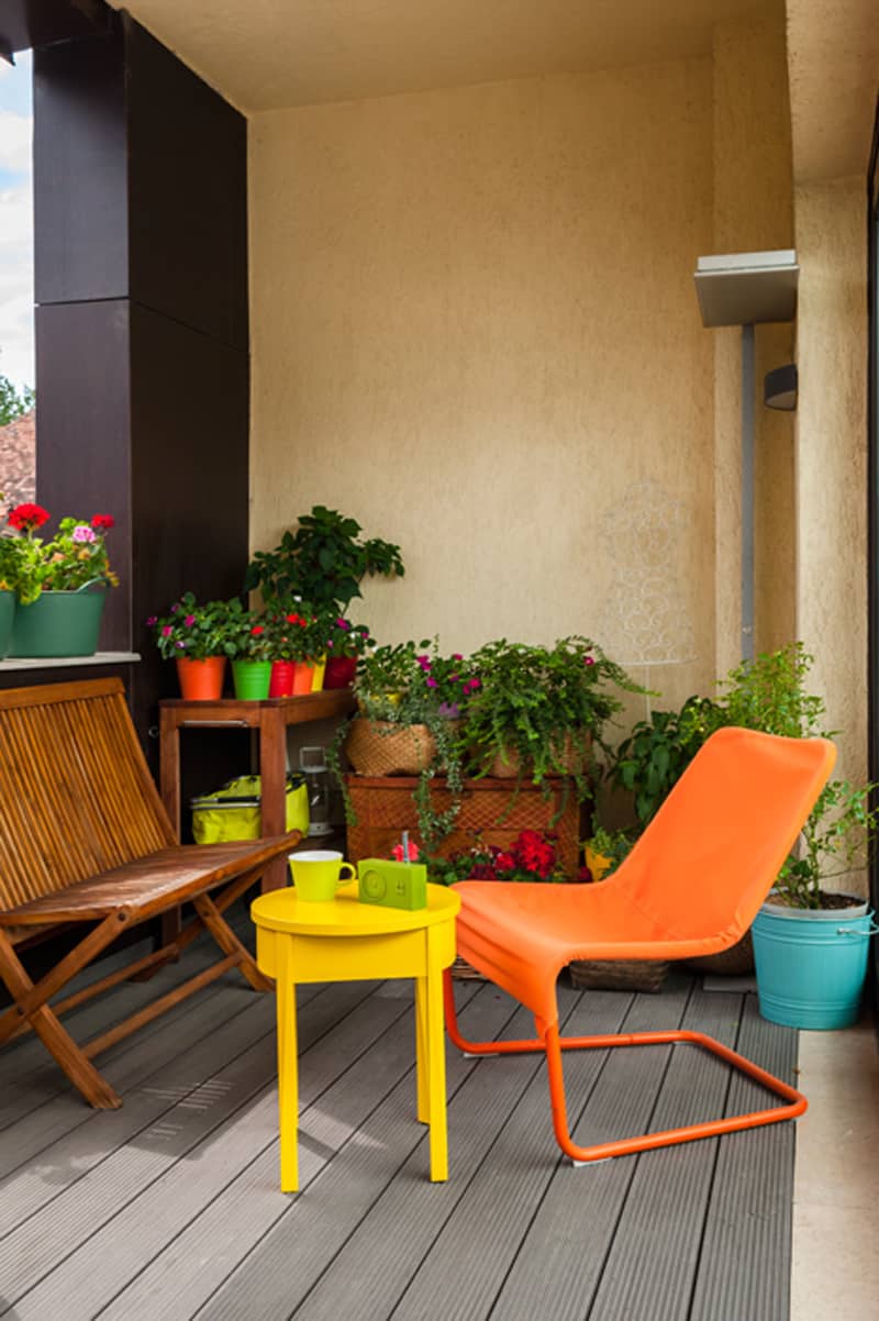
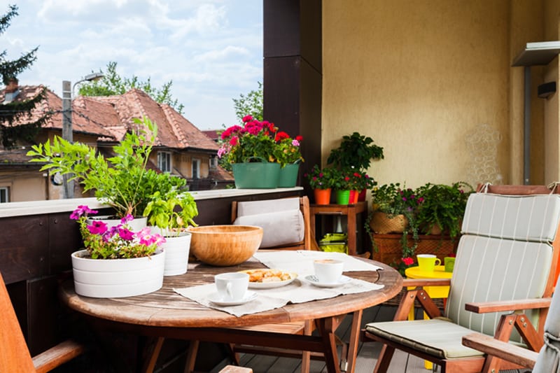
Amazing spot on the terrace: colourful pieces of furniture and many pots with greenery.
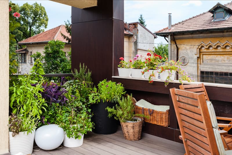
Wicker baskets are perfect for terraces and balconies.
Storing in the hallway
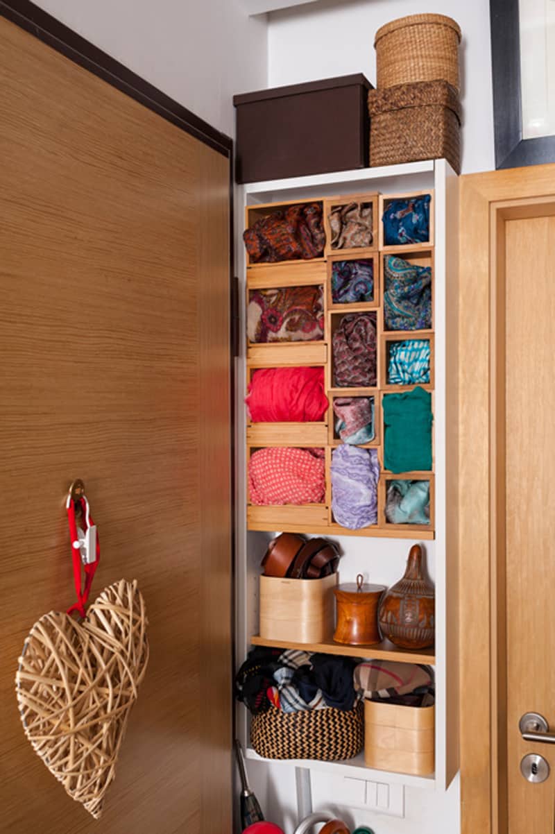
Most of the time, the hallway is not a vast territory. If you have a mirror to check your clothes before leaving the house and a little table for keys and magazines, then you are lucky. But, when designers show us how to arrange things wisely, the space becomes more generous. For example, the slim area between closet and door is now a storing contemporary ‘installation’. Tiny boxes holding bags, scarves and belts changed the look of the hallway which became very lively. This trick reminds me of collages and I find it both artistic and functional.
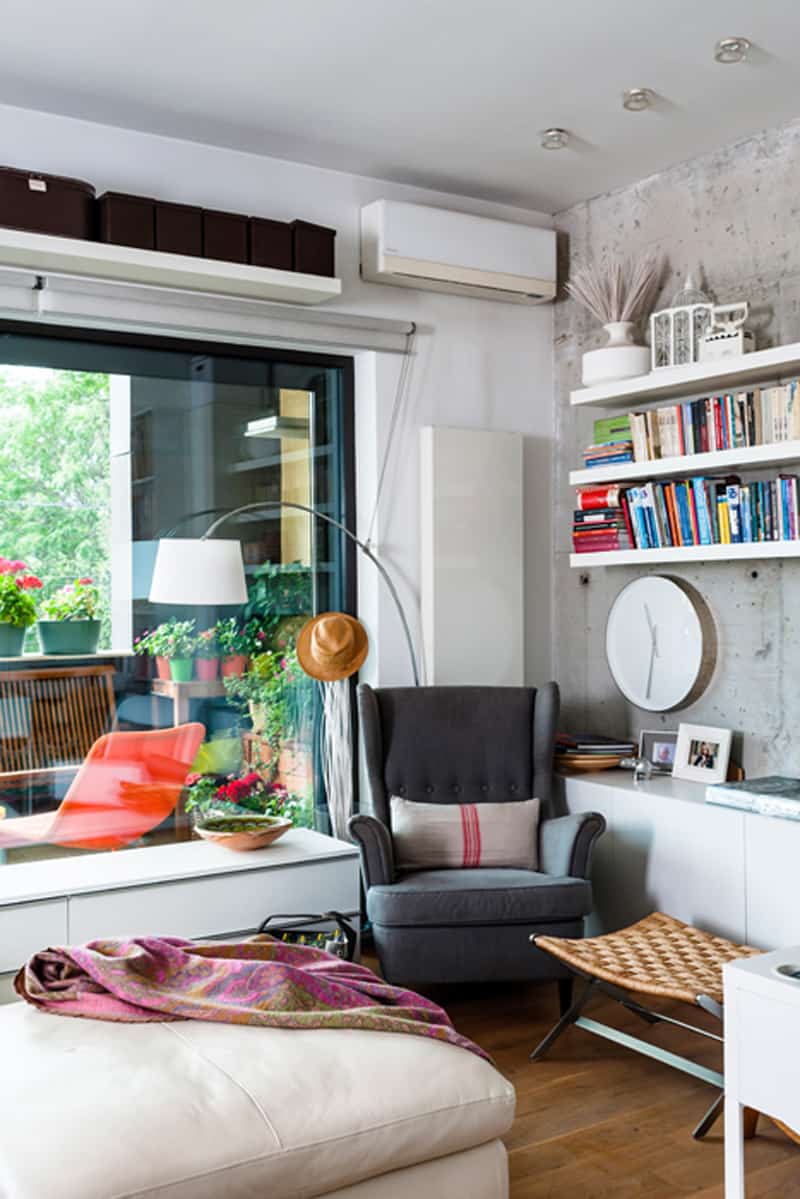
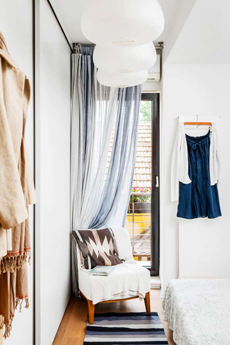
A reading area by the window — one large armchair with a floor lamp by its side. I love the fact that the reader enjoys natural light as well.
A white, slim shelf holds 3 pictures and a plate. This bedroom feels very relaxed and welcoming. I love the clothes left exposed on hangers and I think that we should try this at home more often.

