The prefab house introduces the next generation of building. Would you ever try to live in a house made of prefabricated materials? Using natural and reclaimed materials, the construction is modern, relaxed and very welcoming. It was designed by Aamodt / Plumb Architects, a studio specialised in innovative living and working places. The project is an example of how to use the resources smartly. Located in Texas, the house relies on natural lighting and has a strong connection with its site. The building features an energy efficient envelope made of a fabricated roof and an exposed timber frame. The interiors are simple, yet catchy and versatile. The overall black and white aesthetic was sweetened with tones of orange, red and light brown. Explore the gallery and let us know if the project inspired you.
The industrial look
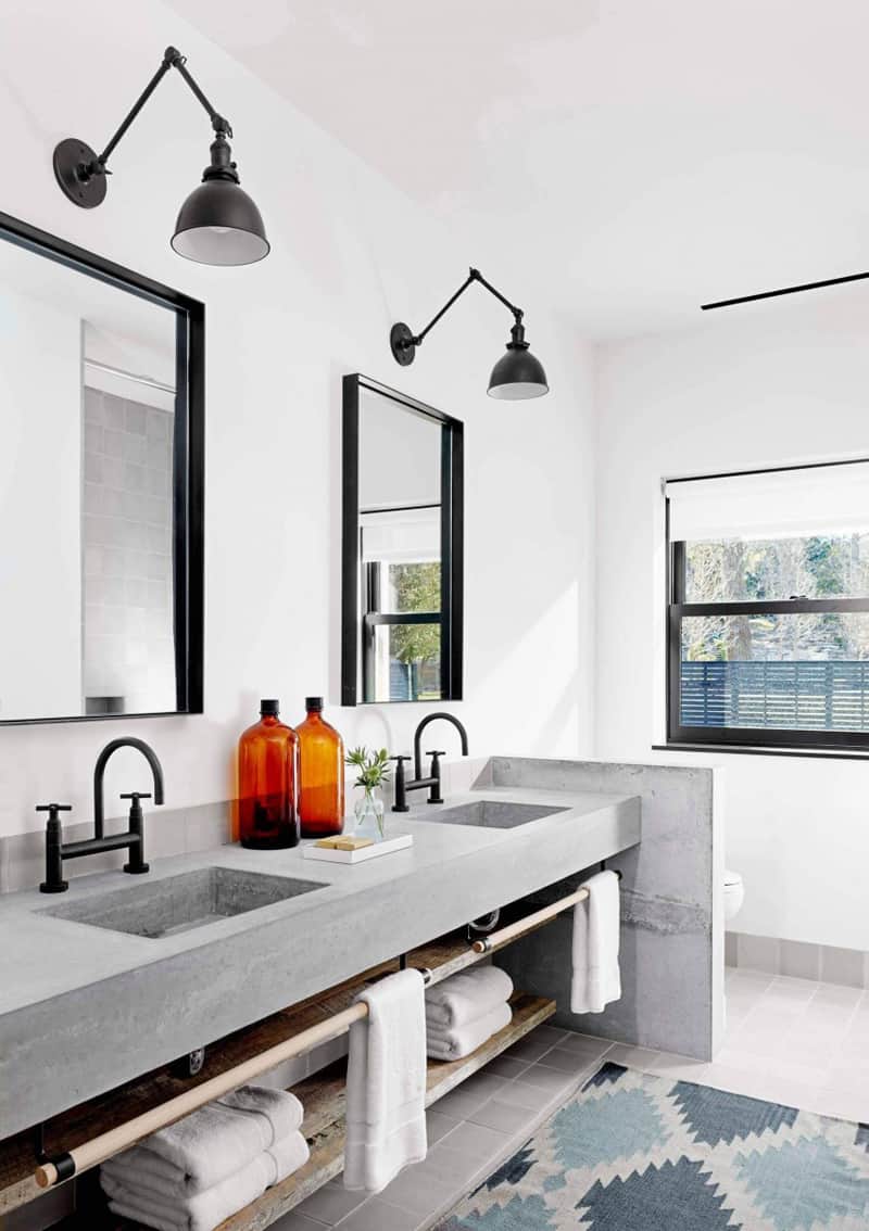
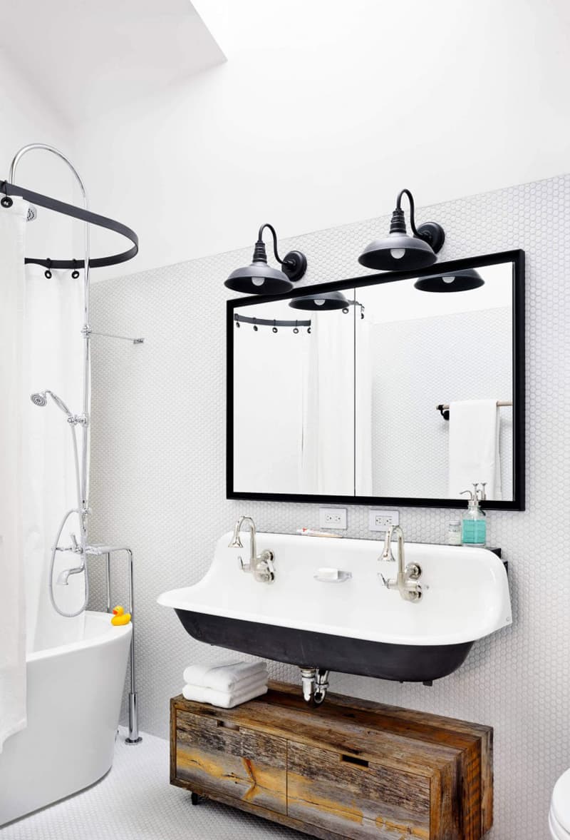
The prefab house is rooted in industry. No matter what influences will model its look, you can not change its heart. It beats…factory-made design. This is also the case with the room above. The two sinks ‘poured’ in cement fit perfectly in this grey and white bathroom. Hot contrasts were obtained with black (lamps, mirror frames) and brown (glass bottles) insertions. When decorating like this, try to introduce elements that are able to mild the atmosphere. For example, some natural wood shelves to store the towels or a vase with greenery. Consider fixing a parapet instead of a new door to separate the toilet.
Conquered by wood
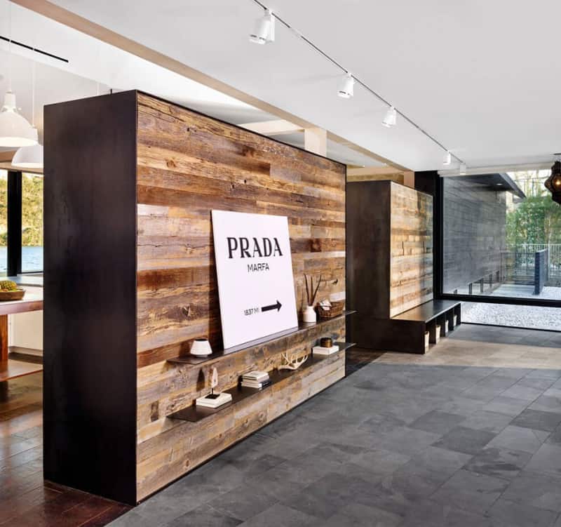
This is how I would summarize the picture above although, let’s face it, it’s only a separation wall between two distinct areas. But what makes it so relevant for the living experience? Its authentic overwhelming look. The long unfinished boards used for the composition of the walls have various colours. Intense, light, rough and partially finished panels create a natural mix. Some tiny decorations on shelves – sculptures, souvenirs, dried branches or books – add personality to the space. They enhance the natural feeling of the interior.
Build-in storing cabinets
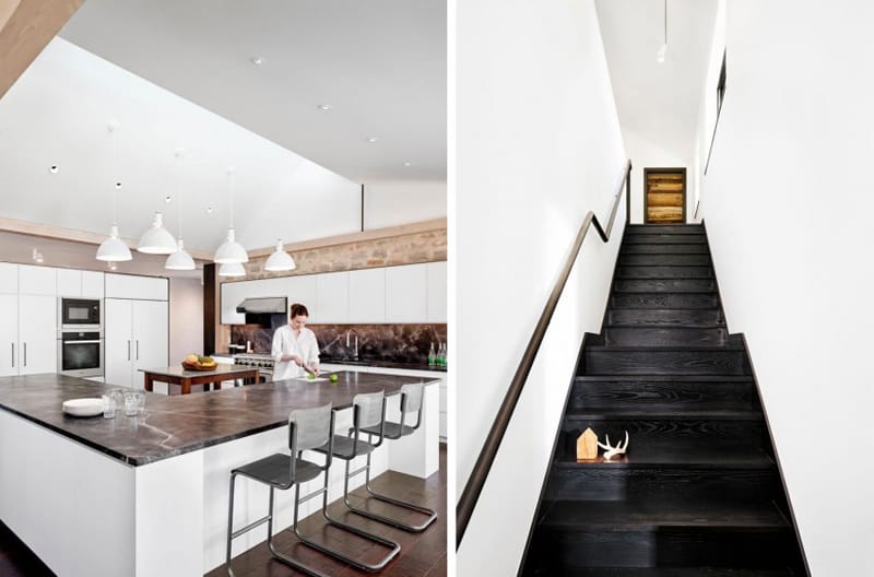
If you want to keep the kitchen tidy, try to store all the materials behind the doors. From plates and cutlery to bowls, pots and pans, it’s better to hide them. Let the room feel aired. Opt for floor-to-ceiling built-in cabinets with simple or gliding doors, and large shelves. The ‘working’ area is a L-shaped structure with a marble countertop. Add some pendant lamps and you’ll create several focal areas on it.
Spotless, hygienic, bright
The three words describe perfectly the interior of a prefab house. Located next to the window, the enormous closet features a neat facade made of wood and four boxes underneath. Rattan baskets integrate smoothly in the decor, being available to store items anytime. What you gain with simple layouts is the grateful feeling of freedom – the room is airy and lighted naturally.
Minimalist at its best
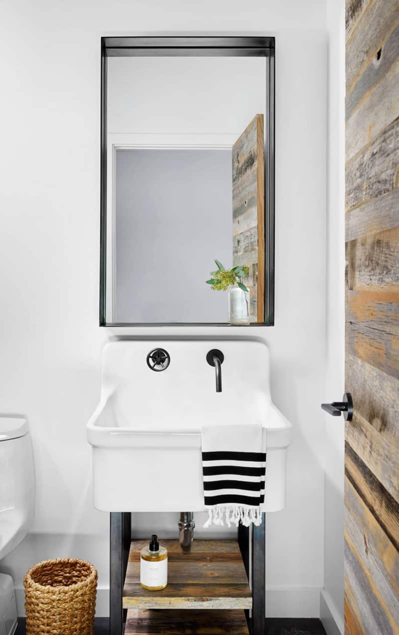
Needless to say that a prefab house will always embrace minimalism. The powder room features a slim, simple sink with two shelves underneath, a rattan basket and a rectangular mirror. The decor calms your senses and reminds you of our essential needs. Now I realise our houses are full of unnecessary details most of the time. Do not forget to enliven the spirit with flowers or pots with greenery.
Uncomplicated landscape design
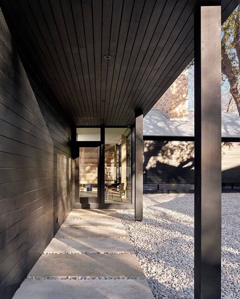
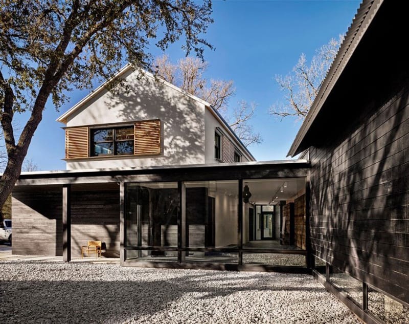
If the interiors were designed with simple layouts, why to complicate the exterior? Of course, it follows the same routine with rectangular lines, a sense of symmetry and parallelism. The alley next to the house is composed of concrete rectangular tiles arranged one after another; this reflects an astral order. The courtyard was filled with pebble and very much complements the overall design.
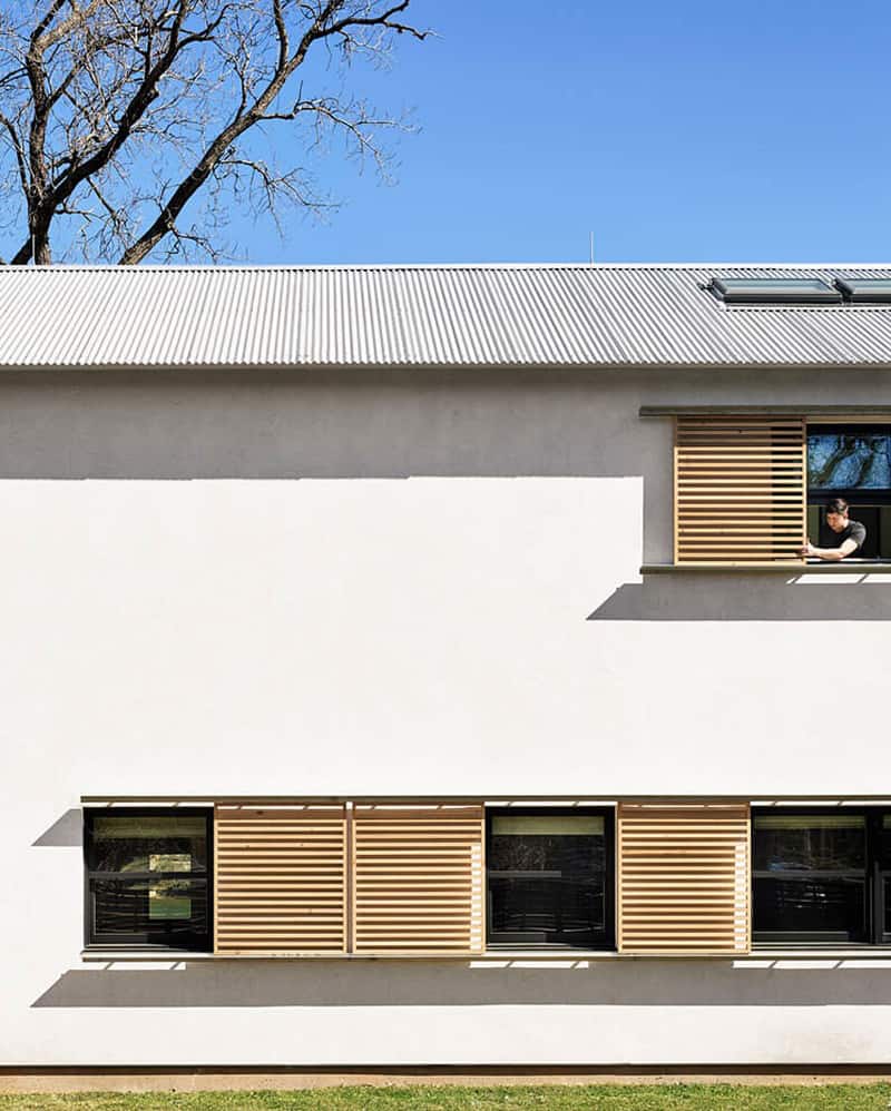
The windows are disposed in row and protected by wooden shutters. Explore another prefab house with astonishing design, here.
The house enjoys natural light all day long.
Some of us might consider the usage of similar materials around the house monotony, but it’s something that clears your mind. For me, these decors are fantastic sources of inspiration. The honeycomb like pattern on both walls and flooring is dynamic and very catchy. A slim niche above the sink is enough for a glass and a toothpaste.
Inspired by nature
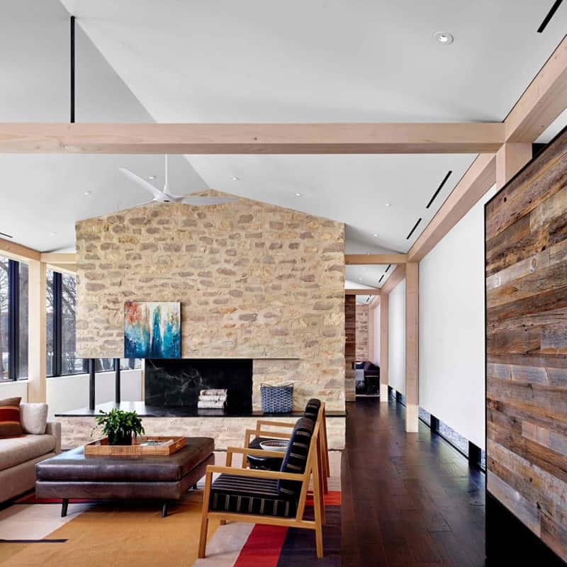
Leather, wood, stone, marble – I love it when I found them together, in a decent dosage that offers comfort to the inhabitants. The living area features a sofa, two armchairs and an absolutely spectacular table made of leather. In front of them, a fine fireplace incorporated in a solid stone structure. The living functions like a communication/ transitory space and it almost invites you to linger about when passing by. To add personality to the space, the owners hung a painting on the niche of the fireplace. But this is all they’ve done regarding the beautifying process. They let the house speak for herself without ornaments.

