Smart design combines aesthetic with functionality wisely. Some say it is not easy to obtain arrangements with care, but the moment you start planning you realise an experienced mind is needed. Like the ones working at Fabryka Nastroju, a studio based in Warsaw, Poland that knows how to deal with tiny spaces. As a general rule, less is more – take it as a creed and stay stick to it until the end. What do you get? Airy rooms, accessible storing spaces, relaxed intimate corners and a feeling every urban citizen looks for at home: relief. In crowded cities disconnection is mandatory afterwork. You go to a movie or you linger about in a bar, but when you arrive at home, you want to have your senses pampered. How do you obtain this when you are constrained by space? You plan a strategy for every inch and practise minimalism.
White backgrounds
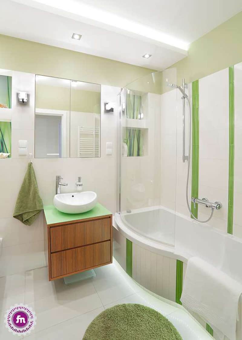
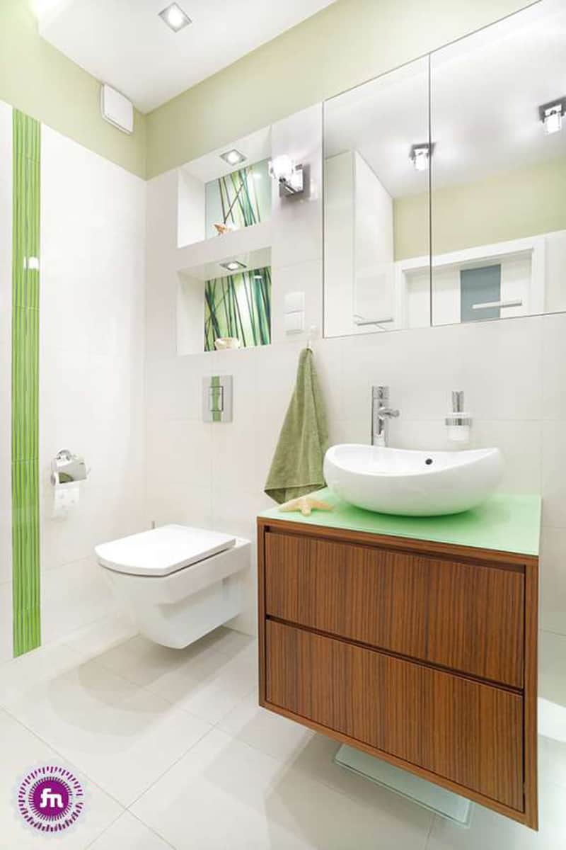
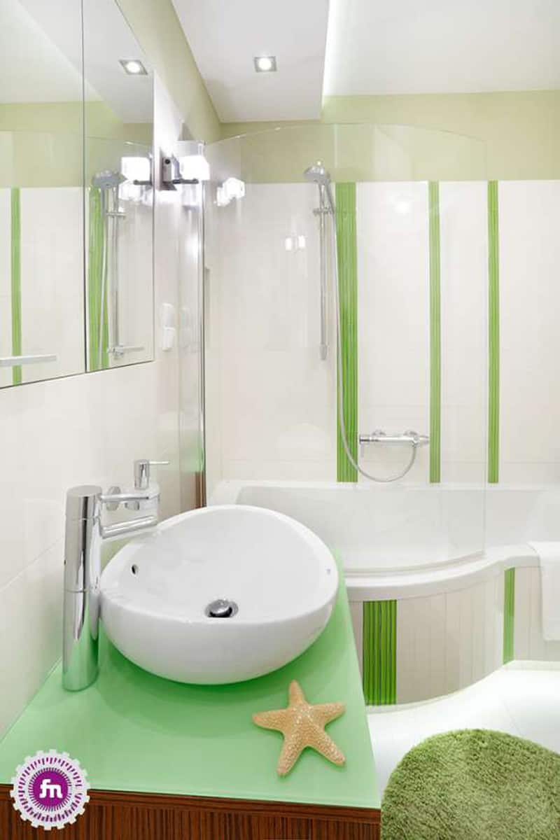
The background sets the atmosphere, designers say. Therefore, when limited by space, white is frequently used. In this bathroom, they also opted for no patterns at all. The green stripes enliven the spaces, also adding heigh to the room. If you can introduce a little bit of wood – go for it! It is not a big fan of condensation, so treat it with special lacquers to stop deterioration.
Embrace the straight lines
They reflect order, tidiness, sometimes even a sense of purity. I love rectangular sets because they also transmit coordination, stability. In tiny spaces, people want to experience these feelings – that everything is stored well and accessible. Play with straight lines in decorative niches, when you pick the cabinets or the mirror in the bathroom.
Shelves instead of bookcases
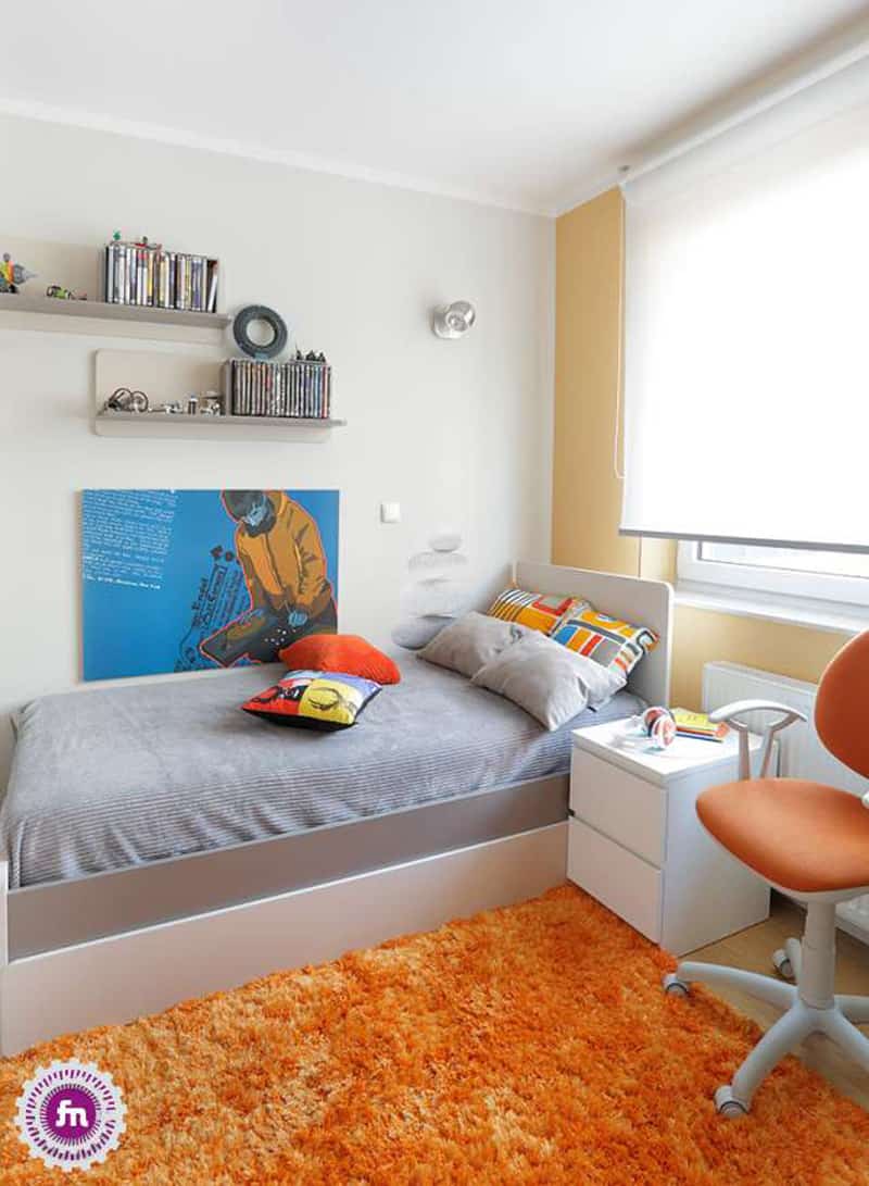
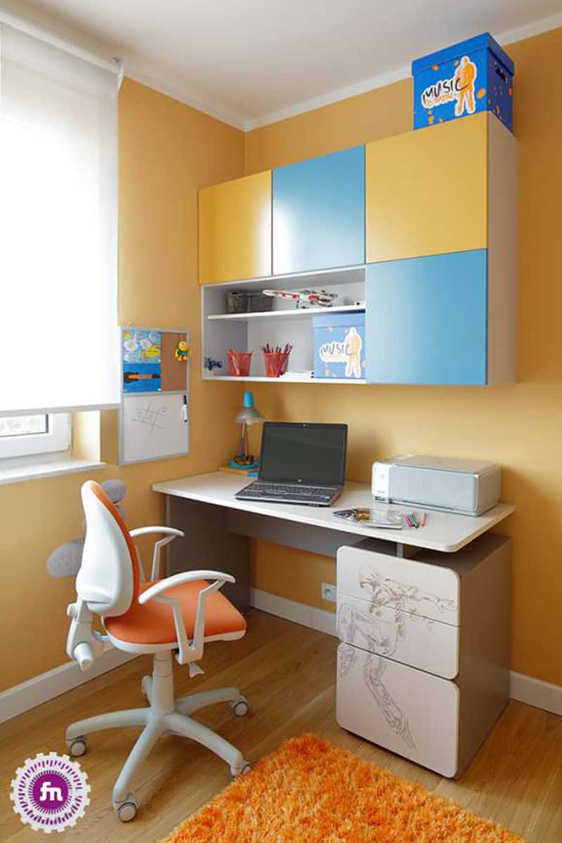
In children’s room space matters. They tend to spread toys everywhere regardless of what you keep telling them. Don’t worry! There is an antidote for everything. For books, fix several shelves just above the bed; they are easy to access and also make the corner dynamic. Plain rectangular boards are frequently used, and you can also try to create an original installation with them. For example, a honeycomb or a triangle. For toys, take big colourful boxes or use the cases under the bed.
Make the dining fresh
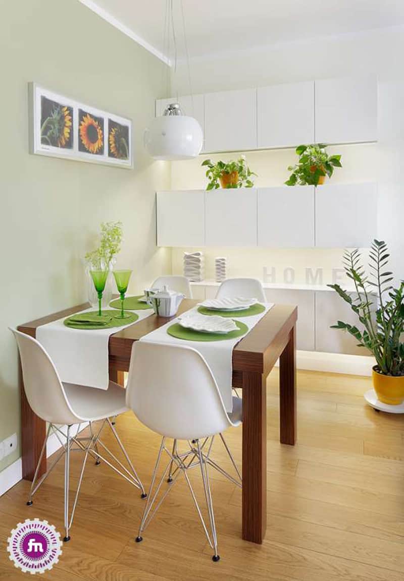
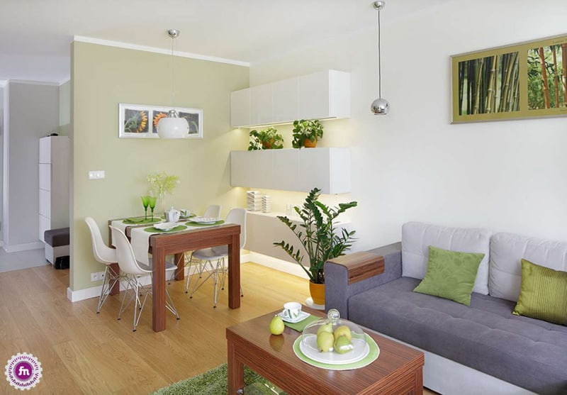
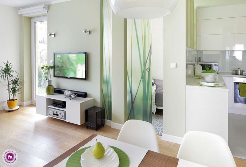
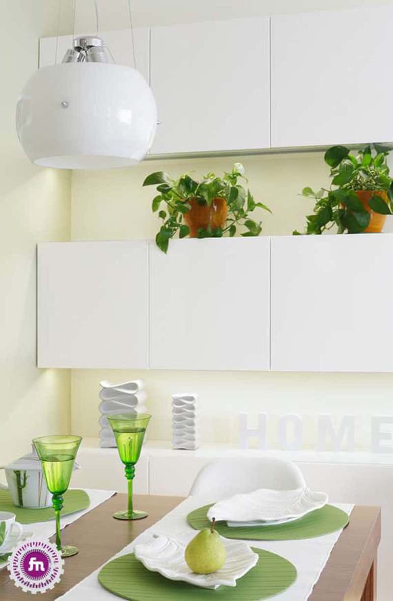
Who affords inviting guests in large, sophisticated saloons for dinner? A very few of us. No need to worry. The dining room can feel very special if you introduce some greenery. The simple wooden table was paired with four Eames inspired chairs, located somewhere between living and hallway. The atmosphere felt differently after the owners introduced the plants. One big pot on the floor, one transparent vase on the table and two little ‘shrubs’ in a niche. Lovely, isn’t it?
Pay attention to details: this leaf inspired plate is amazing and fits wonderfully in the decor.
Transparency
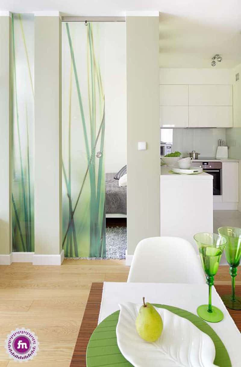
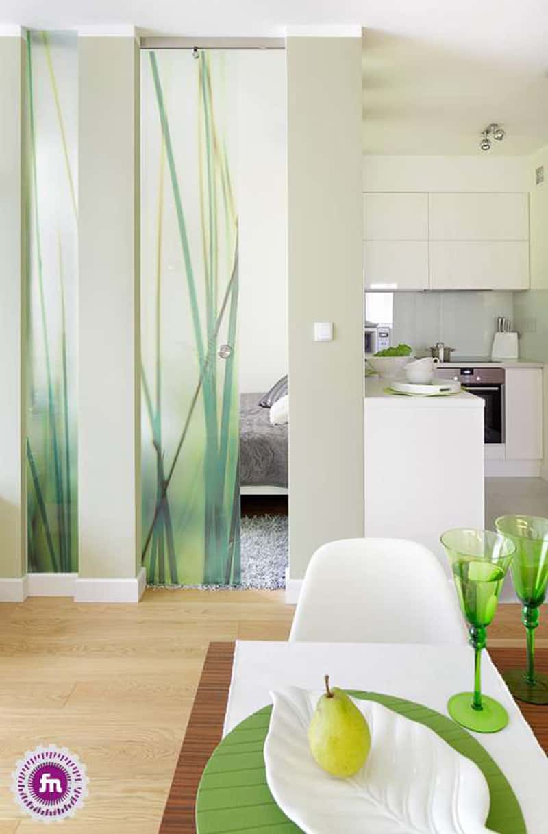
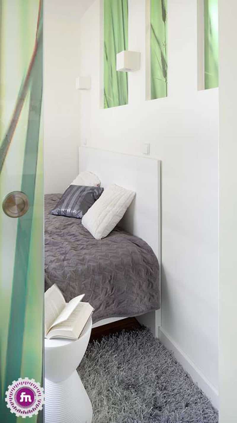
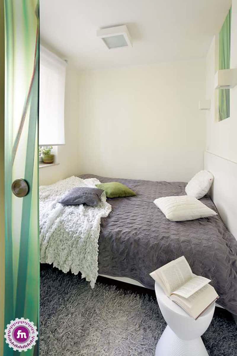
A friend of tiny spaces, transparent doors allow the uninterrupted passage of light. The one that separates the living and the bedroom features a green vegetal theme that has two functions. The pattern creates intimacy for the bedroom but also decorates the room.
Make the most of it
Not very big, indeed. When the room is tiny I believe it’s perfect to use the space for the bed. At least, you will rest like a king. Look for other spaces in the house that can function as closets or dressing rooms. For example, a built-in closet in the hallway or several cases under the sofa.
A white kitchen
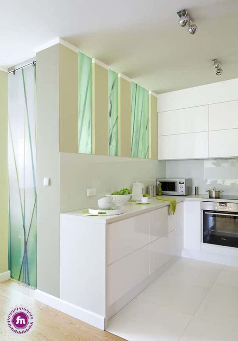
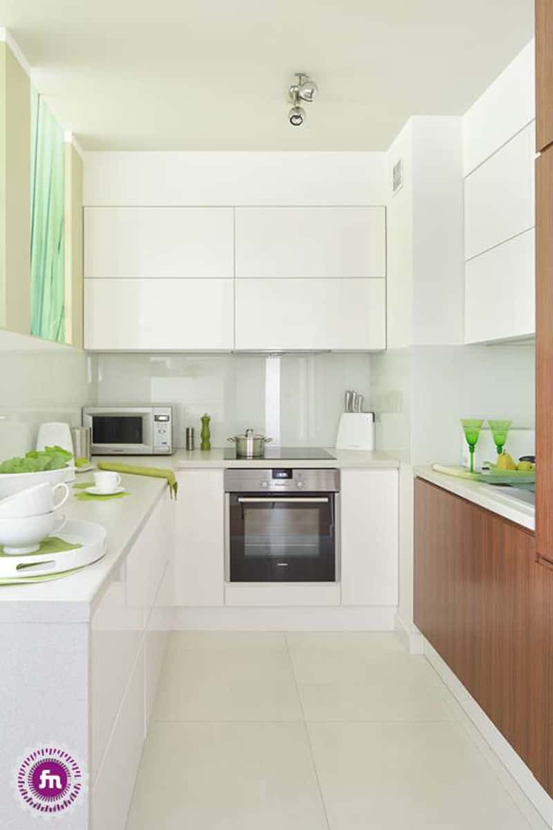
Honestly, I am not afraid of trying it. It is elegant, chic and gives you the feeling of a very posh style of living. But, if you want to experience the ivory as long as possible, hide the unnecessary details. Plates, pans, cutlery, pots and all ‘big machines’ used in the kitchen rest behind white doors. The leaf theme continues in this room too.
Break the monotony
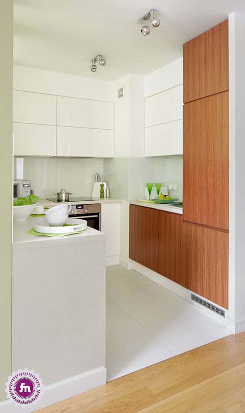
Do you feel that variety lacks? Maybe, but try not to introduce many ornaments. Flowers are vivid, thus never unnecessary. Also, crystal vases, glasses or plates are welcomed for their diaphanous look. The fridge and the deep-freezer were hidden behind wooden doors which also warm the all-white open kitchen.
An open kitchen is easy to access and very relaxed. No need for doors when you are limited by space. Play with light if you want to create focal points.
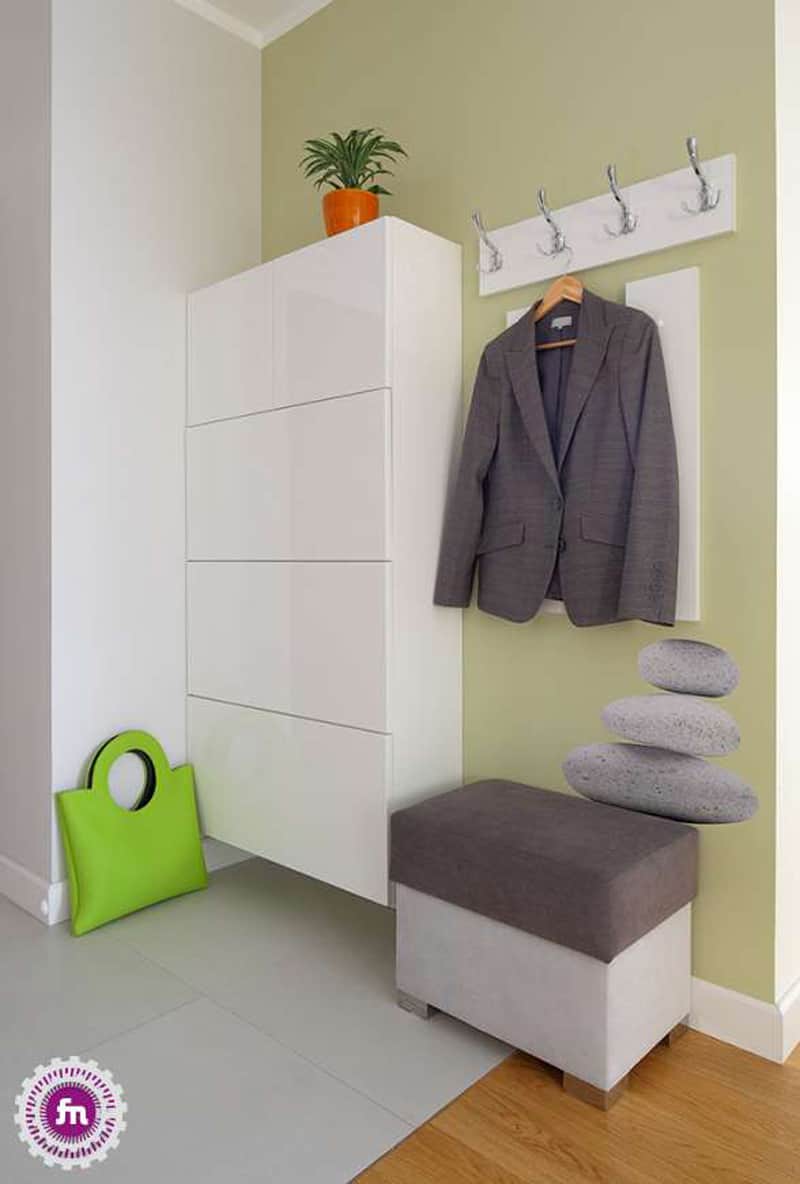
The hallway is usually neglected. But, the first impression matters. A big closet to store the shoes, the umbrella and other small objects will be enough in a small apartment. Grey, green, white – the colour palette in the entire home was used here too. It makes the spaces feel coordinated and harmonious. If you are a bit more creative, choose a wallpaper for a wall in the hallway or original clothes-pegs. Also, do not forget the stool you sit while you tie your shoelaces.

