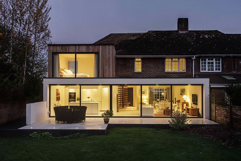
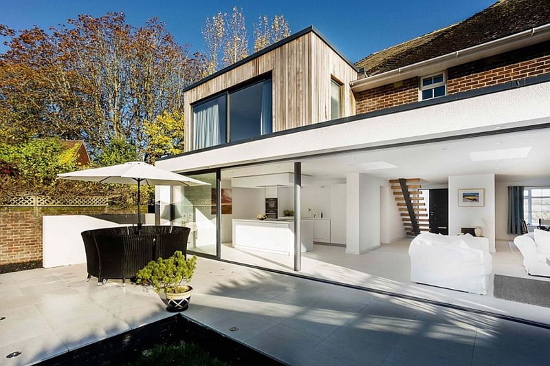
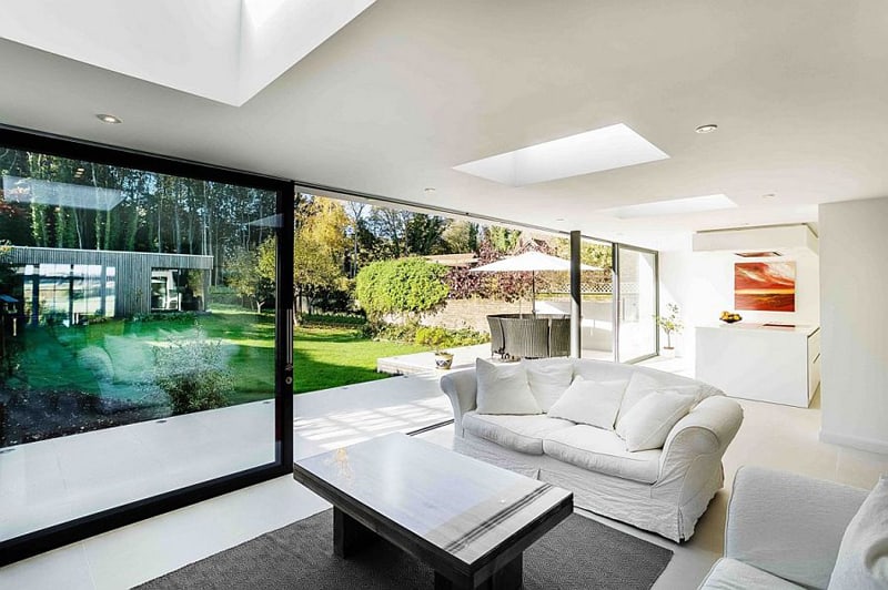
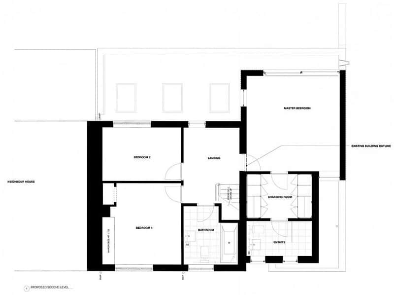
A modern extension is a good way to revitalize an old house. If you are looking for successful projects to get some inspiration, then you’ve come to the right place. Work of Adam Knibb Architects, the English house below got a modern extension that facilitates a smooth communication between indoor and outdoor. As you can easily notice, the team chose to apply the ‘appendix’ at the back of the house, letting the façade facing the main street unchanged. As a result, the owners enjoy lovely views in the garden and are free from intrusive looks. The modern extension consist of two geometric volumes, placed one on another and featuring transparent glass fronts. Although some may claim that the combination is strange, the construction integrates very well in the landscape mostly due to its discreet silhouette. Moreover, an exterior flooring was installed so that the dining area is clearly delimited and accessible.
A very popular material for extensions, glass looks amazing, but you have to be careful not to create a space that will be overwhelmed in strong sunshine. It can also be difficult to meet Building Regulations standards on energy efficiency if you use a lot of glass, so it needs careful design.
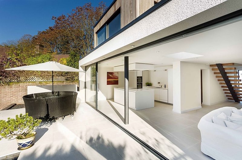
A gliding wall separates the terrace and the living room. White makes the room feel bright and welcoming. The inhabitants can access the rooms upstairs via a wooden, delicate stair without handrail.
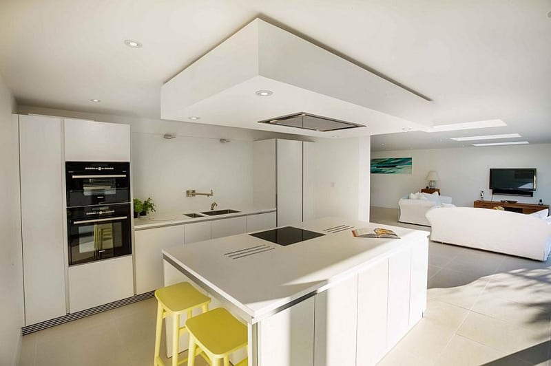
Built-in cabinets offer space for storing the utensils in the kitchen. The island is perfect for cooking, while also providing a corner for quick snacks.
The front façade kept its old look, with red bricks and thin windows.
The garden is almost part of the living room and enlivens the space. The interior relies on a minimalist aesthetic, with several decorations that function like focal points.

