For the first time ever, the design world is gifted with not one, but two Pantone Colors of the Year for 2016. The Pantone Color Institute, the world’s authority on color, declared a soft pink called Rose Quartz (Pantone 13-1520) and a muted blue called Serenity (Pantone 15-3919) as the colors of the year.
Pantone Color of the Year 2016 – Rose Quartz and Serenity
“Rose Quartz is a persuasive yet gentle tone that conveys compassion and a sense of composure,” write the color experts. “Serenity is weightless and airy, like the expanse of the blue sky above us, bringing feelings of respite and relaxation even in turbulent times.”
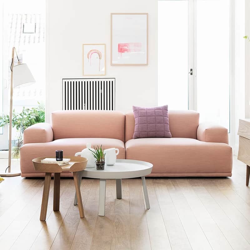
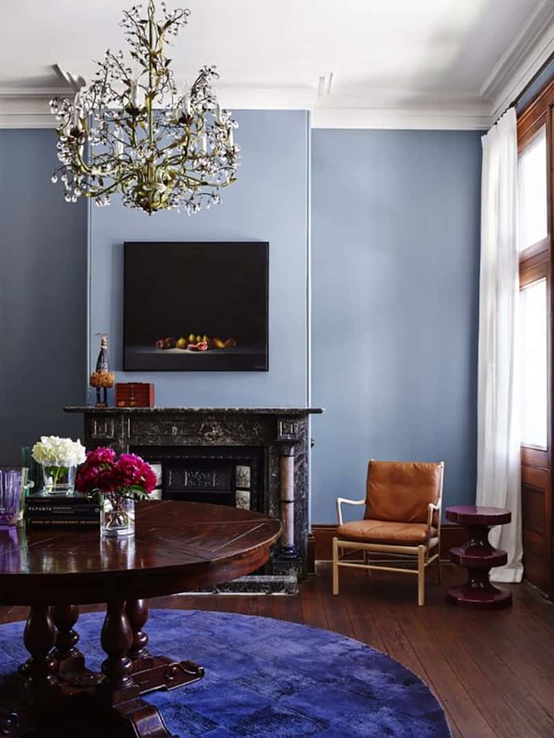
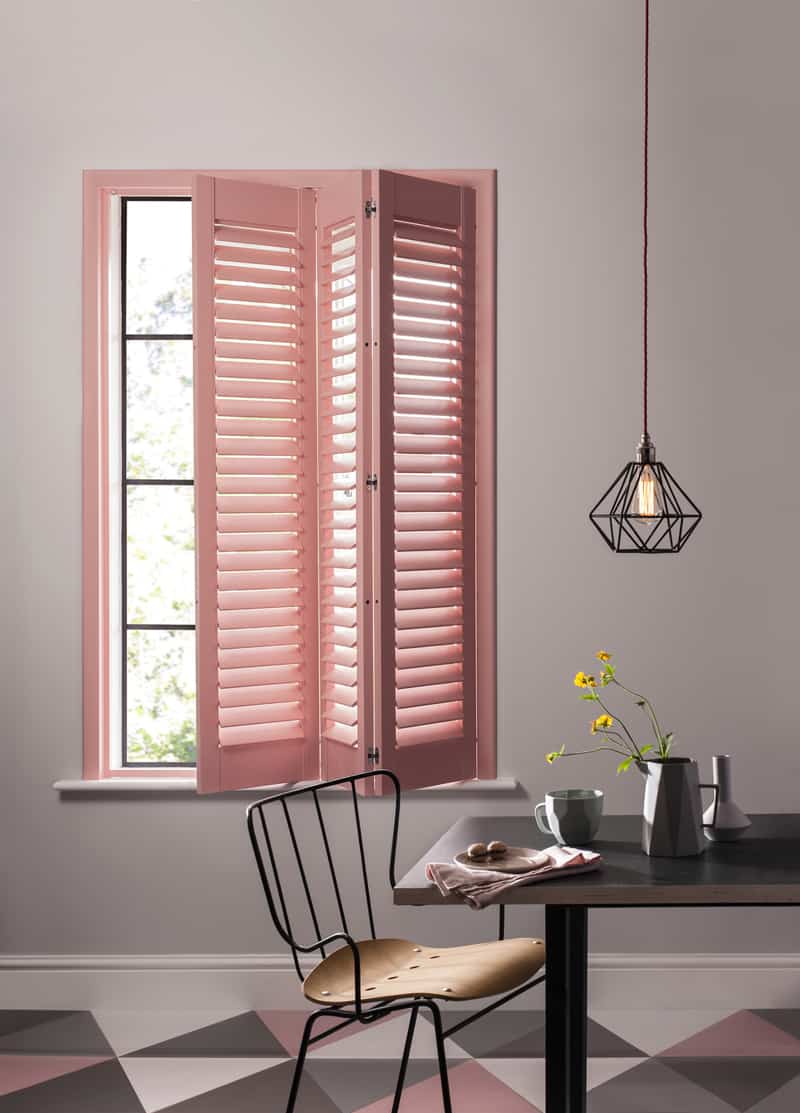
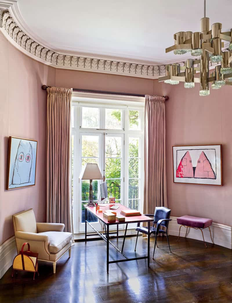
Adding Rose Quartz and Serenity Blue to your home will produce a calming and refreshing effect. In many instances, these colors, alone or in combination, are great for conservative tastes. Rose Quartz and Serenity are ideal for day rooms and generally small spaces, creating the illusion of a larger, airy space, while still being able to keep that cozy feeling. There are many ways to introduce these both colors in the decor. From walls to furniture and accessories.
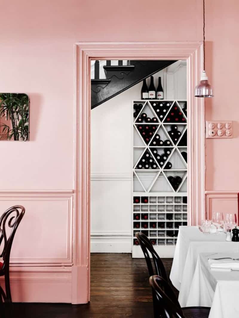
These two picks are versatile hues, in particular when it comes to décor and interior design, and both go well with a wide range of styles, from the most conservative to modern minimalist. It’s like a unicorn rainbow in spring. Because unicorns don’t do normal rainbows, they do Serenity & Rose Quartz. We love the rosy warmth and tranquility that these shades bring into a well-designed interior. The soft pink hue is versatile enough to adorn the walls of a library or master bedroom, while the light blue shade is neutral and calming. Although I heard some opinions raving about these colours (from “this is nothing new” to “who in their effing mind would buy stuff with these grandma colours?!”), but I am so obsessed with this combination… I cannot describe it!

How to Decorate Your Home with Pantone’s Rose Quartz and Serenity
Serenity, with its muted hue, is an easier color to deal with (or maybe that’s just because I tend to gravitate more toward cooler and neutral colors). But combined? You’ve somehow got a fresh, gender-neutral space that feels to-the-minute. The key is keeping your furniture and accessories streamlined, so no chintzy shabby chic, please. These shades, which reminds many of “baby colors” Pantone says, were chosen to convey rosy warmth and tranquility. With two colors, the possibilities are endless. It’s just a matter of time until the design and fashion industry respond by incorporating the two colors into their palettes and set the trends for 2016. Check out our collection with the two trendiest colors for 2016.
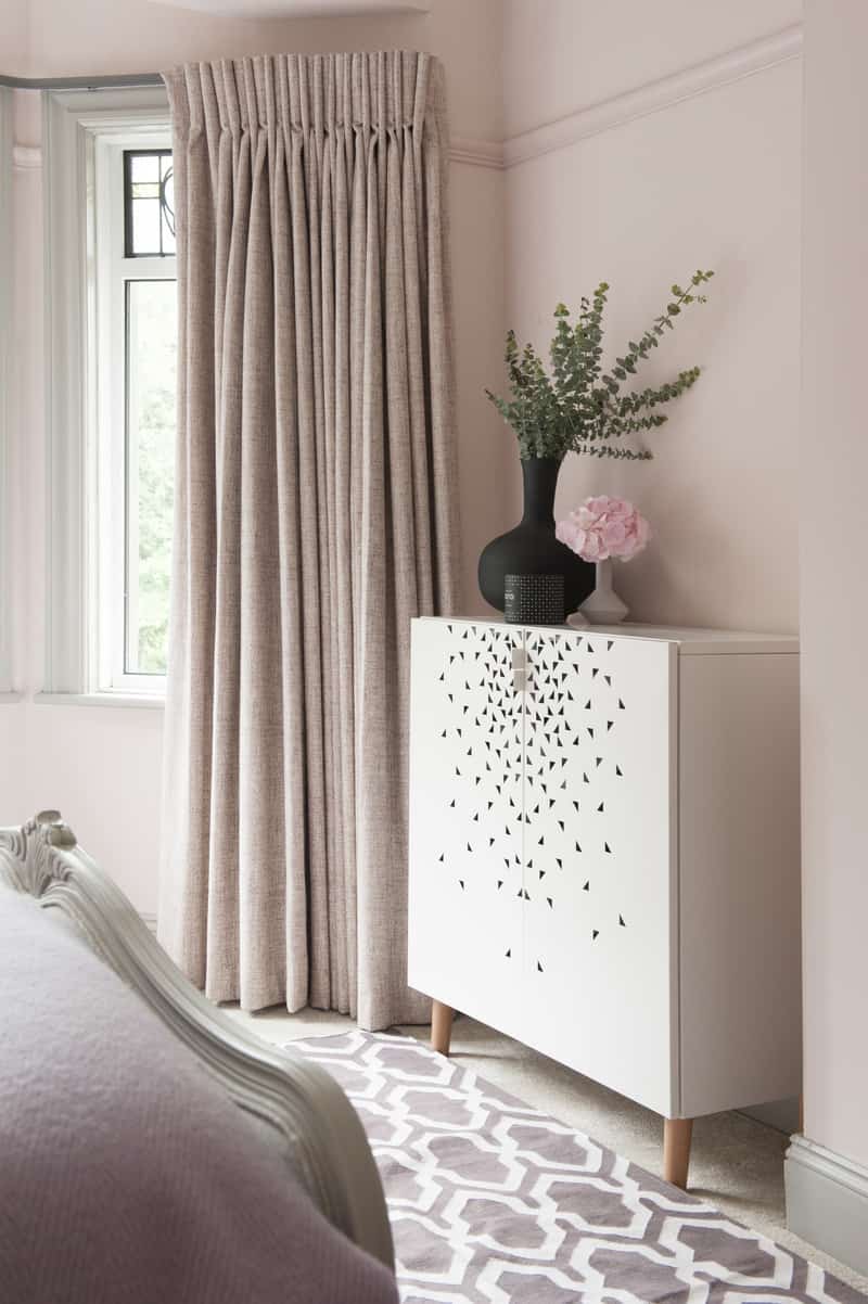
Metallic Moments
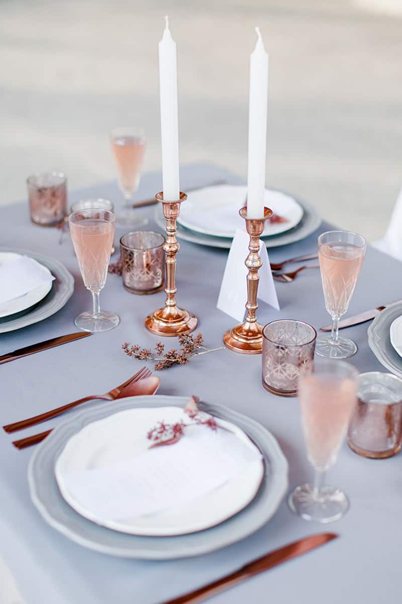
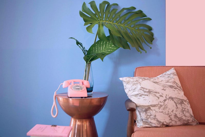
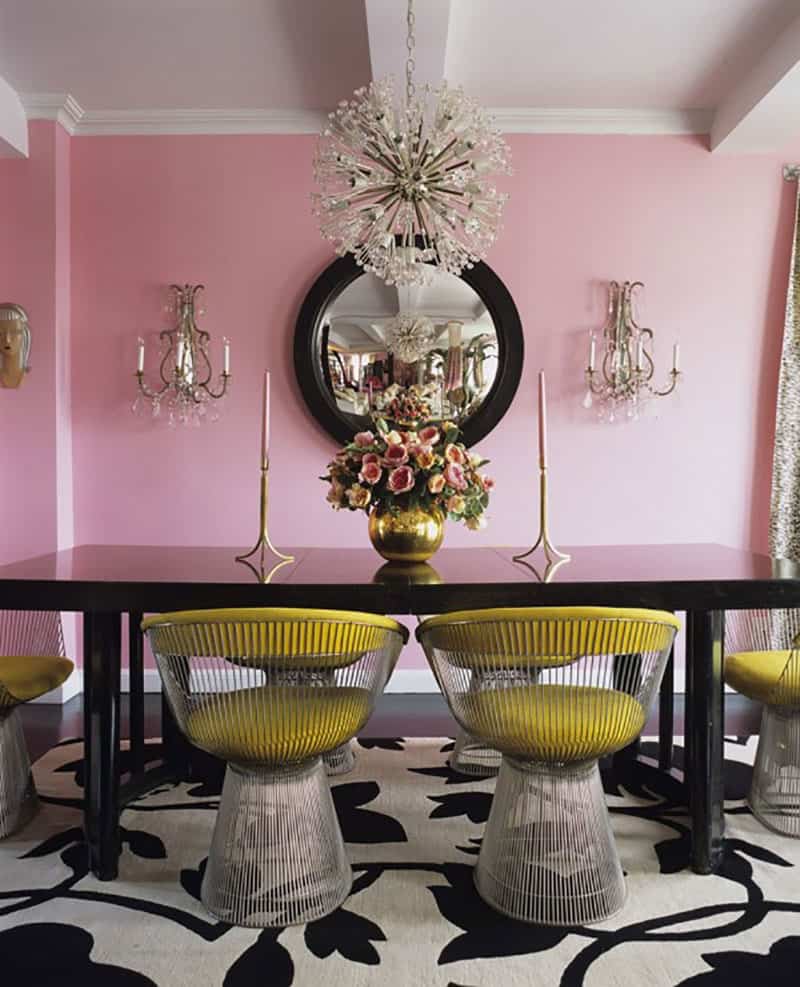
Give this pairing a glam twist with the addition of metallic accents. Rose Quartz pairs beautifully with warm metallic shades such as gold and copper, whilst Serenity is a natural partner of cool, silver hints. Pick lighting, vases and small accents in these glittering hues to lift your look.

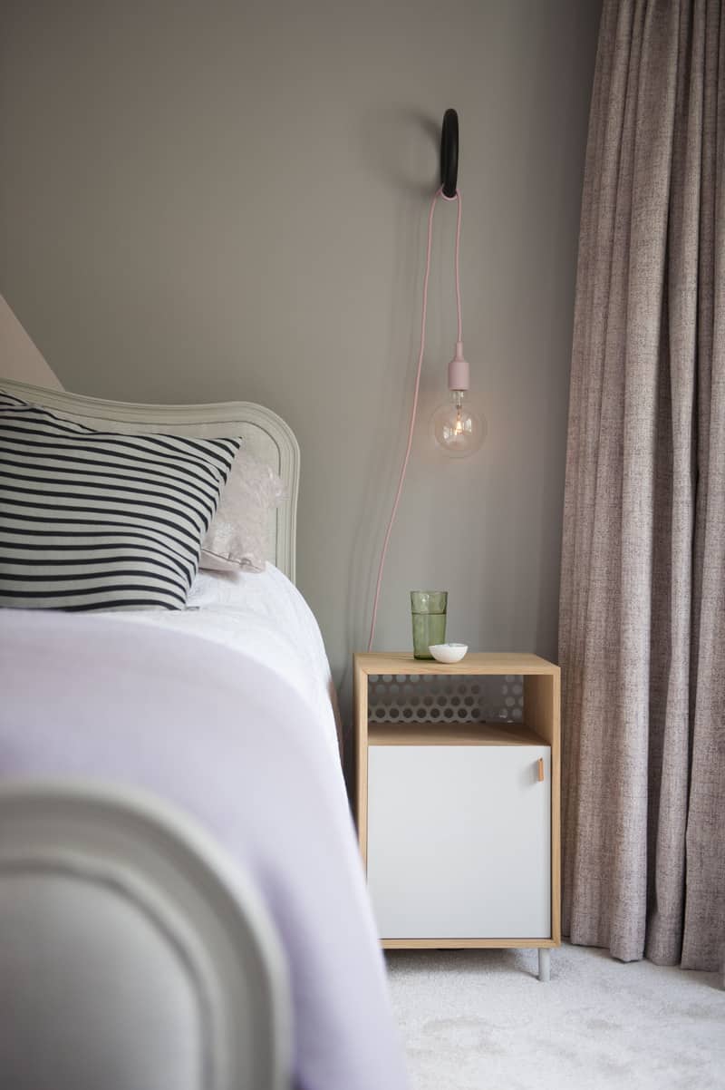
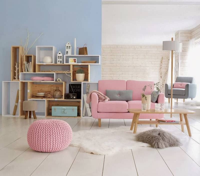
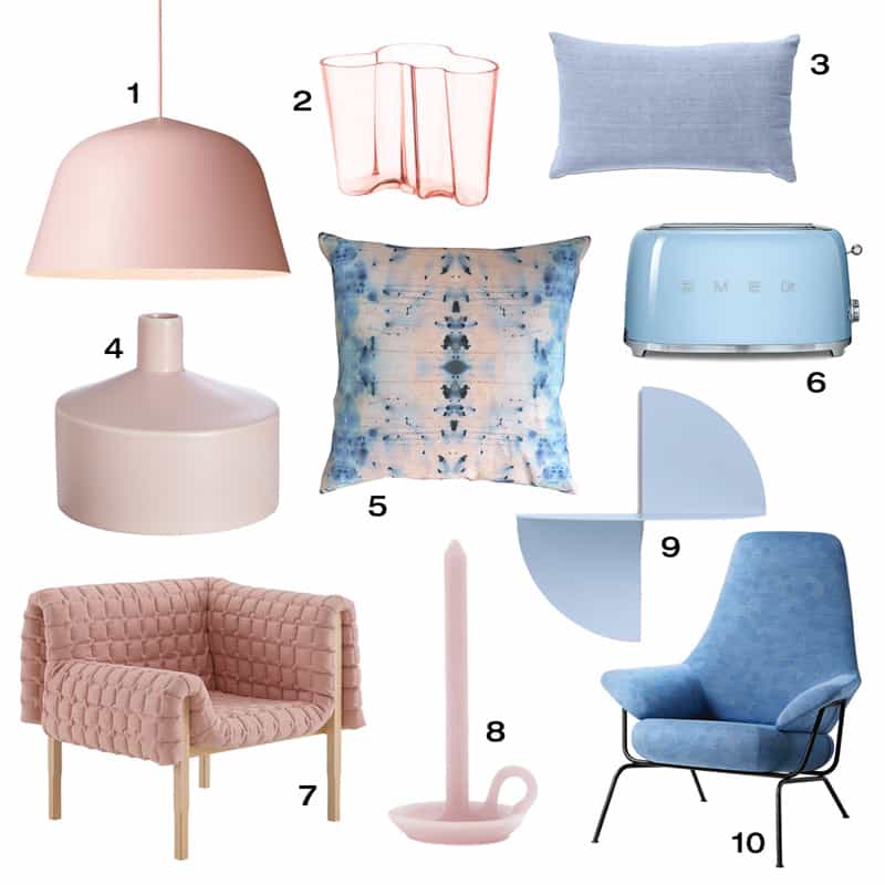
We rounded up 10 home furnishings to match PANTONE’s latest selections. Have a look.
1. Ambit Pendant Lamp by TAF Architects for Muuto 2. Aalto Vase by Alvar Aalto from Iittala 3. Denim Cushion from BoConcept 4. Askew Vase from CB2 5. Nairutya – Citron Pillow from Eskayel 6. SMEG Toaster 7. Ruché Chair by Inga Sempé for Ligne Roset 8. Tallow Candle by Ontwerpduo 9. Pivot No 1 Shelf from Hay 10. Hai Chair Razzle Dazzle by Luca Nichetto for Hem
Products you can buy right now from Amazon!
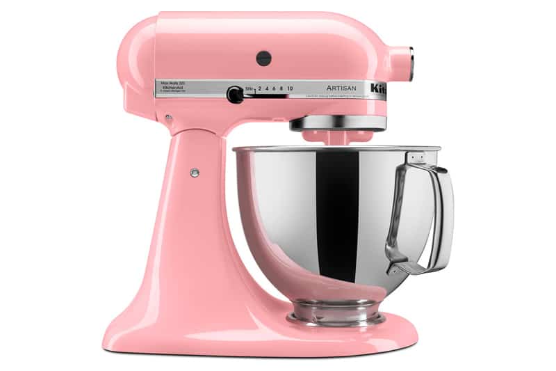
KitchenAid KSM150PSPK Artisan Series 5-Qt. Stand Mixer with Pouring Shield – Pink
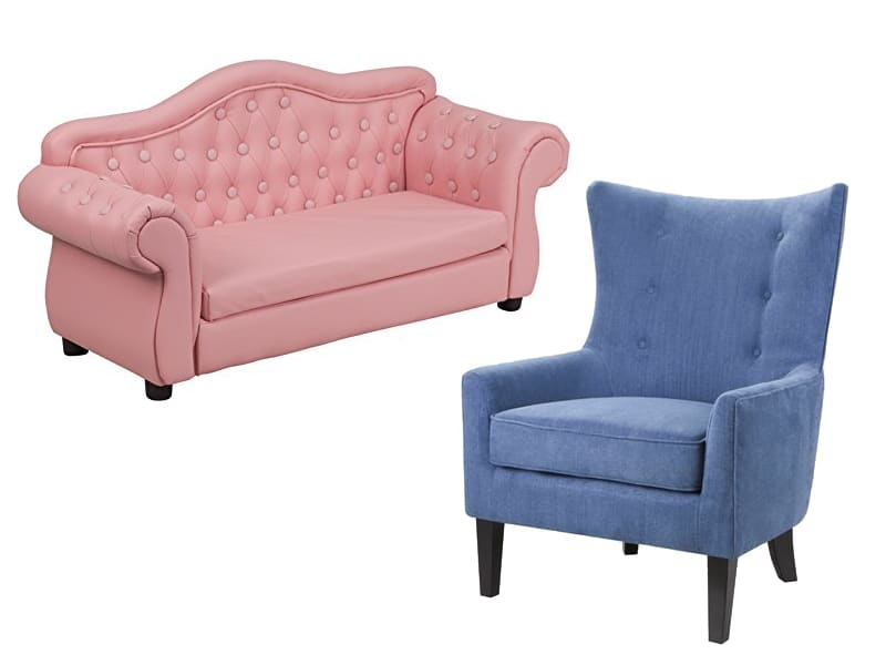
Kids Pink Traditional Sofa
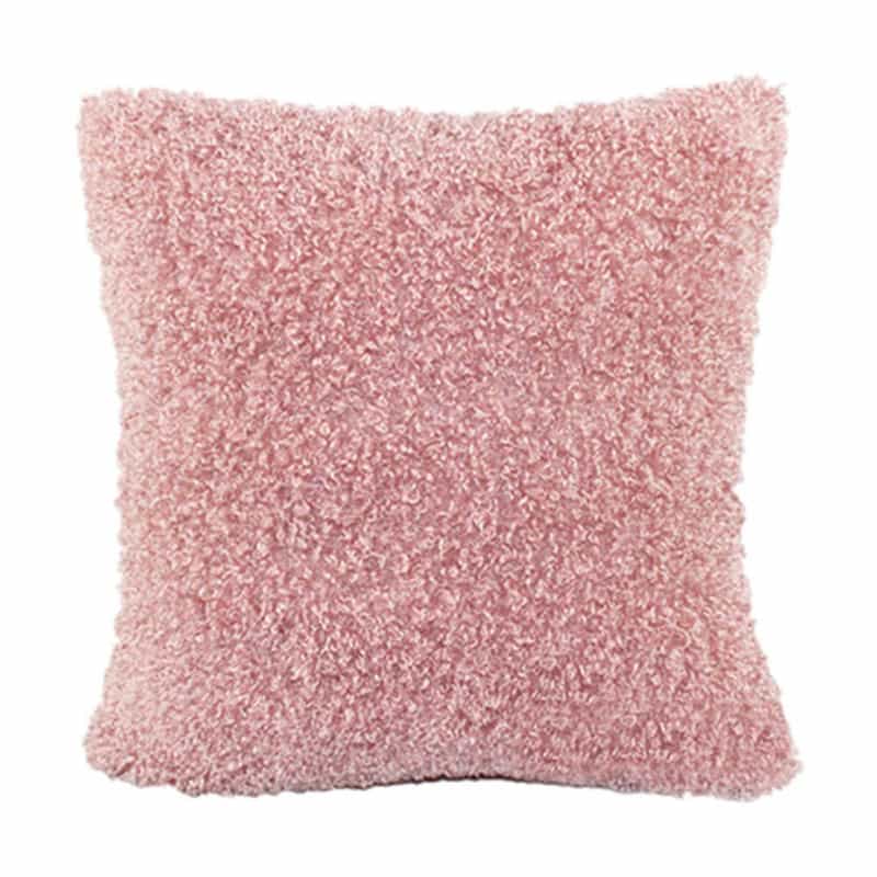
Super Soft Plush Faux Fur Cushion Covers Pillows Shell Home Bed Sofa Pink
LexMod Molded Plastic Armchair Rocker in Blue

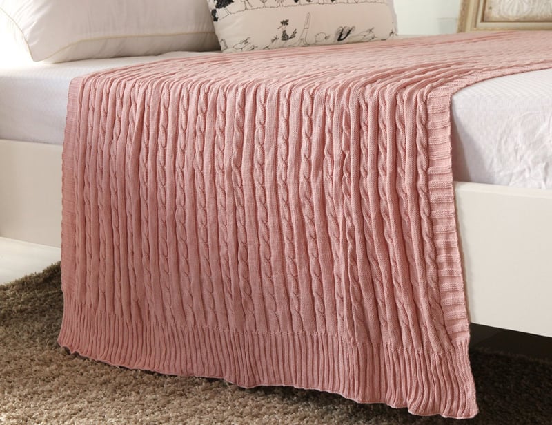
CottonTex Cotton Knitted Cable Throw Soft Warm Cover Blanket Cable Knitting Pattern
Rose Quartz Serenity Chevron Door Mat – Large Door Mat – Indoor Outdoor Neoprene and Machine Washable

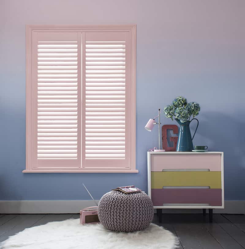
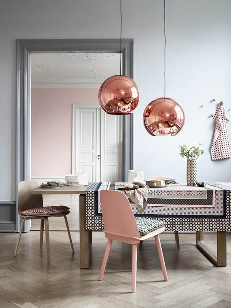
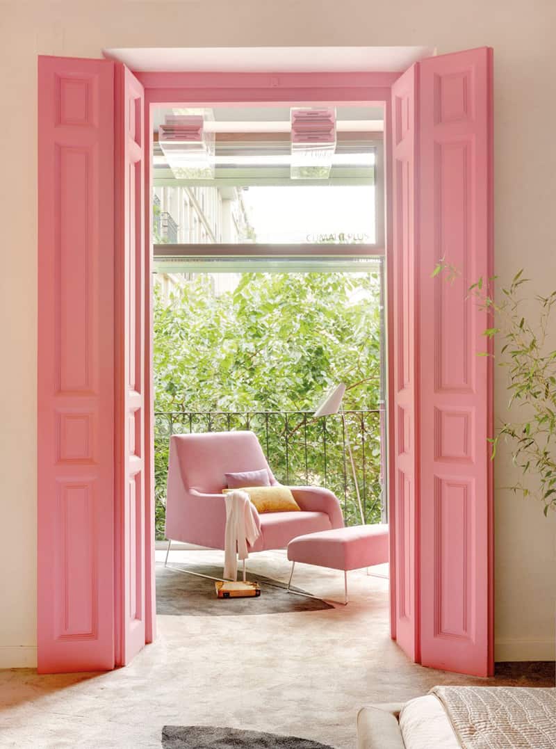
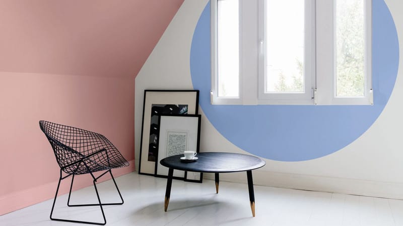
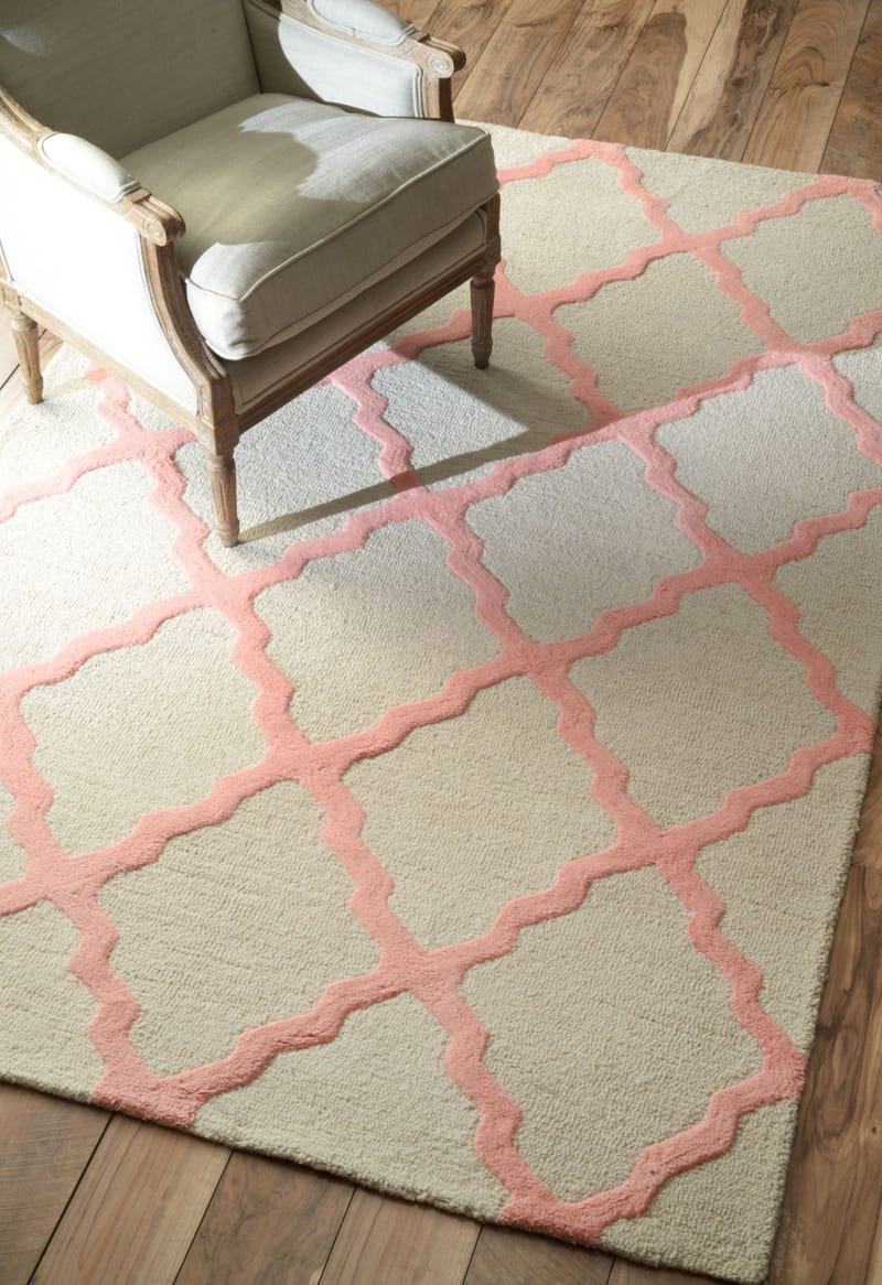
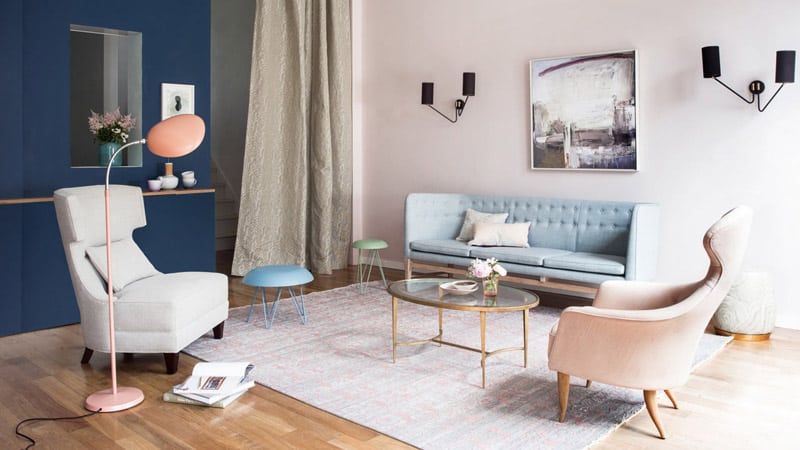
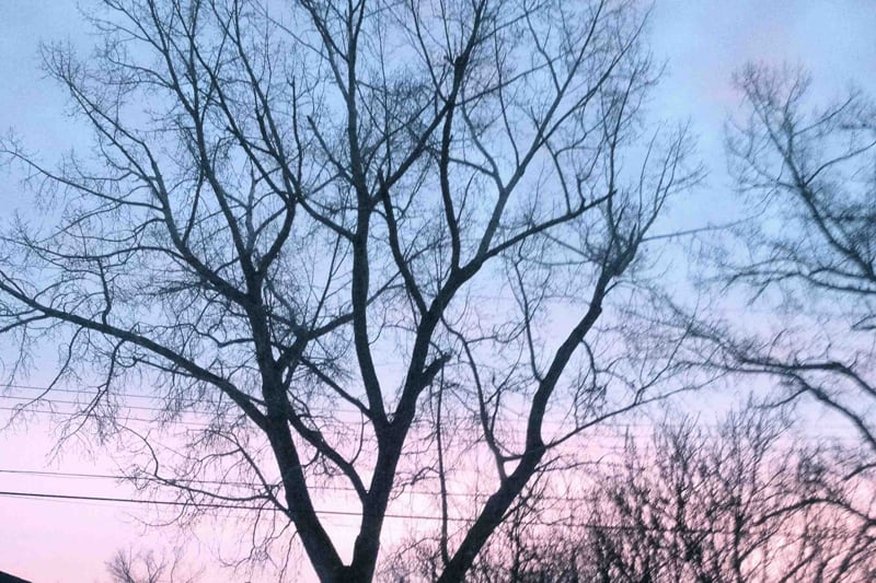
Pantone colors for 2016 were inspired by spring mornings when the sky looks exactly like that. Beautiful!

Any predictions for the color of 2017? Share below!
