Amir Schlezinger is a garden designer. He prefers working with natural materials, particularly stone. Being able to create something contemporary out of a piece of material that sat within the planet’s crust for many millennia is so rewarding. Te always tries new combinations as the material available is vast from both the UK and the continent, India, China, Brazil, etc. Slate with sandstone, limestone with granite, variations in finishes sizes and thicknesses – it’s a never-ending exploration for articulating a space. Amir Schlezinger has contributed to numerous magazines and books on garden design worldwide. Having grown in the Mediterranean region his knowledge and understanding of both European and Tropical flora has contributed to a style of planting which combines sculptural and architectural plants with northern European traditions. He has designed and realized over 200 projects since, cultivating a particular interest in roof gardens and terraces.
For now, we want to present you 5 most beautiful projects designed by Amir Schlezinger:
Thank you Amir Schlezinger, for sending us this projects!
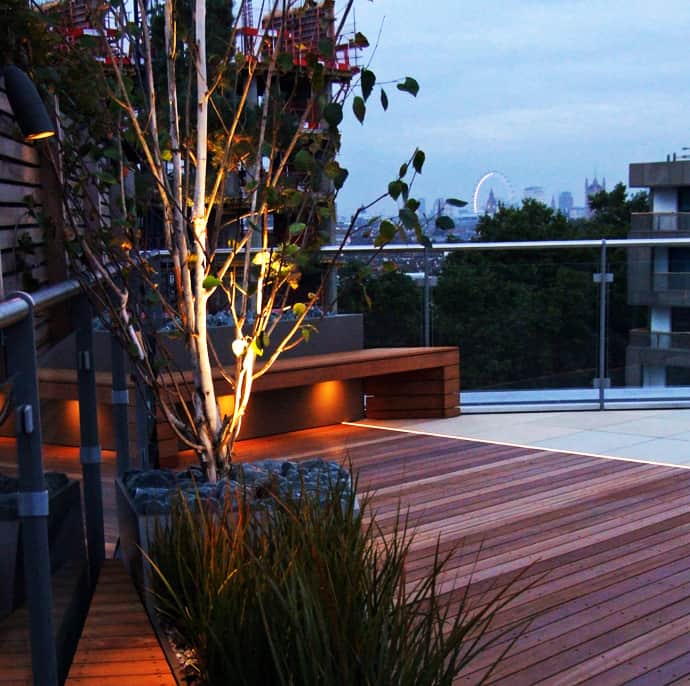
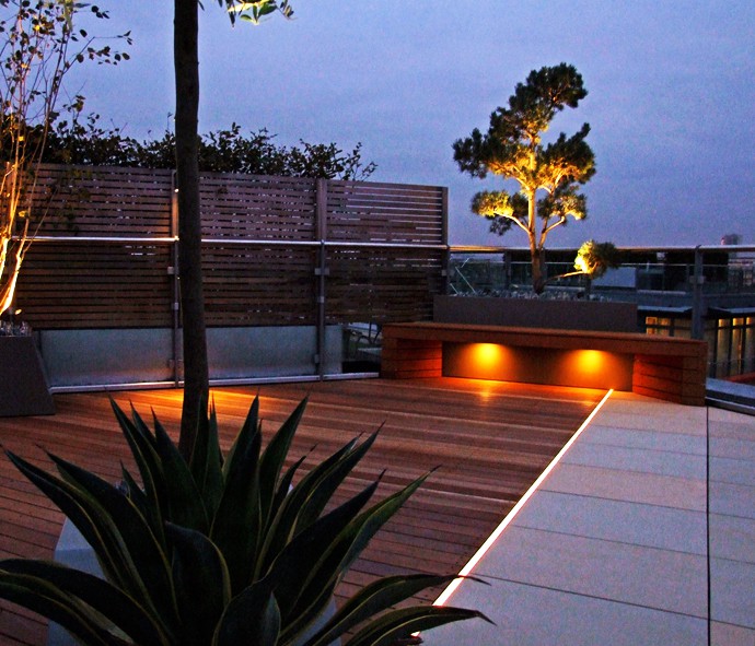
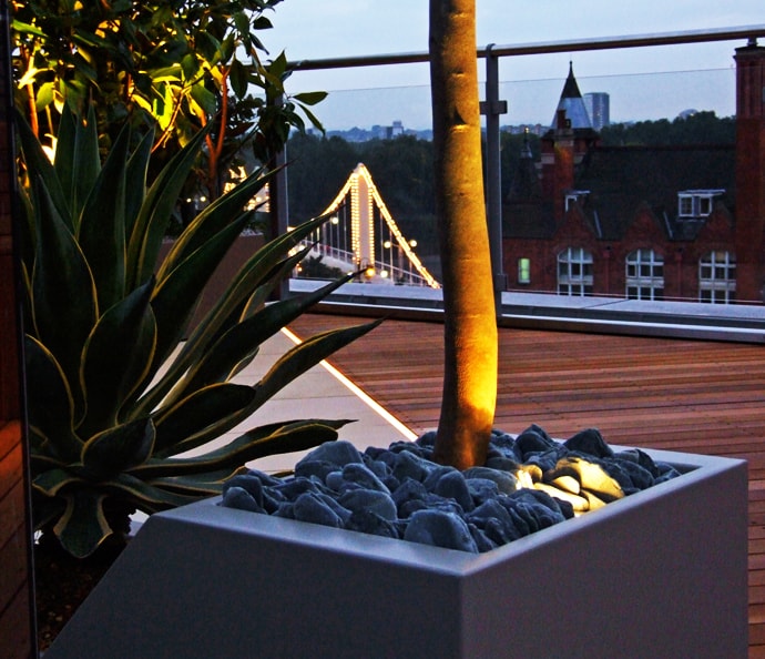
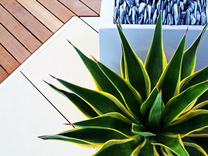
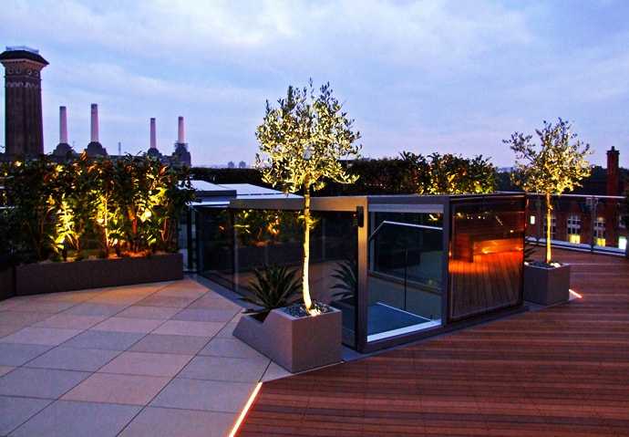
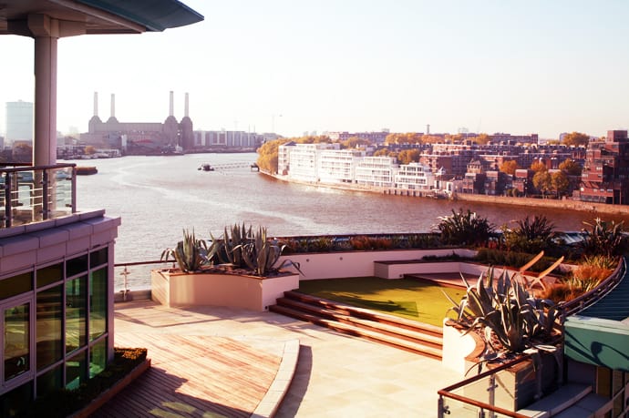
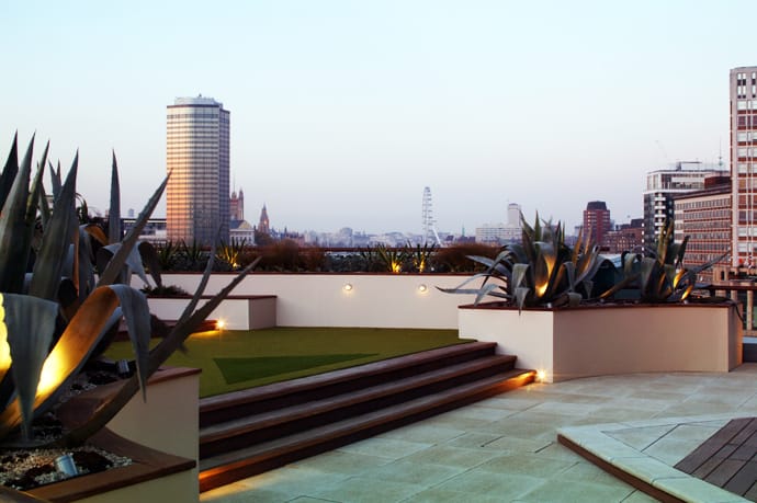
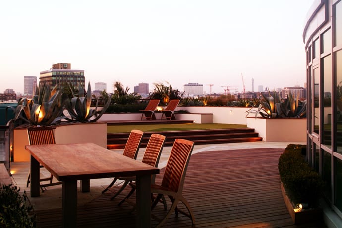
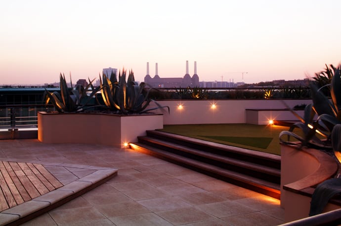
1. The first challenge was how to get rid of the tonnes of earth, grass and railway sleepers amassed on the roof by the developer’s scheme. With such an ultra modern development and such a busy client there was no room for all of this. Whilst not all of the apartments were occupied at this time, this gave an access opportunity via the end of the building for craning in timber. The orientation of the deck follows the line of Chelsea Bridge (at about 40 degrees.) This also satisfies the view to the Bramah building on the other side being perpendicular to it. The detail between the hardwood and sandstone is highlighted by an LED light strip, which harmonizes beautifully with the bridge lights. The new sandstone was cut specifically at 700 x 500 mm as I wanted a solid, medium size slab with a slight length for directional purposes. This stone, quarried in Yorkshire, has several tones ranging from buff through yellow to light blue. When mixed on a large area such as this, it gives a beautiful mix of tones which appears natural and works well with other natural materials.
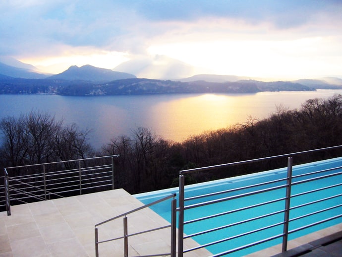
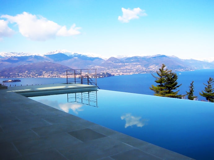
2. Villa Neamh is blessed with a truly majestic view of the Alps. Overlooking Lake Maggiore near Milan it enjoys the mountain countryside with the proximity of the big metropolis. When my clients approached me to help with the garden, construction of their 10,000 square foot house was well underway. It took a while, as Italian law restricted heavily on contemporary developments and so many alterations and traditional adaptations had to be made. Over a period of three years and utilising the early morning EasyJet flights from Gatwick to Malpensa, I was able to draw up floor plans for the hard landscaping.
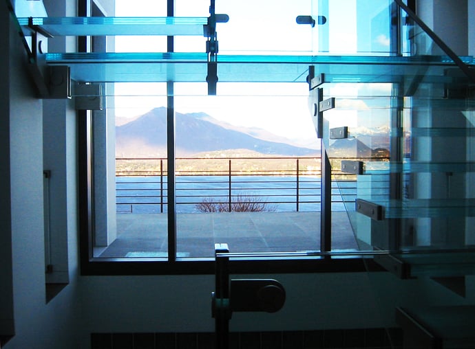
A roof terrace spans the width of the living room. The blue sandstone was flamed to give it a subtle texture and grip; it blends in with the interior glass, the lake and the mountains beyond. The arresting view was left unobstructed. With such a large quantity of sandstone in various finishes and sizes, nearly 2 full cargo containers, it was important to select the right stone. At the end of the selection process stone from China was imported – it seemed the most consistent, cost-effective and the proximity of the Port of Genoa made it all worth while.
The micro climate around the lake is intense, humid and gets very cold in winter and very hot in summer. Most of the plants came from a nursery in Como, which specialises in acid loving plants. The front of the house was pretty much organised similarly to one of my London roof terraces with architectural plants, built-on seating and lighting. Large Lagerstroemia trees (Crape myrtle) for the front were craned into place and specimen shrubs for the back were driven around down the slope via the neighbours drive. Work had to continue 7 days a week 12 hours a day to achieve 3000 plants in the ground in two weeks.
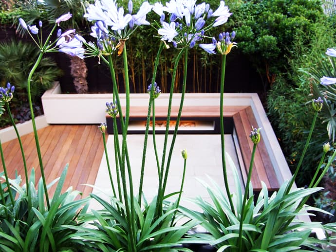
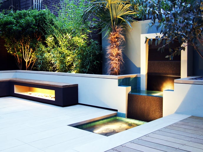
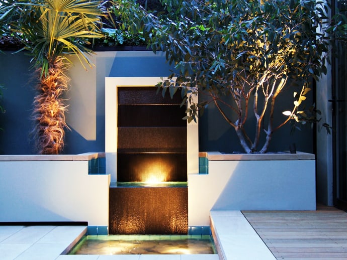
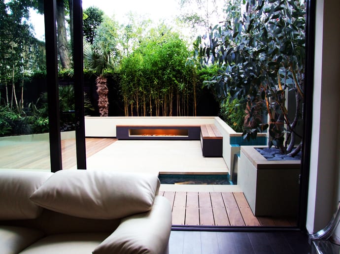
3. The living room was extended into the garden in this end of terrace house, creating an opportunity to link the two spaces and make a roof terrace on top. Both the garden and roof terrace were blank canvasses; there was also a front garden to tackle. Although the design contains many intricate details, the initial plan came about fairly quickly. This was aided by the nature of the site, the chemistry with the client and the relaxed budget. Because the interior was in place when I first visited, I was able to take inspiration from a few key elements that let to quite an instinctive response.
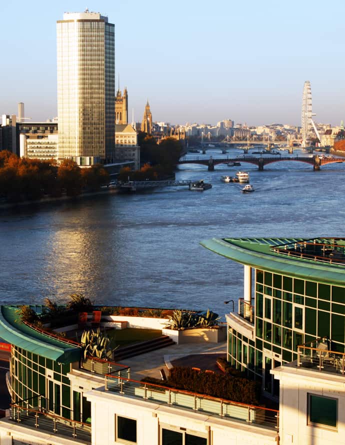
4. The client was not bothered about any of the many constraints facing us and over a period of 4 months stirred the preparations with ease. When construction commenced he simply left me to get on with it. Compared to other terraces in the development that are situated much higher, being on the 7th floor not only meant less wind but also ease of access. The Iroko deck is edged with beige concrete pavers and follows the exact arc of the building. Such a large deck in the ferocious westerly wing had to be fastened to the pavers below. Visually I introduced a pattern of two 6” boards followed by three 4” boards, which gives rhythm and variation. Without much option we had to create 13 removable covers for the abseiling access points. The deck however is a pleasing feature with its curved hardwood riser fascia and shallow height which makes the whole deck appear lightweight.
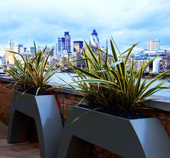
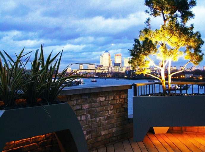
5. The position of the roof terrace at Tempus Wharf is at the midpoint between Tower Bridge and Canary Wharf. It therefore enjoys 2 tremendous elevations of sheer illuminated city views. As with many converted buildings along the River Thames the ever presence of water and its cycles form an important element in any design. With 2 terraces to the north and south and a further walkway between them there was plenty of scope for some interesting detailing.

