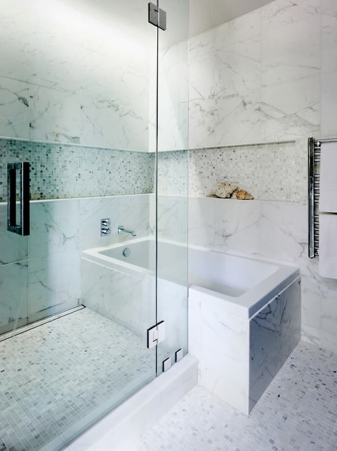
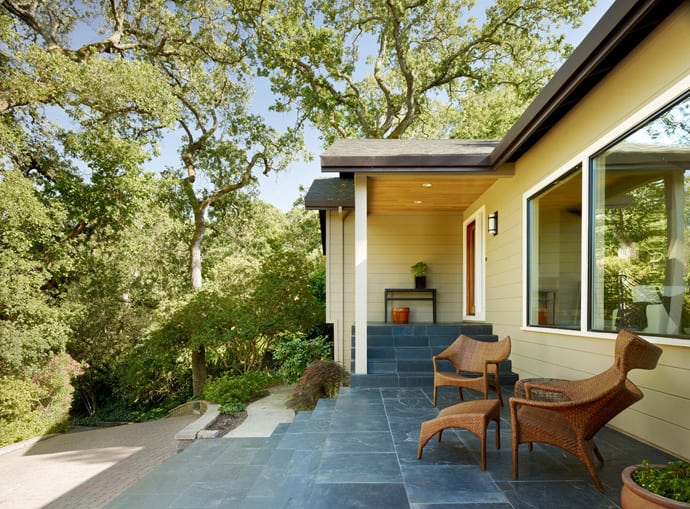
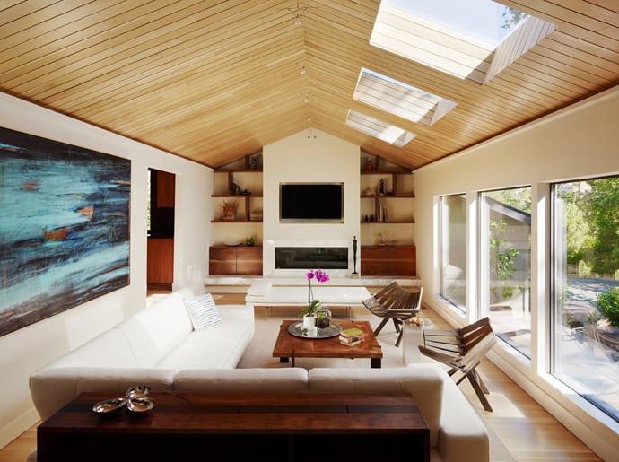
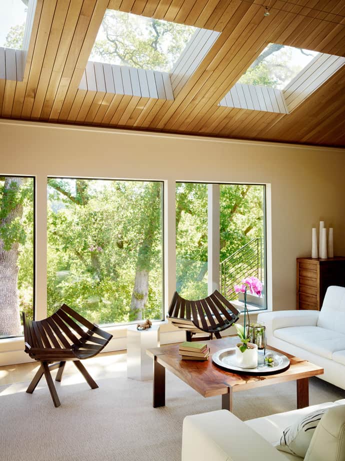
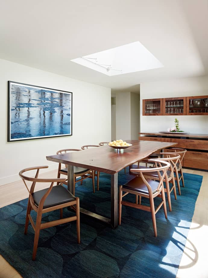
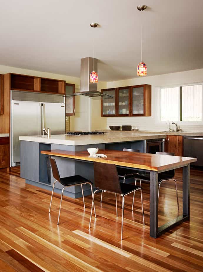
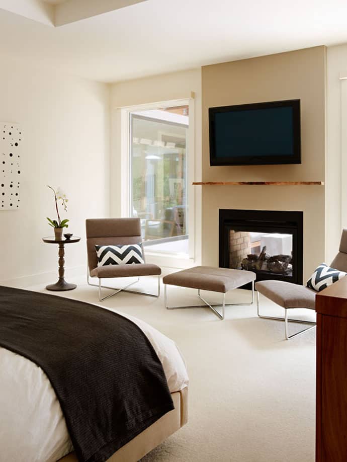
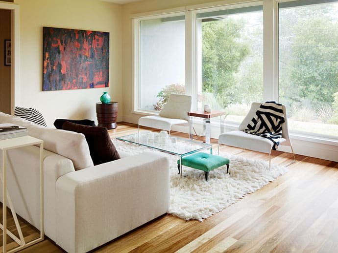
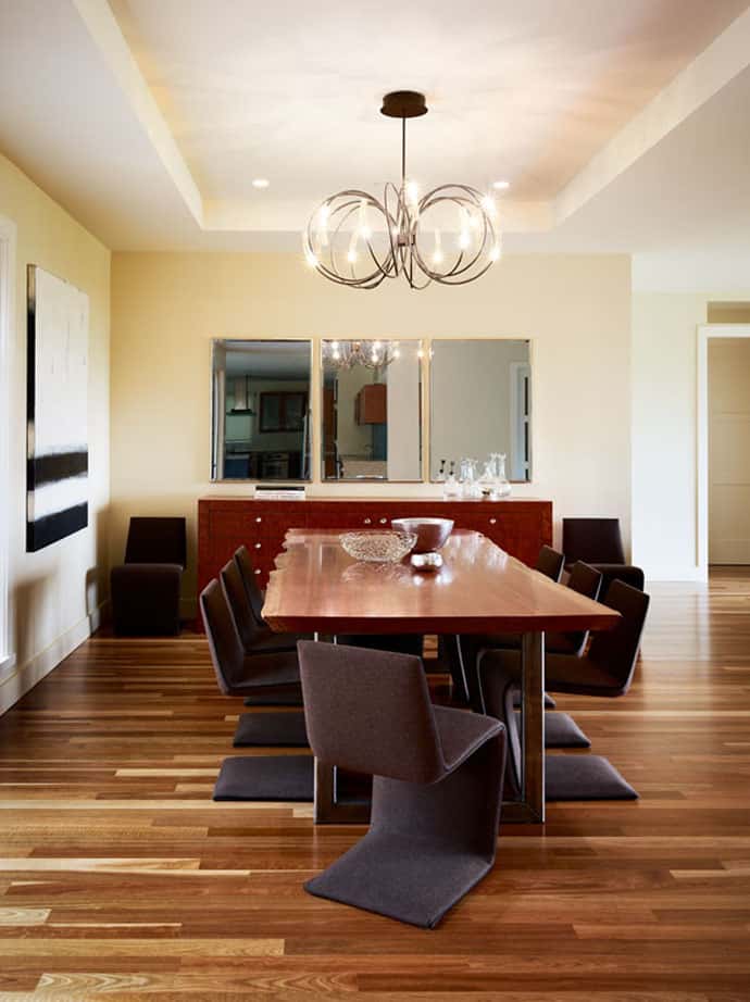
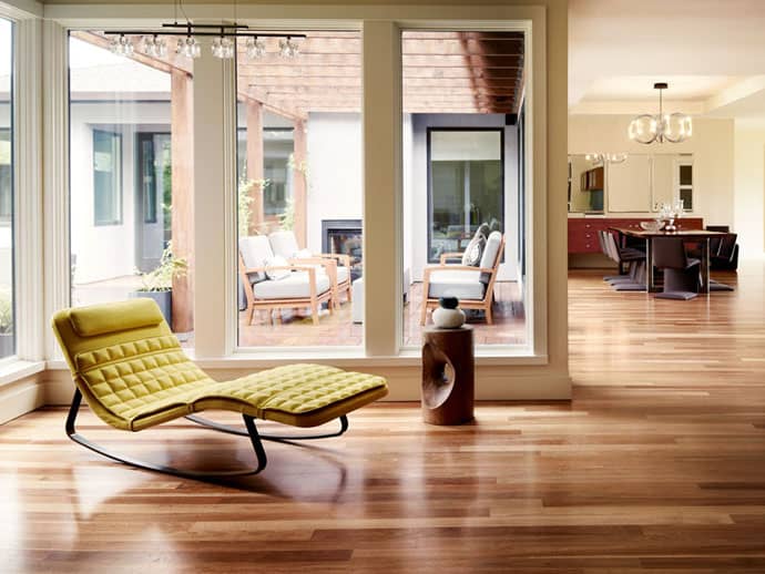
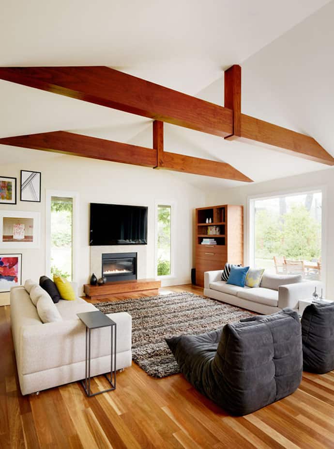
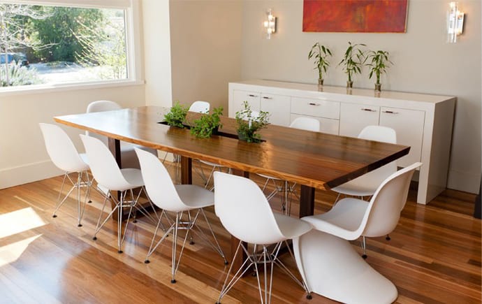
When I first saw the pictures of this project, I said “Wow, the architect knew something about space planning!” Because, when done right, it can produce finished rooms that feel larger and perform more efficiently. And, the principle works very well for the house we present you today, a project realized by Studio SHK. One tip you should keep in mind when designing a room is the size of your furniture and the number of people occupying the room. For instance, the space between the kitchen counter and the dining room table should be at least 4 feet so that people can walk between the two and diners have room to pull out chairs. But an entry door in the path and/or a larger scaled space will need more space — 6 feet or more. Large windows that let natural light come inside make the space look wider and climbing plants that beautify the terrace transform your house in an energetic landscape.
Committed to functional and creative design, Studio SHK bridges the demands of artistic exploration, environmental and social responsibility, and financial considerations. Founder Sherry Hope-Kennedy has formed a team that strives to deliver the highest level of service coupled with creative design that evokes a sense of energy and playfulness.
