In 2005, Atelier Kempe Thill won an invited competition to construct within such an area of the
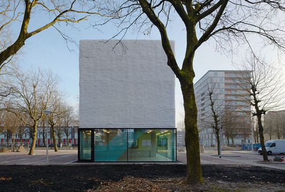
„Reimerswaalbuurt“ a small youth- and neighborhood center. The task was to integrate the small building as carefully as possible in the existing tree population, to keep enough distance to the adjacent building blocks and to design a monumental, poly-directional and well visible free-standing building.
Two room types
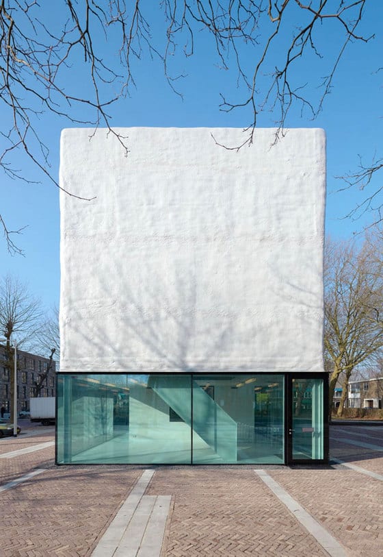
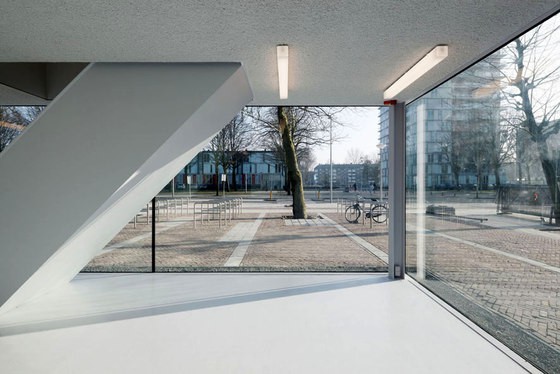
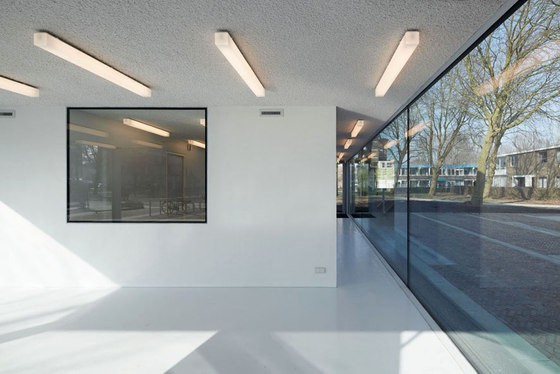
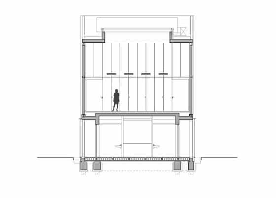
The realized building consists of the simple stacking of two – diametrically opposed – concepts of space. The ground floor level is designed as a flat sandwich-space, which opens up completely to the surroundings thanks to the glazing on all sides. The public green with its dominated tree canopy becomes part of the interior and generously extends the small space to the outside. This effect is enhanced by the modest interior design and the grayish color scheme. Used as a „public living room“ of the neighborhood, activities on the inside are well visible and stimulate the direct interaction with the public space.
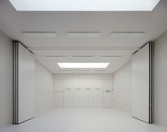
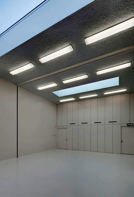
On the upper floor is the Community Hall. In order to realize the desired multi-functionality and neutrality, it has a fully closed facade and forms a hermetic and introspective space. Its desired, very neutral appearance is offset by its generous ceiling height and two skylights that illuminated the space naturally. The room is deliberately kept modest with whitish colors in order to maximize the effect of the skylights on the interior. With this, the hall is given a very specific character without limiting its multi-functionality.
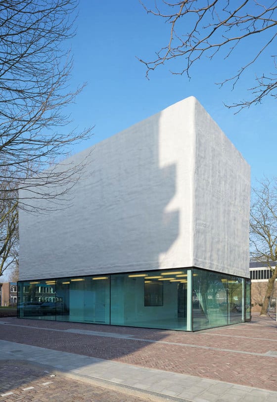
The combination of these two room types, the open and closed space, determines the appearance and character of the building. From the outside, this is directly visible and dominates the design of the façade. On the inside, the contrast between the two room constellations determines the perception and surprises, as the fully enclosed room is much brighter than the fully opened.
Cheap-tech
As usual in these projects, the available construction budget was very low. In order to realize a spatially appealing building within this framework, it was necessary to apply a variety of very cost-efficient construction methods.
Like a cheap industrial compound, the building is made of a steel frame structure with a wall infill of sand-lime brick. All technical installations are integrated in the walls and the floors, so no lowered ceilings where necessary, which contributes to higher rooms.
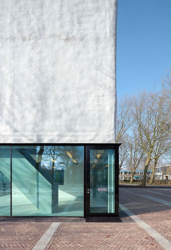
The glass facade is made from an inexpensive all-glass system, which uses large glass panels up to 5 meters in length, clamped only on two sides with a 5cm high steel profile. The structural glazing doors were specifically designed for this project. A polyurethane spray system was applied for the closed part of the facade that normally is used in the insulation of oil tanks and pig shed. The insulation is sprayed onto the sand-lime brick in liquid form and froths up on-site. Then, the very rough surface is finished with an UV protective coating. The appearance of the exterior facade is essentially derived by the creative tension between the two systems; on the extremely smooth, transparent and reflective glass base rests a rough and scale-less polyurethane box.
The interior is governed by a similar economic and creative approach. The slightly rough concrete floor is only coated with a layer of polyurethane; the ceiling is covered with an acoustic spray plaster. Contrarily to this, large reflective interior glazing, smooth industrial lights and two elegant steel staircases were installed. via
