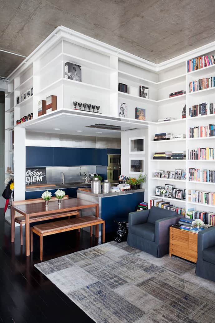
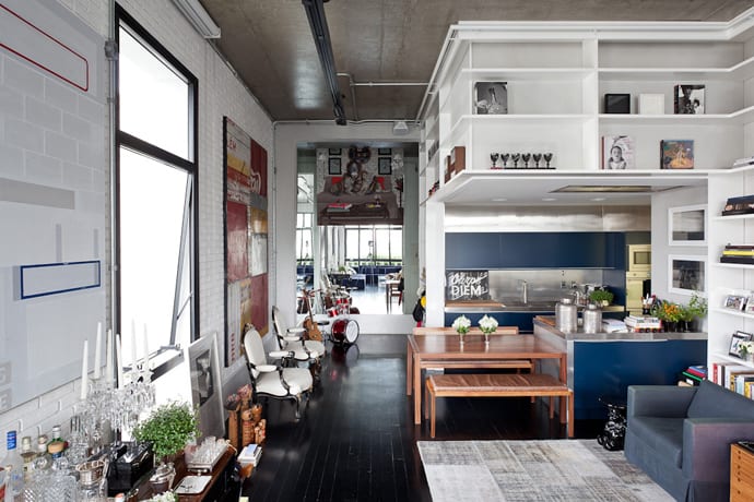
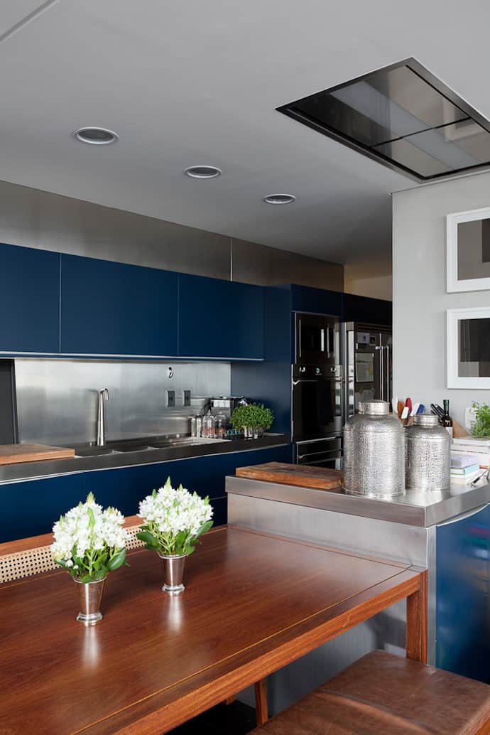
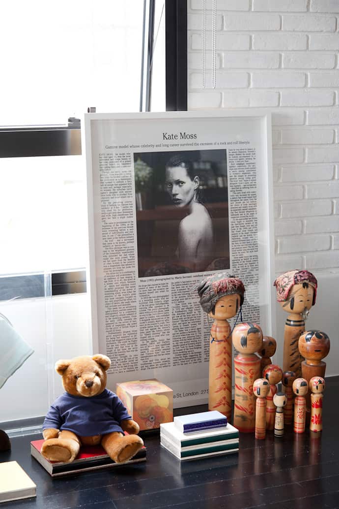
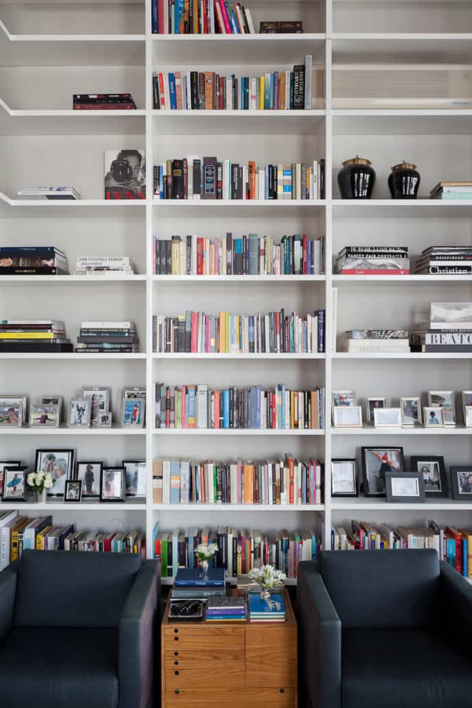
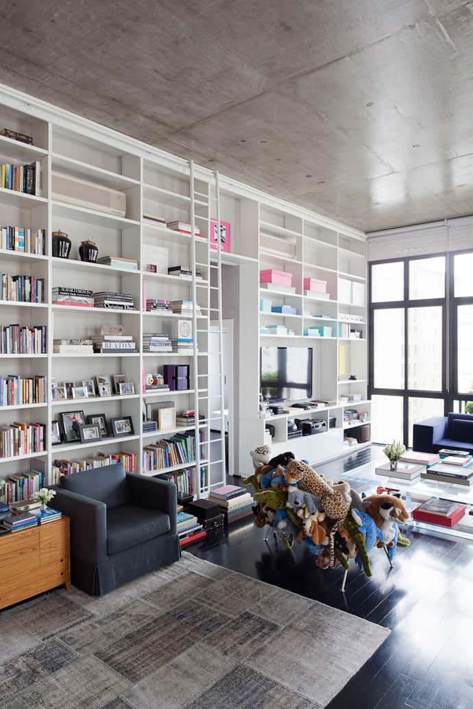
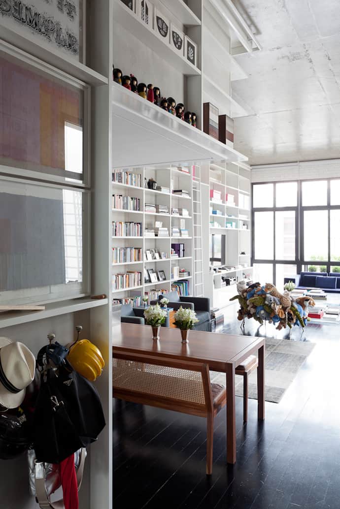
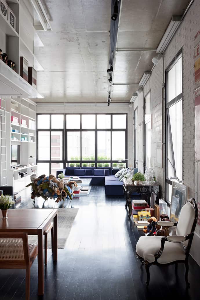
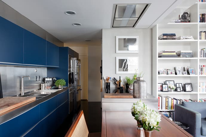
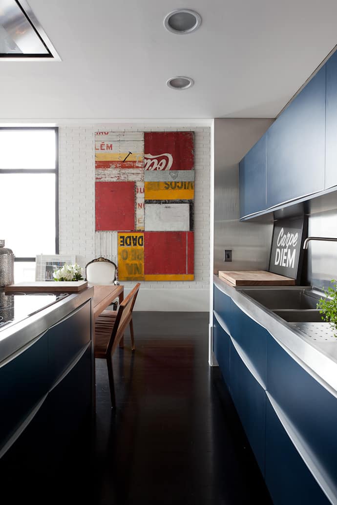
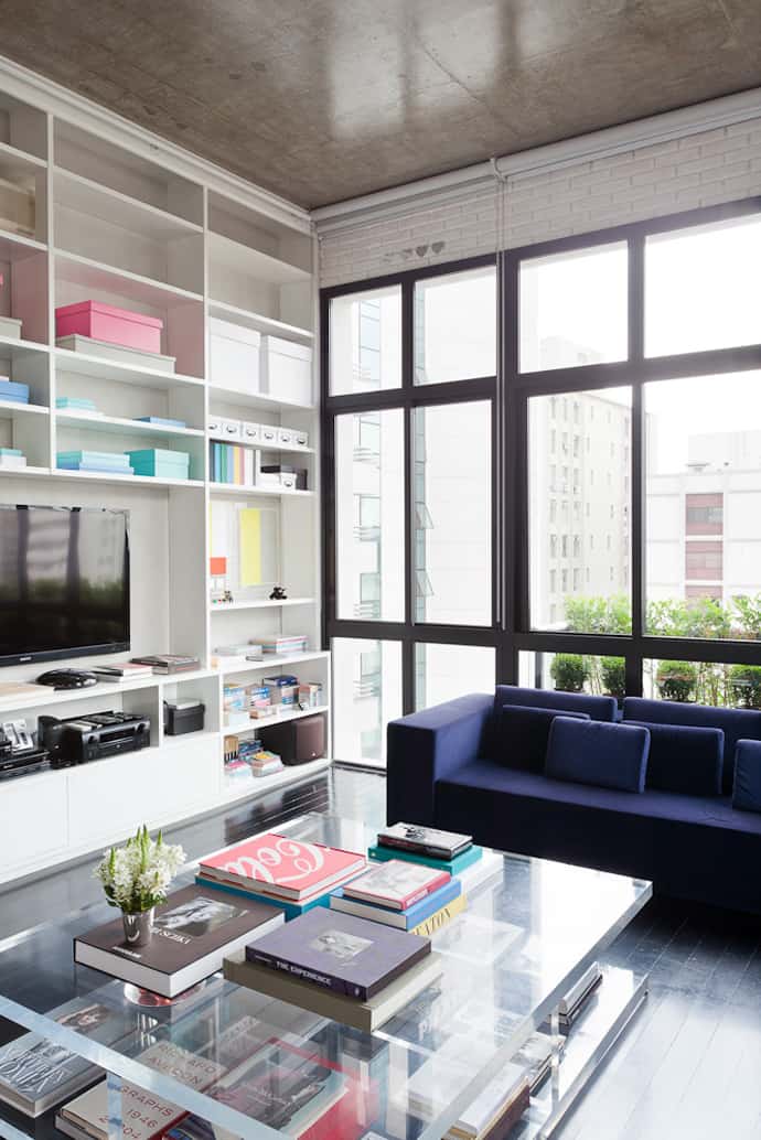
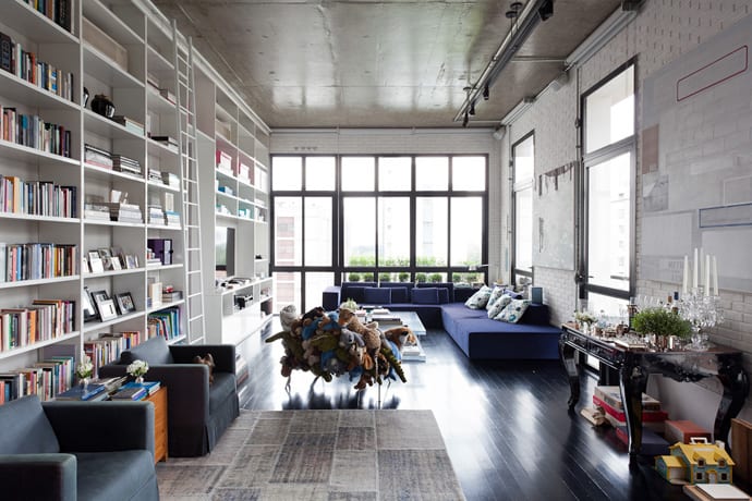
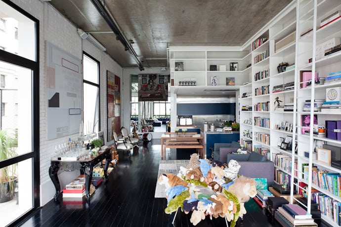
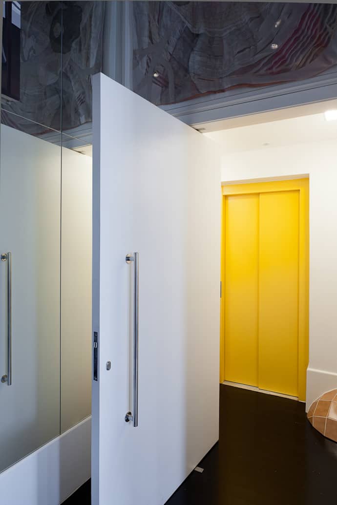
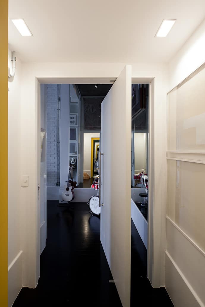
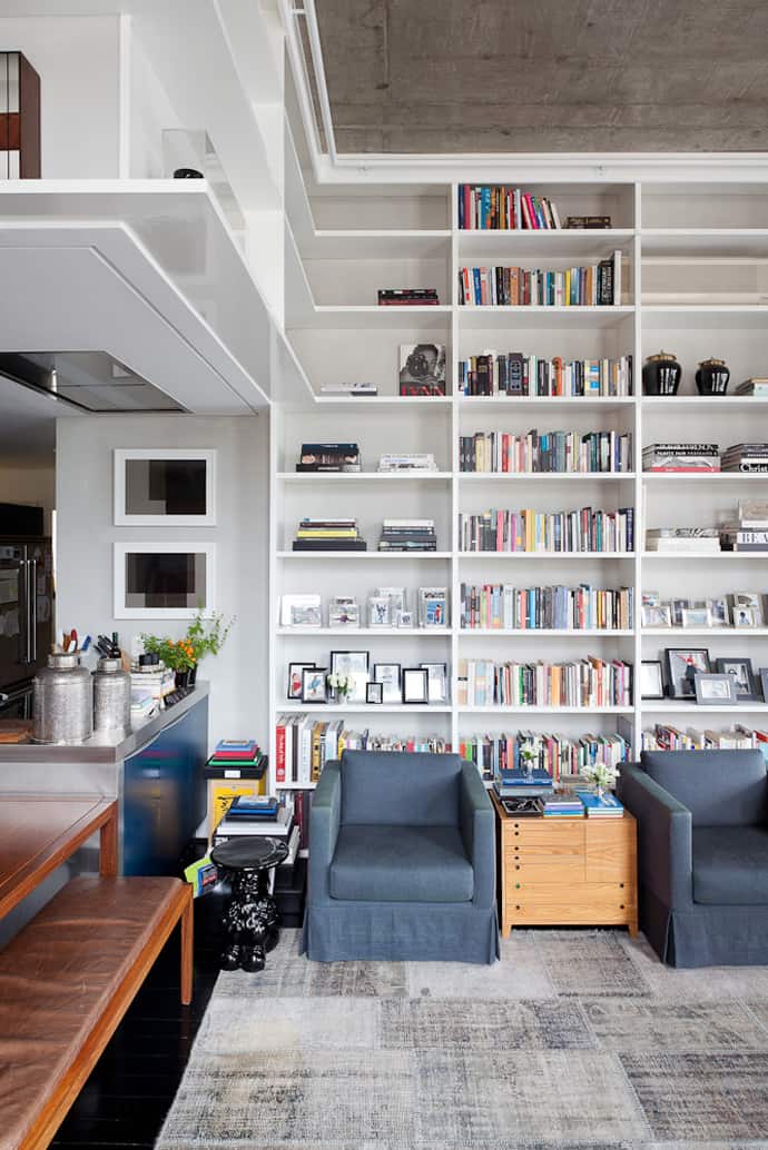
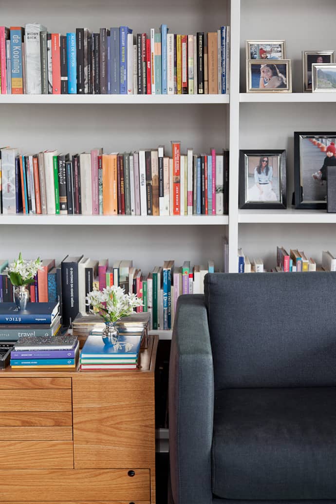
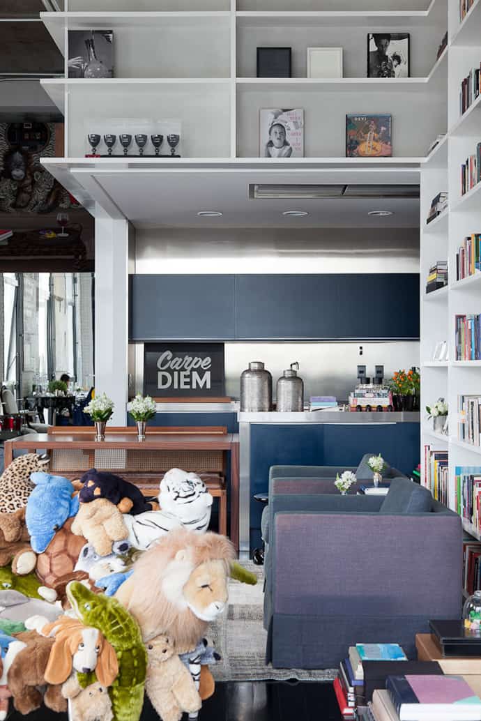
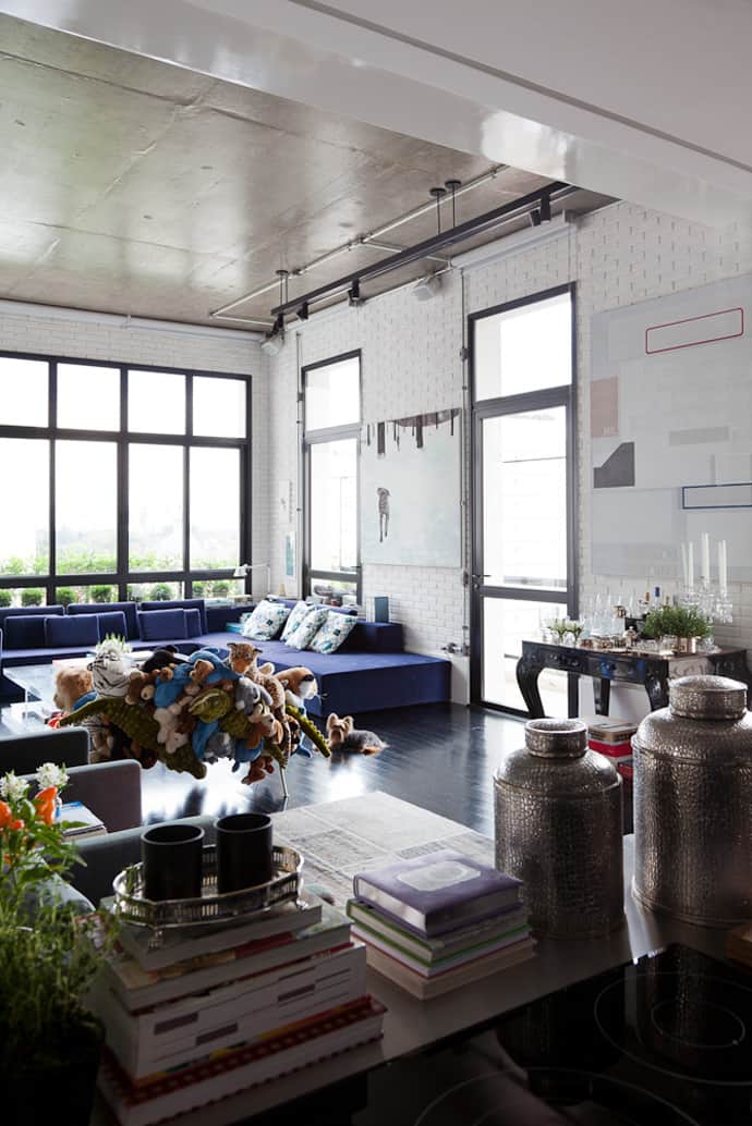
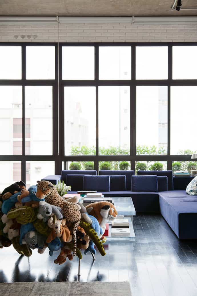
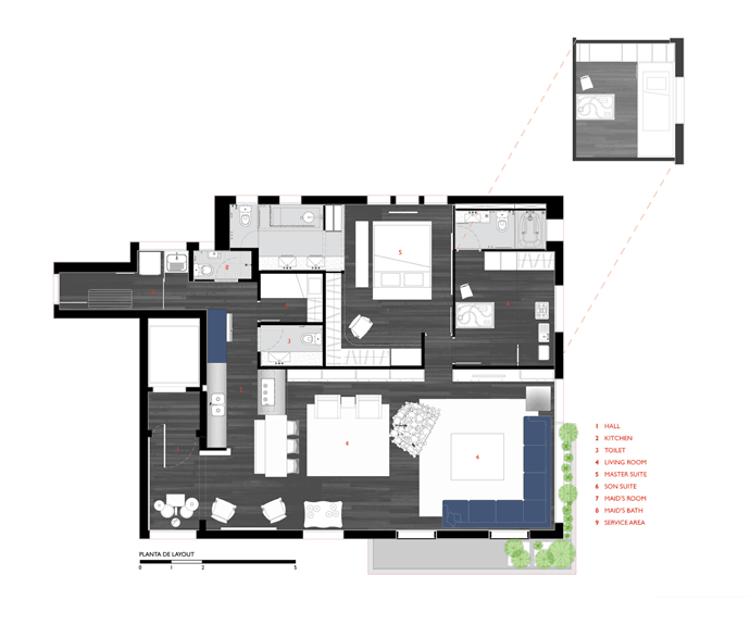
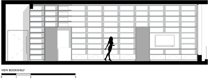
Spotted on www.archdaily.com, the apartment designed by FGMF Arquitetos in São Paulo, Brazil was decorated with a lot of “Get organized!” goals. The architects wanted to make the interior look larger and demolished all the walls and separations that seemed superfluous. Therefore, they succeeded to assure greater expressiveness of its best characteristics – the airy space created by the double height ceiling and large windows. In order to extend this feeling and organize the books, the architects created a large bookshelf that covers the entire living room, making an integrated open kitchen underneath. Moreover, art played a very important role in decorating this house. The key is to keep the arrangement loose but the spacing tight so that the overall effect is one large focal point. Repeat key elements — colors, materials, shapes — within the arrangement for a look that is casual yet pulled together.
