Making classic design feel contemporary is both challenging and rewarding. One of the easiest solutions of dealing with such compositions is to use white backgrounds. It might sound very common, but this pure layout functions wonderfully with ‘old’ items of furniture. Due to its heavy ornaments and sometimes very crowded aesthetics, classic interiors do not adapt easily. But in the apartment we spotted on designist.ro, things evolved with grace. The spaces communicate without boundaries, letting the inhabitants experience various perspectives at once. All the rooms benefit from natural light as much as possible and feature classic items of furniture with modern looks. To animate the home, the designer relied on vivid colors, soft textiles and original decorations that transform the living experience into a fairy tale. Explore the gallery and let us know if you enjoyed the project!
Rustic flavors animate the bedroom
3 in 1: dining, kitchen and living room
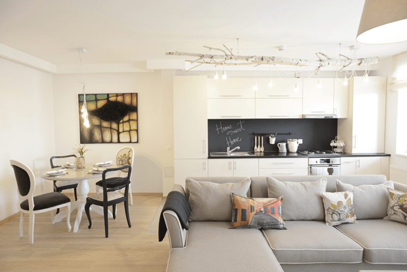
You feel very relaxed when communication is smooth and areas talk to each other with elegance. This is also the case in the picture above — the dining, the kitchen and the living room share one open floor. They are connected, but still enjoying their privacy. Near the door, a round table with 4 chairs represents the dining area; all items featuring a classic aesthetic brought into present. Made by The Craft LAB,
Blackboard in the kitchen
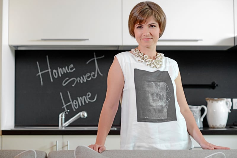
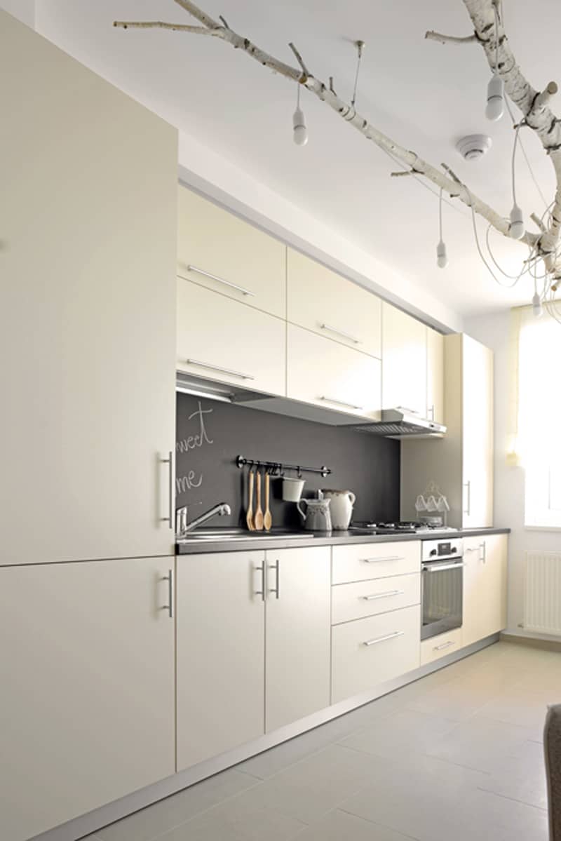
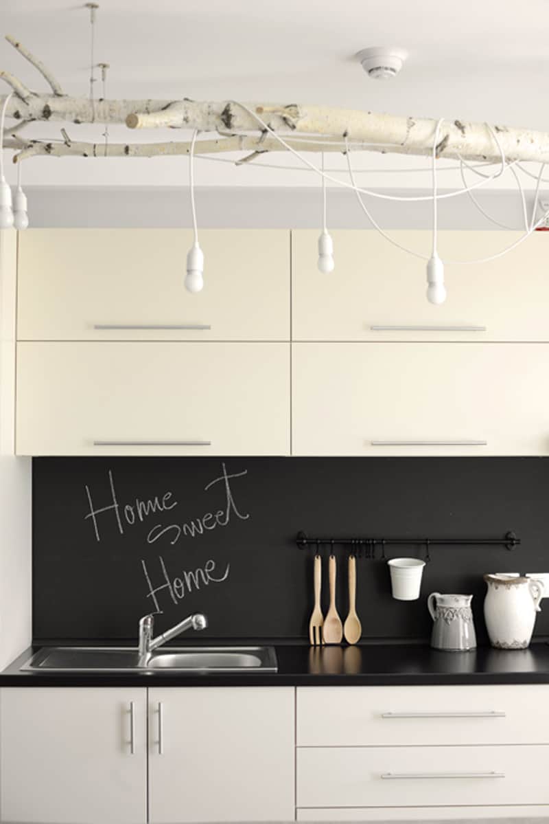
Known for its multiple functions, the blackboard feels marvelous in the kitchen. You can cover an entire wall with it or you can fix various pieces as in a collage. When you have a bad day, a message and a happy face can change your mood immediately. Home sweet home, Dare to wander, Enjoy life, Love matters and Don’t worry, be happy! are on my list. Use white chalk for strong contrasts and colors to make inspiring drawings. A smiley face, a flower, a tree, a sun or a moon will add joy to the environment.
Classic design – elegance in the dining room
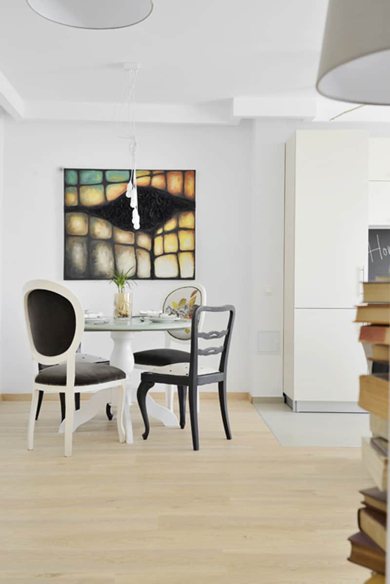
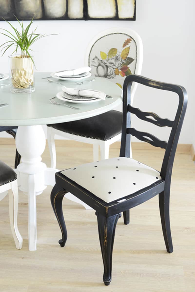
Refinement, grace, good taste – these words describe the dining room of the home. Quite austere at a first glance, the area offers an intimate corner for the inhabitants. The dining set of furniture reinterprets a classic aesthetic in a contemporary way. The chairs feature a soft, patterned tapestry with ludic elements. A king size picture overlooks the area, creating a hallucinatory effect. A bunch of bulbs like a contemporary installation completes the décor.
A close-up to this amazing chair that reinterprets the Louis style in a modern way.
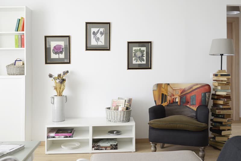
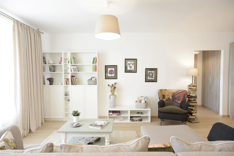
The living room features a comfy, L-shaped sofa and several discreet items of furniture. Neutral tones make the room feel warm and cozy, while also enhancing the space. The floor lamp made of books represents the focal point of the room and introduces the inhabitants into a fairy tale.
The armchair made of the Craft Lab is amazing – it is attractive and very chic.
Real simple, real organized
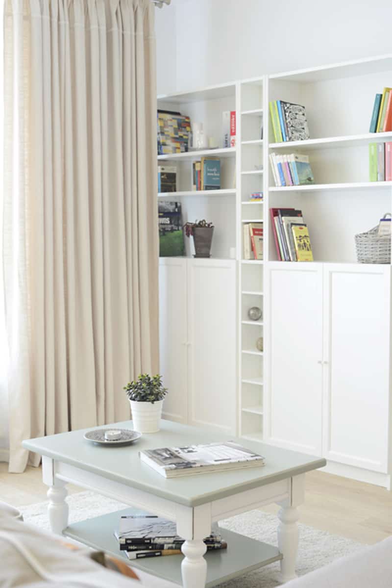
When you use space smartly, you enjoy the time spent at home differently. To make a small living room look tidy and organized is challenging. In this case, the designer recommended light pieces of furniture and colorful spots that add personality to the house. Two white cabinets offer space for storage behind the doors, while the superior shelves serve as book holders. On the right, a cozy reading corner featuring a comfy armchair and a floor lamp. The overall look is welcoming, relying on the stability of the classic interiors, but also with a glance towards the contemporaneity. I also love the fact that natural light comes inside as much as possible through large, diaphanous curtains.
Enliven the space with greenery and flowers!
Original installation
Who does not appreciate an intrusion of nature inside? The silver birch fixed like a pendant from the ceiling is one of the most interesting ‘chandeliers’ I have ever seen. White simple bulbs were interwoven with the branches, thus obtaining a very interesting installation.
Home sweet home and many more messages will inspire you while making coffee in the morning if you install a blackboard in your kitchen. I also love the contrast between black and white — it adds a bit of drama to the space.
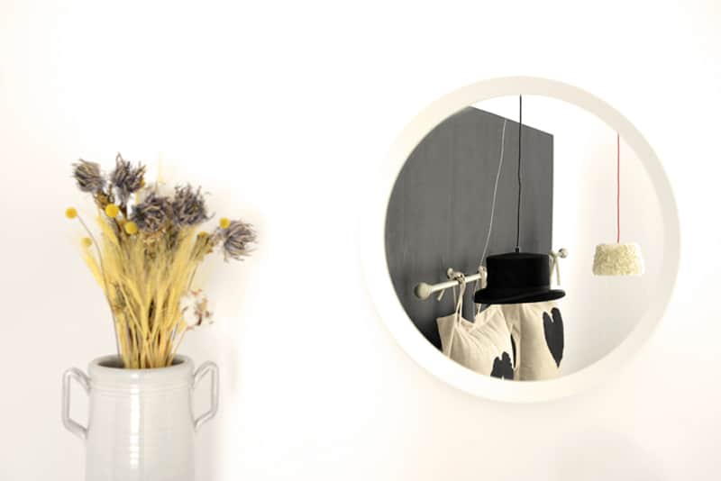
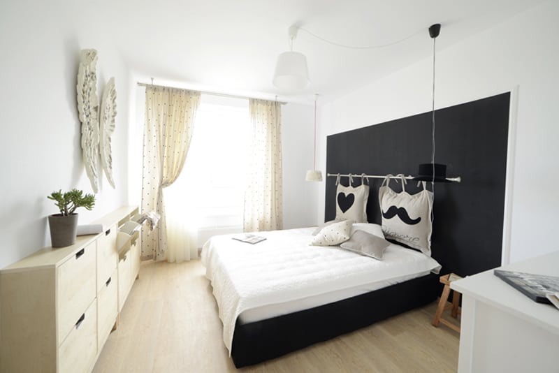
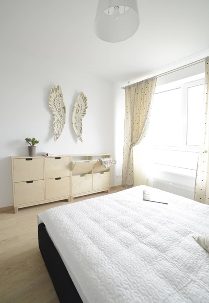
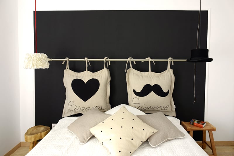
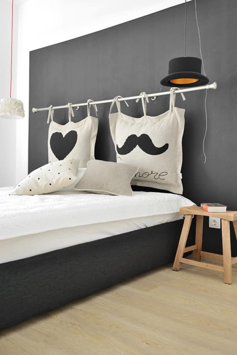
In the bedroom, the closet is missing — the designer wanted to avoid piles of boxes on the top of it. Instead looking at a huge closet with opaque doors, the inhabitants have the pleasure to admire two wings fixed in front of the bed. Using natural materials for the furniture, the room feels cozy and relaxed. I also like the way feminine and masculine are marked in the bed. It brings spots of joy inside.
Signora & Signore have their sides marked in the room, accompanied by two gender allusive pendants. I also appreciate the traditional stools at every side of the bed; they function like bedside tables.

