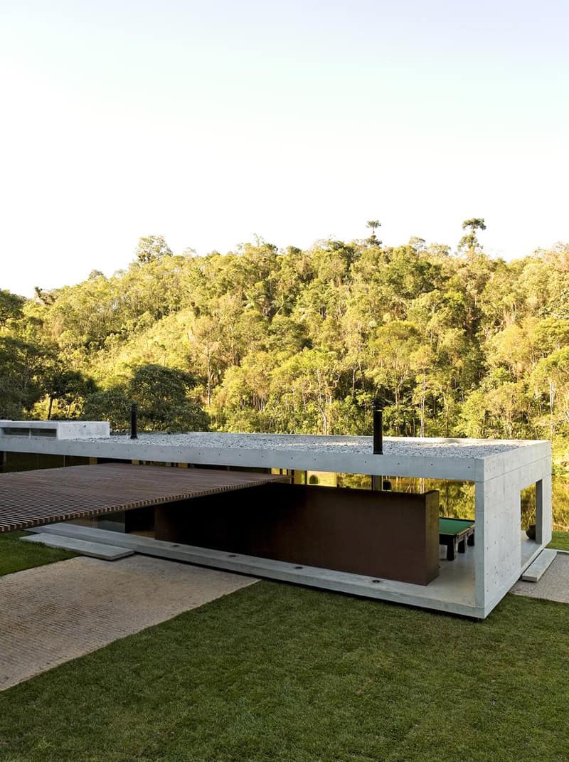
What’s so appealing to a pavilion house? Most of the people would qualify it as a big warehouse or a modest garage. The irony gravitating around the topic derives from a very naive understanding of the architectural language. We are used to see the home according to tradition – pitched roofs, framed windows, water pipes along the walls. These elements disappear in a pavilion house. Don’t look for grandma’s chalet anymore! Lightness and elegance conquered the designers. Moreover, due to its incredible fine silhouette, the pavilion house integrates smoothly in the landscape, creating a very harmonious composition. This is also the case with the project we spotted on galeriadaarquitetura.com. Explore the gallery and let us know if you enjoyed it!
Dining in-between
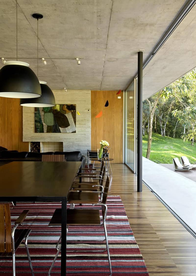
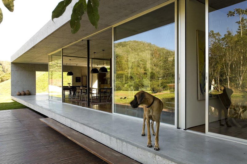
The connection between the interior and the exterior feels very natural. An almost invisible frame holds the gliding glass doors, offering a very beautiful view towards the garden. As for the interior, everything relies on natural colours and items of furniture. Light and dark brown, bricky, but also some vivid green recreate the good will of nature inside. I also found very inspiring the geometric touch of this interior. It transmits stability and tranquility.
Invite nature inside!
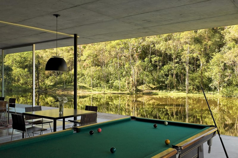
One of the most expensive privileges a residence can have is an amazing scenery nearby. The lake and the forest accompany the inhabitants during their daily routine. Isn’t it marvellous? It goes without saying that if you own a property like that, you opt for floor-to-ceiling transparent windows to enjoy the view as much as possible. A billiard table offers space for entertainment in this luxurious residence.
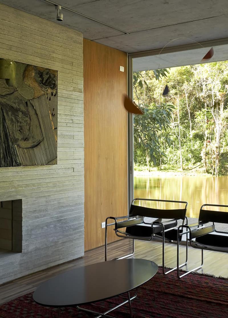
A very simple set of armchairs and a low coffee table in the living room. The abstract painting introduces the colours of moist ground inside.
Open plans make use of large space
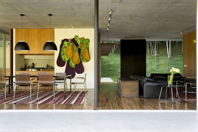
The kitchen, the dining and the living room share one open plan – a design that offers the owners the possibility to operate in a gracious relation with their home. How do you obtain visual unity in these cases? The most common attitude is to play with colours. As you can easily notice in the picture above, the areas share the same colour palette. Inspired by nature, the designer chose a parquet that features various tones of beige and brown. The result? You have the feeling that you step on moist ground. I also love the organic touch of the abstract painting resembling a split avocado. It adds personality to the space.
An entire wall made of glass
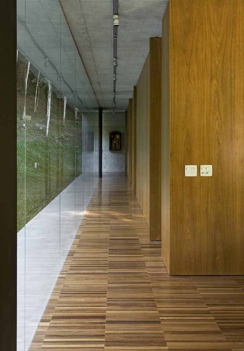
The wall ‘overlooking’ the forest is made of glass, allowing a strong communication with the exterior. It gives you the feeling that the symbiosis between the human habitat and the nature is the most common thing in the world. I mean, why don’t you try it at home too? Also, it allows natural light come inside, making the corridor ‘shine’ all day long.
A light building
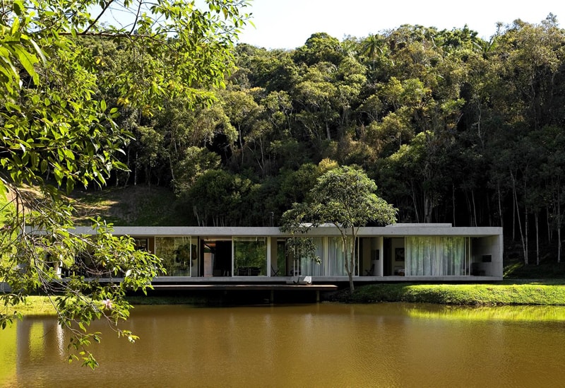
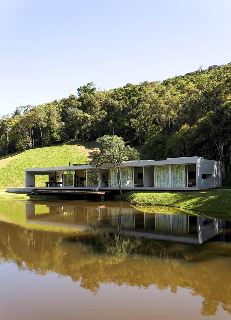
Yes, that’s the pavilion house. A light construction that seems to be floating on water when built on the bank of a lake. The one above ‘lives’ very close to the water, featuring a wooden deck at the entrance. The area serves as terrace during sunny days. The owners enjoy sunbathing or a glass of wine during evenings. The design of a pavilion house is quite simple: box-like volumes with expansive glass that extends in harmony with the landscape. This also combines with open-plan interiors for modern living and an relaxed lifestyle.
Solid material
The house features a solid concrete structure that encloses like in a protective box the living areas. Most of the architects go for solid materials in pavilion buildings so to gain resistance and stability. This tight system usually combines with fragile glass walls. That’s not so unusual, I would say. The weak-strong couple is able to last in this harmonious and elegant composition for a very long time. Moreover, it offers the inhabitants the possibility to admire the natural beauties.
The skillion roof
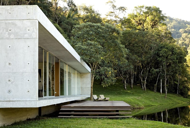
The house features a flat roof, but skillion – mono-pitched roofs – are very common on pavilion houses. The simplicity, clear lines and contemporary style of a skillion roof create a sense of spaciousness inside. Outside, the feeling of the house sitting lightly on, and of being one with the environment is enhanced. Two chaise longues on the terrace and a spectacular landscape invite the inhabitants to relax.
A view from the back yard
The living space is enclosed in a concrete box whose edge became an elegant terrace. I like the smooth, almost invisible transition between the exterior and the interior. The terrace does not have items of furniture – chairs, tables, umbrellas etc; they can be installed when necessary -, and creates the feeling of freedom without frontiers. Once again, the pavilion house proves its appetite for neglecting the unnecessary details. A rule to remember when designing your space!

