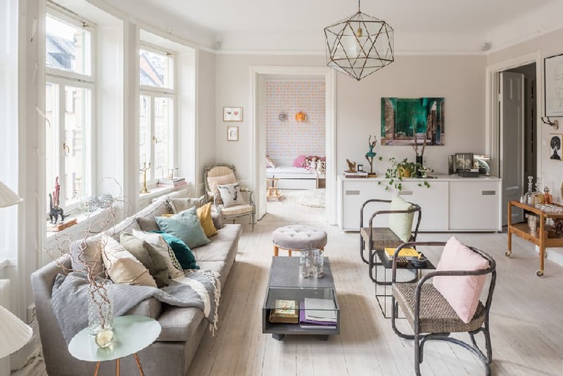
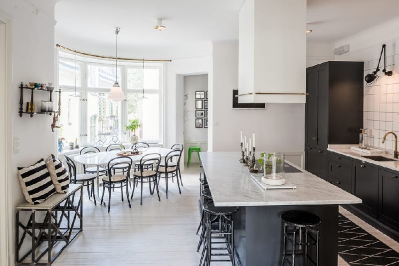
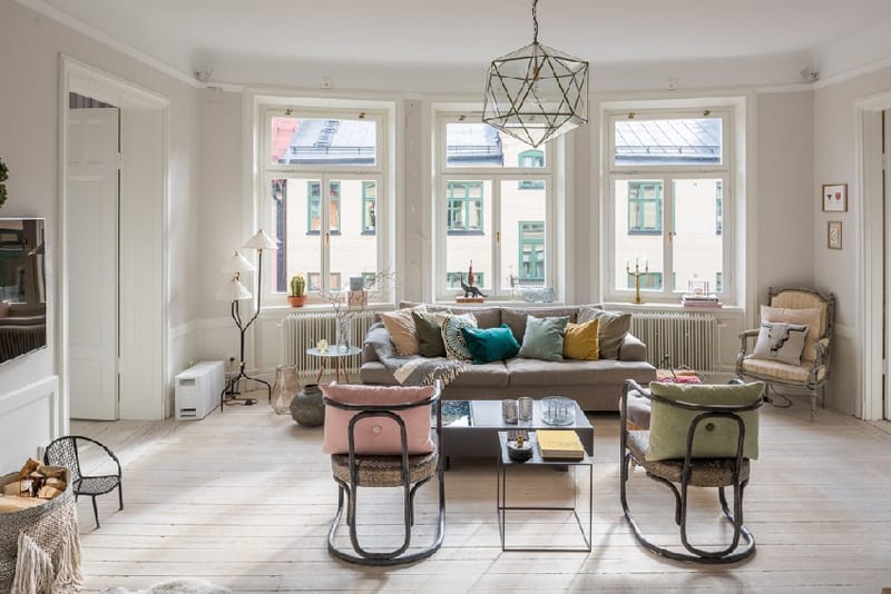
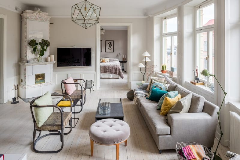
Nordic design is always trendy. But, it’s not easy to remodel an apartment in a historical building when you want to preserve its charm. Spotted on freshome, the crib below represents an astonishing ‘update’ for a not-so-modern look. Animated by eclectic mixes, the Nordic design fits perfectly in this all-white apartment accompanied by a lovely terrace. Following the rule of the North, pure white dominates the interiors that were animated with vintage pieces of furniture, original decorative items and surprising fusions of colors. The living room features a large comfortable sofa by the window, also facing two wicked armchairs and a low level coffee table. The serene tones and the abundance of light make the room feel diaphanous and relaxed. It’s always the place to be, to chat, to linger. Explore the gallery and let us know if you enjoyed the project!
Try the unusual!
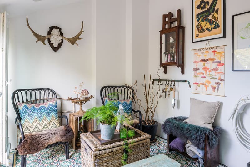
A comfy area designed to host long chats and reading sessions during the weekends. What I love at this corner is that it has something curious, unusual that challenges your stereotypes about design. Retro armchairs with sunny pillows, fine. But who would have ever imagined that they can also be paired with furry blankets? A deep, overwhelming love for nature is also present here. Dried tree branches, a poster with various types of mushrooms and one with colourful butterflies, together with the green pot on the coffee table make the terrace a splendid escape. Consider mosaic for flooring – it makes the room feel original and exclusive.
A solution for tiny spaces
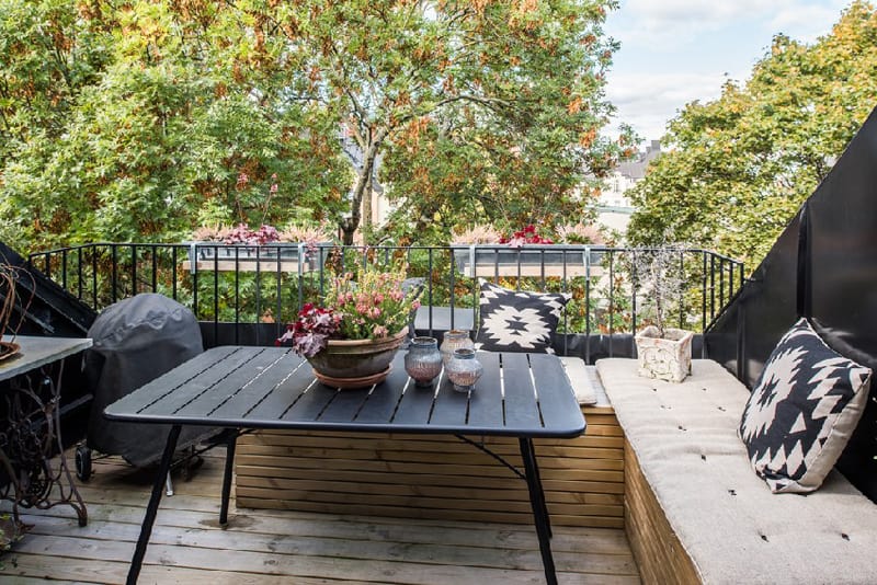
Would you like to save some space on the terrace? Of course, this is a must when it comes to tiny urban balconies. Thus, instead of several chairs or armchairs around the table, consider building a bench that would follow the curves of the exterior wall and the parapet. If you go for a box-like bench, fix a clipping above and use the space underneath for storing pillows, blankets, decorations. Wooden is usually used for its natural look and durability.
Exposed to light
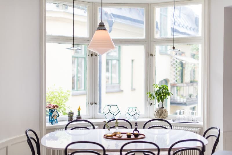
Nordic design is always about light. This elegant dining area was installed right by the window to make use of sun as much as possible. If you do not mind neighbours peeping in, avoid the curtains and create your own scenery on the window sill with little decorative objects. Ceramic statues, pots with flowers and glass hexagonal boxes beautify the one in the picture above.
Bring history up to date
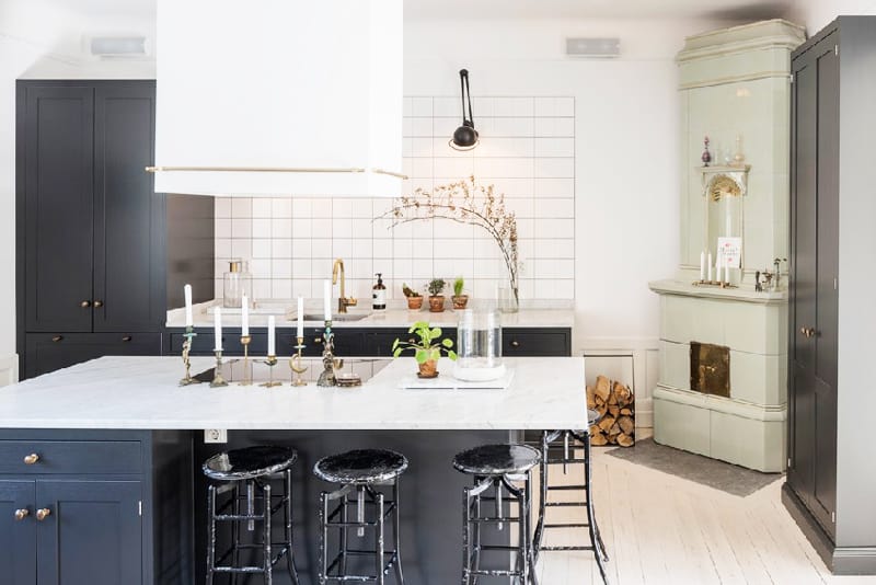
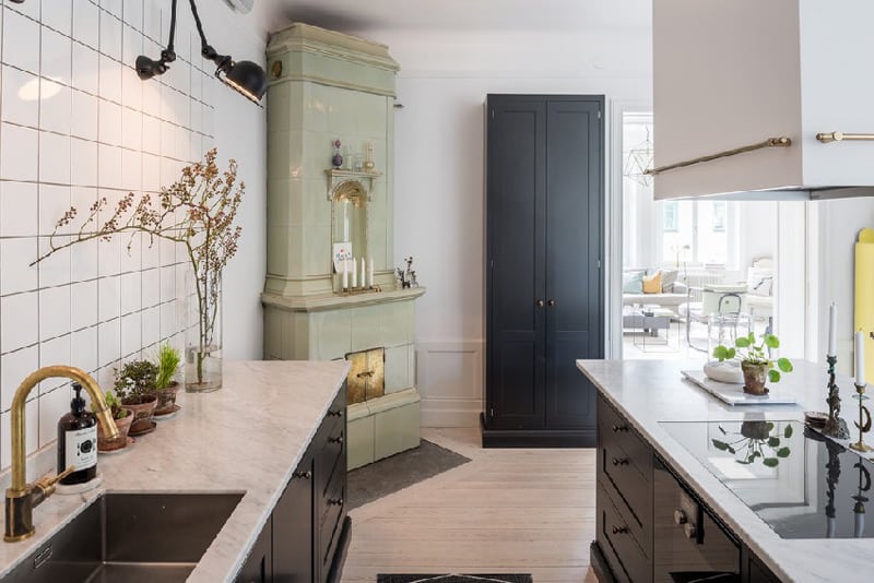
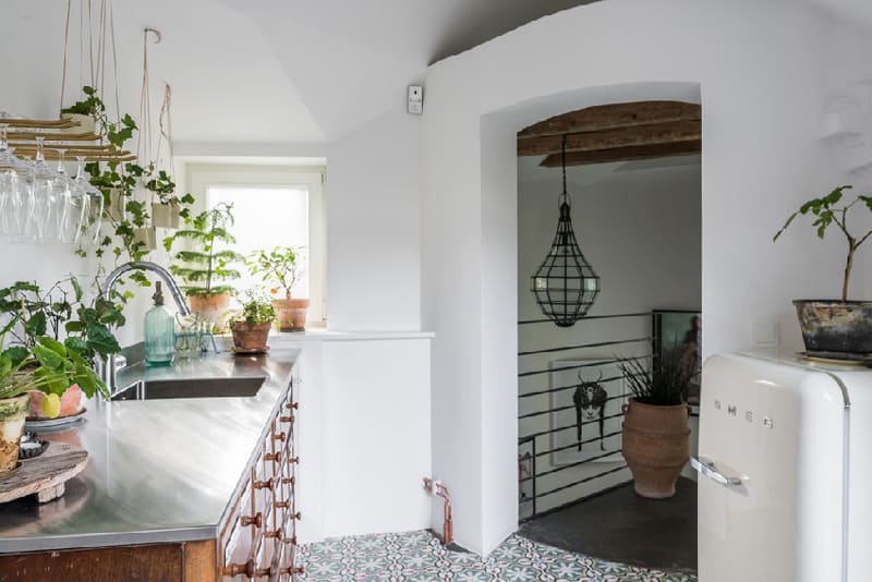
A slim, most frequently white elegant stove is the jewel of every Scandinavian interior. I am not sure if they are still functional, but who cares? I would never refuse such an offer for my living room … or kitchen! As you can easily notice, the owners decided to keep the original stove inside the cooking area and opted for classic cabinetry to include it smoothly. A pile of woods nearby is the natural touch any home craves for.
Creative mixes add charm
How do I mix without mistakes? Well, that’s a very good question. You are on the safe side if you start with a natural, simple background – which is, for example, an overall white interior or a light beige painting if you get stressed with clinic white. Then, the mixing process evolves according to your feelings. Combine wood with cane, glass with ceramics, cotton with linen paying attention to one single rule: harmony. Nordic design is flexible!
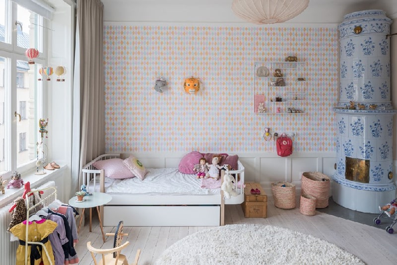
If pure white does not inspire your children very much, choose a vivid wallpaper in their room. Toys and books can be easily hung on the wall, stored in baskets or exposed on shelves.
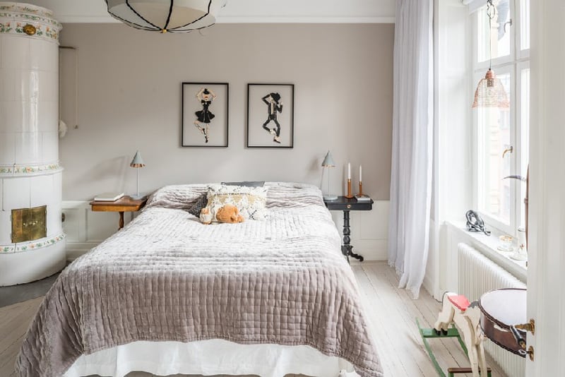
The bedroom is simple, yet elegant and very welcoming. The bed, the central piece in this room, is flanked by two wooden tiny tables and ‘supervised’ by two pictures above. I find this symmetry very harmonious.
Take it easy!
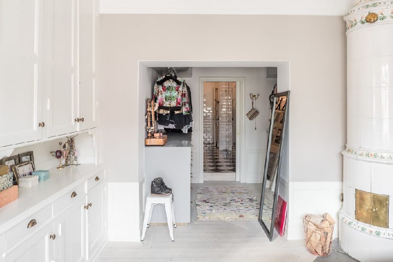
The entrance features calm and modesty – the two ingredients that made Scandinavian design so popular. Coats are hung in an open area above a cabinet, a pair of shoes stays independently on a stool, a tall mirror backs up the wall, a traditional carpet covers the floor at the entrance. A very simple mix, I would say, but one that reveals order and variety. Layouts that are open to change are always a plus and should be taken into consideration if you want to avoid monotony at home.
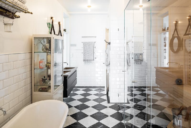
Do you remember tall cases of metal and glass used in pharmacies? Well, they are also good to serve your bathroom in case you want to impregnate a vintage touch. Metro tiles and chess flooring are a dynamic, vivid mix.
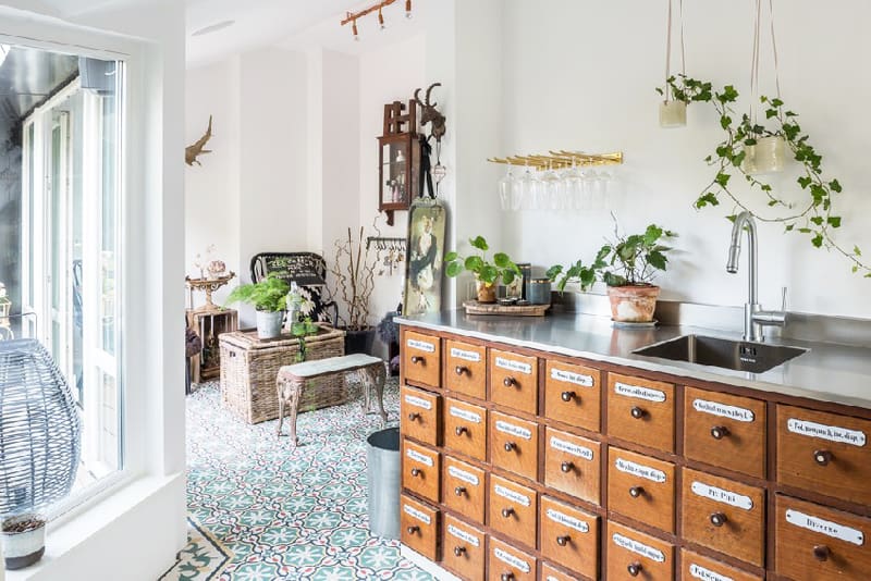
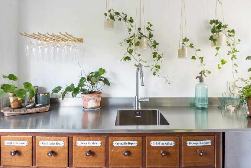
This is the first time I see the library cases with index cards in a kitchen. They are perfect for storing – just imagine how easy will find the seasonings with this kind of ‘asset’ at home!

