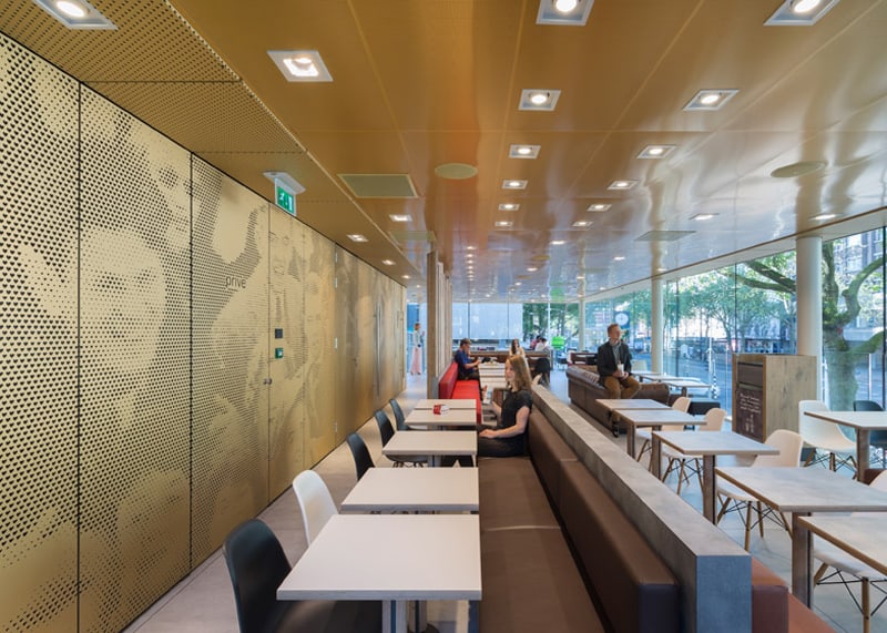
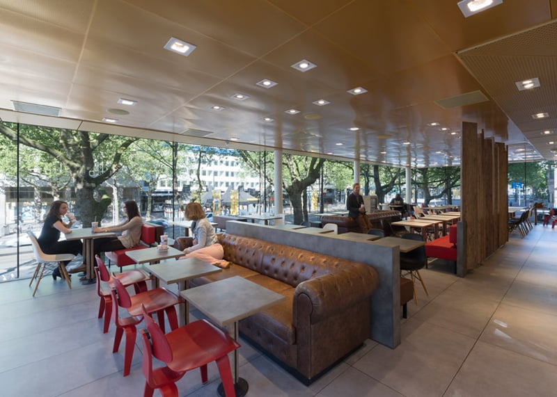
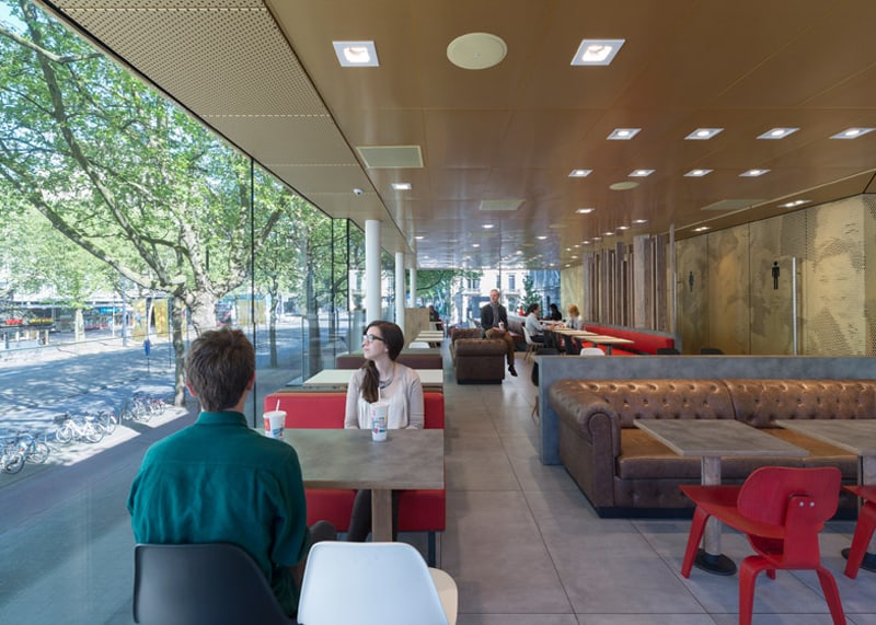
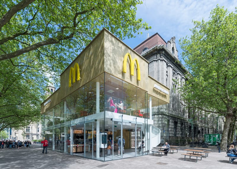
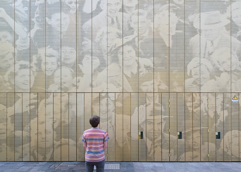
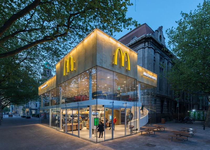
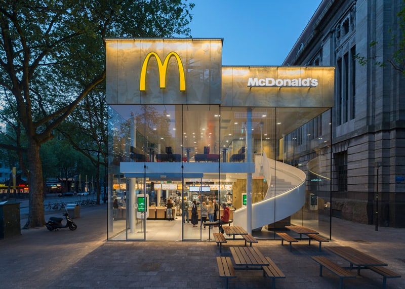
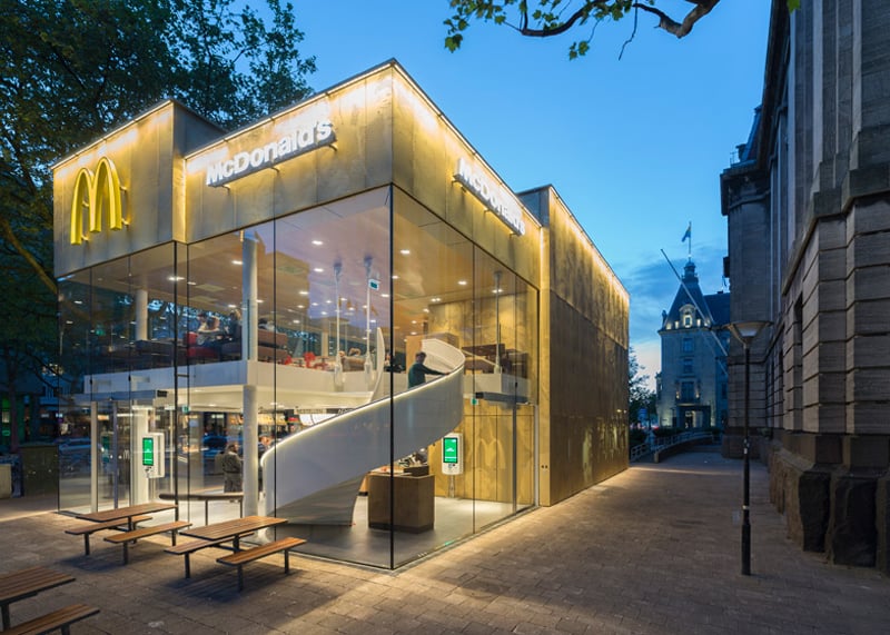
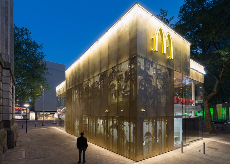
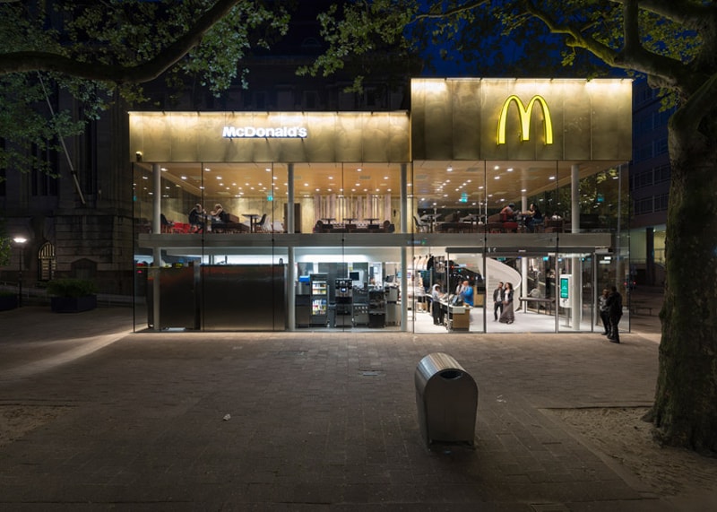
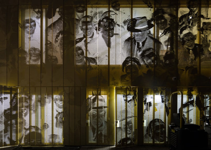
Designed by Mei Architects, the McDonalds Restaurant is located on Coolsingel, one of the city’s most popular shopping streets. the two-storey structure was conceived by Rotterdam-based Mei Architects as a golden pavilion with a facade of pixillated imagery. This McDonald’s restaurant featuring a perforated golden facade and a grand spiral staircase was designed by Dutch firm Mei Architects to replace “the ugliest building in Rotterdam”. After a very fast construction time of two months a spectaculair new pavilion now shines in the heart of Rotterdam. The majority of its exterior is glazed, providing views through the building. This allows passersby to catch a glimpse of the white steel staircase that spirals up from the service area on the ground floor to the dining room upstairs. A fully transparent lobby, with entrances on three sides, makes it seem as though the public space flows through the building.
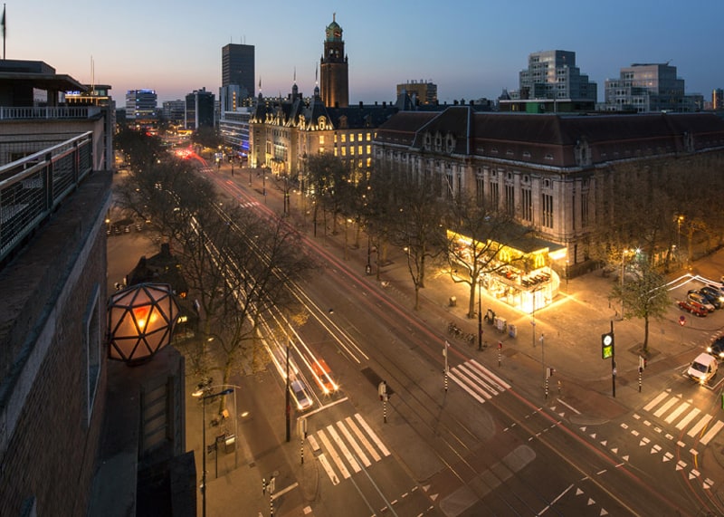
The new building volume has been carefully detailed and articulated by Mei to open up views of the monumental post office behind it. As a result, the pavilion has the most compact possible core, with glazed façades all around. A fully transparent lobby, with entrances on three sides, makes it seem as though the public space flows through the building. Just like the historical buildings in the area, the pavilion features a richly articulated façade, carried out in one single material: gold anodized aluminum. This warm and elegant-looking material is vandal-proof and enduring at the same time.Since the 1970s the McDonald’s pavilion has been altered frequently. Its quality suffered as a result, with its mostly closed facades. This makes the space anonymous. We want to activate this space again. Our task was to redesign the McDonald’s and make it blend into its surroundings,” explained studio founder Robert Winkel.
also view: The Corner by McCafé or McDonald’s Disguised as a Hipster Cafe
