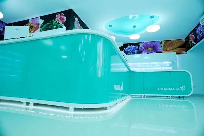
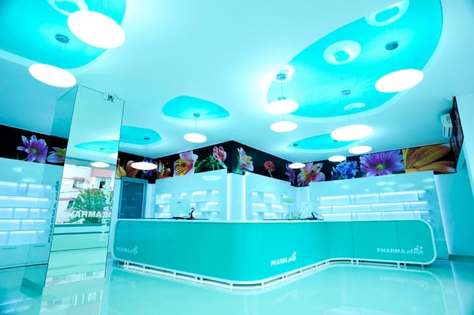
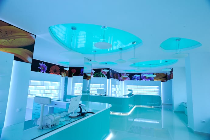
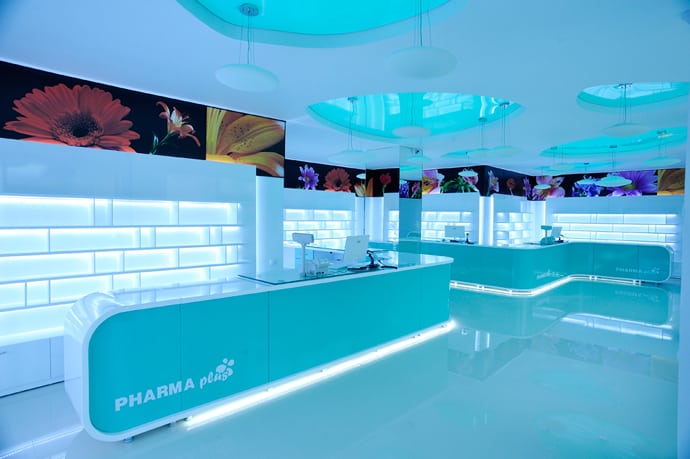
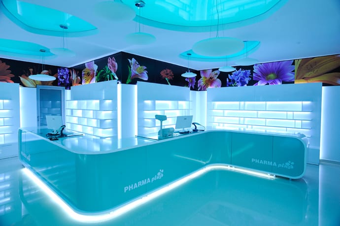
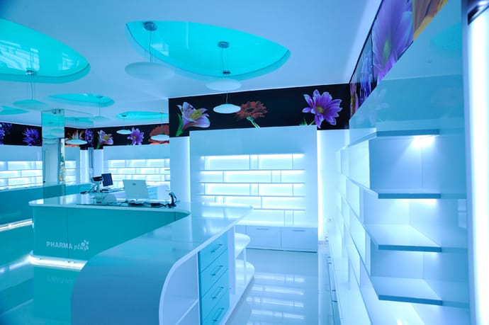
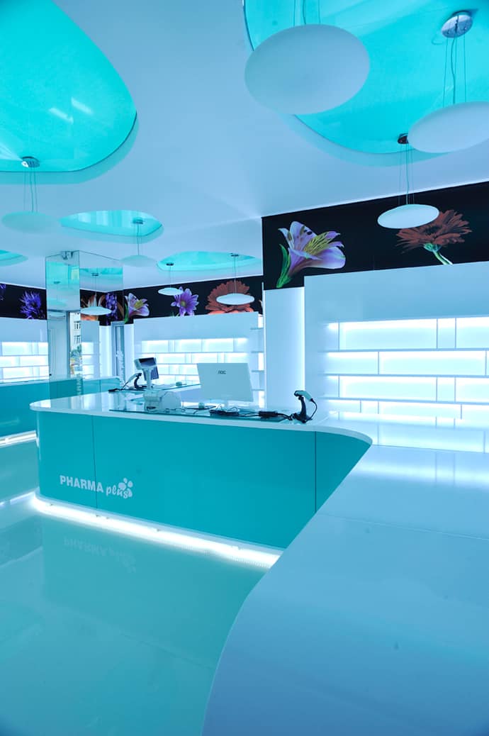
What do you usually expect to find in a drug store? A clear space accessorized with lots of storing items configured to work exactly the way the pharmacist need them to. Well, the one we found on Arhiforum offers more than that: an experience for all your senses! It’s located in Romania, a Southeastern European country where most drugstores choose a common combination of green and white design just to make sure that any passerby would not mistake it for some other type of establishment. Pharma Plus invites you in a futuristic space with lighting objects that create wonderful contrasts and pieces of clear, modern furniture realized by QMobili. The floral prints that circulate under the ceiling warm the interior and make the customer feel relaxed as if he entered a familiar space. I’m sure this is a pharmacy employees love to work in. Enjoy our gallery!
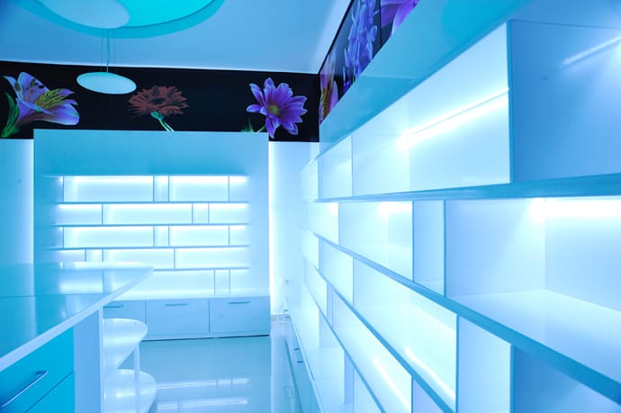
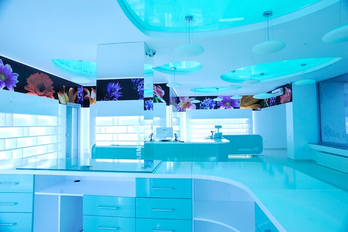
Storage options are plentiful, both above and below the work surface, and keep surfaces clear and items close at hand.
New technologies and processes can be integrated with little effort or expense, as you reconfigure the same components.
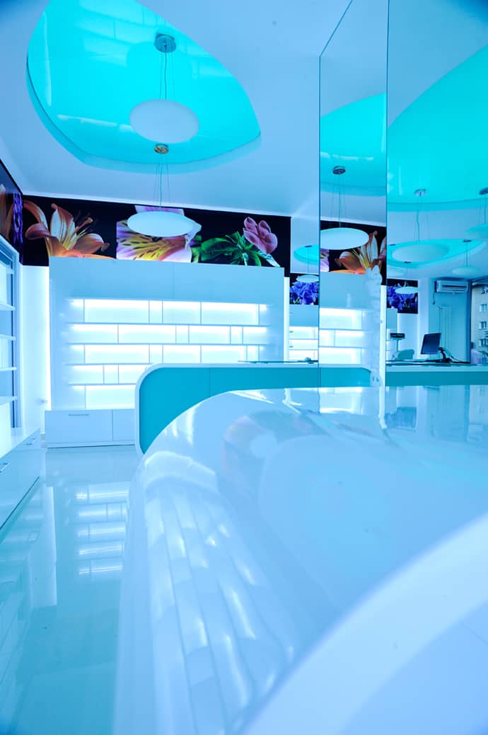
The pharmacy offers an incredible experience of light and color during the night.
Floral prints near the ceiling create the visual identity of the pharmacy.
The pharmacy respect the visual merchandising criteria: a functional distribution and an attractive exhibition of the products.
A fairy-like atmosphere
It’s more than a pharmacy: it’s visual therapy!
Functionality and stylish design: the recipe any pharmacy should rely on!
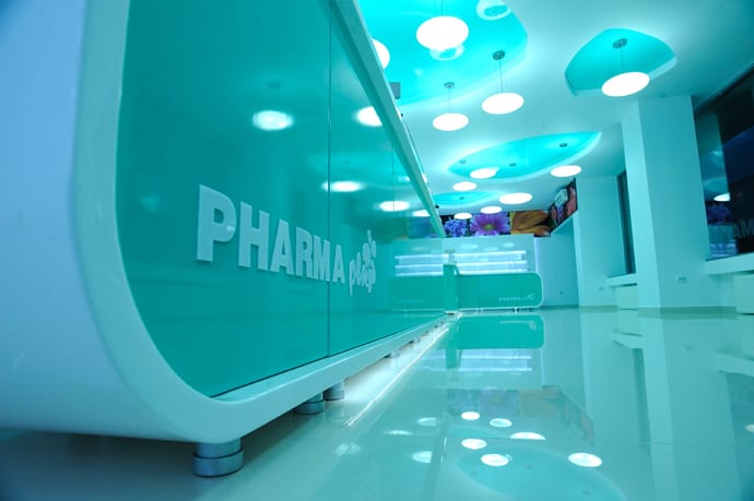
The logo of the pharmacy was printed on the desk.
The designer used shinny materials as well as rounded, circular angles in order to accentuate the impression of fluidity and continuity.
The central pillar is fully covered in pieces of crystal mirror.
The floral prints on a dark background add a plus of extravagance making the pharmacy look elegant and stylish.
It seems we’ve landed in an U.F.O.! :)
The ceiling is extendable.


